For the majority of online retailers, getting new visitors to sign up is a major hurdle. After investing a good portion of your marketing budget on Adwords to drive traffic to your eCommerce site, how much of that traffic do you retain? Industry average suggests that average landing page conversion is 2.35% whereas the top quartile websites get close to 5%. What makes a difference when it comes to retaining the unknown traffic and growing your subscription list? One key differentiator is how well you use the email signup form or pop-ups.
Below, we share 5 best practices for designing high performing email signup form.
1. Requesting for E-mails Politely
We all know how annoying it can be when a signup form appears right after you land on a website, before learning what the site is all about. Imagine asking for contact detail from a person who just walked into your store for the very first time. How likely is that person going to provide you his contact? The likelihood of visitor signing up at this point is extremely low. Furthermore, it may aggravate the visitor to simply abandon the visit. So why waste the opportunity to make a good impression then?
Building a relationship with your customers means knowing enough about them to be able to approach them with the right way and at the right time. Give them a chance to explore your website and get to know what the store has to offer. There are 2 good points during a visitor’s online journey to request signups.
Ask for emails at the end of your content.
It has become evident that most visitors decide whether to subscribe or not after reading your content. By triggering a pop-up as soon as they reach the bottom of your page, you will have a better chance of getting them to offer their email address. Under the principle of reciprocation, you can offer similar content that the visitor seems to have enjoyed. This can be either in the form of eBooks or signing up to be part of the mailing list for future content.
Introduce a Pop-up upon Exit.
When someone is about to close or leave the browser, the action triggers a pop-up. As a result, the user will stop to check what just popped up.
Exit-intent pop-ups for email subscriptions trigger very positive responses. You can use the method to convert your outgoing visitors. Set up an exit-intent pop-up with an appealing invitation to subscribe.

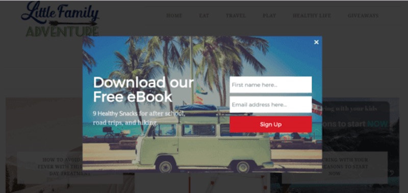
Exit Email Signup Form Example from Hugh Jordan
2. Keep the Email Signup Form Easy and Short
8 sec rule
Whether it’s about collecting email addresses on social media, through a landing page, or on your website, your subscribers will respond better to a straightforward form. You have 0-8 seconds to make a simple, yet compelling headline and landing page. After 8 seconds, visitors lose interest.
Simple is Better
Keeping it simple means keeping your form intuitive. Make it easy to understand what value subscribers will receive for signing up, and any other relevant information like how often they will hear from your company. The email signup form needs to have a simple yet compelling design, similar to an optimized checkout form.

3. Mobile-friendly is the Key Word
Mobile devices have become so prevalent that they simply cannot be ignored. Due to their portability, mobile can be used anywhere at any time – which means, more people are opening up and responding to forms on small screen devices. This means that your email signup form, either in a popup or static form format, needs to fulfill one key criterion – mobile responsiveness.
Keep in mind that:
- All information needs to clearly fit on a single screen without scrolling up and down or left and right.
- Every field needs to be large enough to tap and type in with ease. Users will abandon your form if it is time-consuming to fill out; this is especially true for mobile users with even shorter attention spans.
- Mobile resolution should be kept under 300×400 px
A best practice when designing popup for desktop and mobile users is to create two distinct designs, each optimized for respective screen resolutions. This way you will be able to deliver the optimal browsing experience for your visitors without having to compromise on the content or resolution.
4. Design a Visually Powerful Call to Action
A call to action (often seen as CTA) is a piece of text that is meant to incite movement, action and encourage clicks. It’s a sentence or a button that closes the deal. So, naturally, calls to action are very useful when it comes to encouraging email sign-ups.
Devote some time to crafting a powerful and striking call to action that will attract attention and encourage people to enter their email details right away. Remember, the CTA can either be a power text or eye-catching image that focuses visitors’ attention. So play with both elements and use AB testing to see which versions convert better!

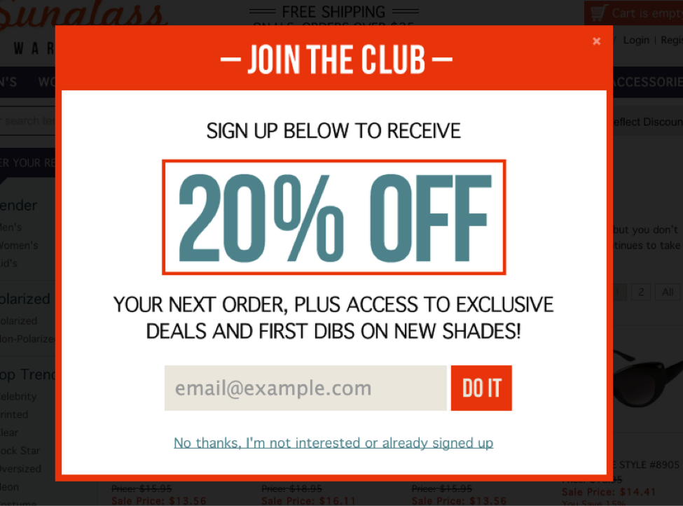
Example of compelling CTA with a use of simple, yet direct “Do It”.
5. Surprise and Attract your Visitors
As the great war strategist, Sun Tzu, proposed, use the element of surprise to your advantage. A design that’s out of the ordinary is more effective in capturing visitor attention and getting them to react. There are two ways you can start incorporating surprises into your email signup form designs:
Be Bold
Choose creative and unexpected designs. A great color scheme paired with subtle animations gives out a stylish and personal impression.
Throw something into the bargain
Provide incentives for subscriptions – free content, useful information, discounts, etc. Particularly at points that are less expected.
Ready to grow conversions on your email signup form?
A simple email signup form with a minimalistic, yet creative design can help create a unique bond between your visitors. Base your copy based on something valuable: their interests, passions, and curiosities. With some thought, time and care you can turn your email signup form from boring to engaging. Hopefully, that will show up directly as email conversions as your mailing list subscribers count soars.
If you nailed your email signup forms then consider taking the next step and see if you’ve adopted these marketing automation scenarios to nurture your mailing lists.


