Now that every click, swipe, and purchase matters, A/B testing for retailers has emerged as a powerful tool for those seeking to optimize their conversion rates and refine the customer experience. Often referred to as split testing, A/B testing allows retailers to experiment with different variations of their website, marketing campaigns, and product offerings to determine which resonates best with their audience. Approximately 85% of all A/B tests help businesses identify the most effective call to action. This statistic underscores the tremendous impact that A/B testing can have on a business’s bottom line.
By systematically testing various elements such as website layouts, visuals, copies, call-to-action buttons, pricing strategies, and product descriptions, retailers can gain valuable insights into consumer behavior and preferences. In this blog post, we’ll delve into 45 must-run CRO experiments tailored specifically for retailers. From refining product recommendations to streamlining the checkout process, these experiments are designed to empower retailers with actionable data-driven strategies for driving conversions and delivering exceptional customer experiences.
What is retail A/B testing?
In retail, A/B testing involves testing two different versions of a company’s website or app to compare how they perform. It gives retailers real-time data to tweak their website’s content to convert visitors more effectively.
Retailers can also use A/B testing on their marketing messages by launching two versions of an ad or a social media post for a small audience. This helps a marketer determine which language and calls to action (CTAs) would drive more sales.
Why A/B testing is important for any eCommerce retailer

In 2023, more than 26 million eCommerce stores were online. The online market is saturated, and unless an eCommerce retailer has strong brand recognition, it risks being relegated to the back pages of the search results.
A/B testing enables retailers to stand out online by learning which features drive conversions. Without A/B testing, retailers would rely on the same layouts and marketing techniques or risk blindly making web design and marketing decisions while hoping their changes are effective.
With A/B testing, retailers can test which versions of their campaigns and ads are most successful and leverage the data to improve the lacking parts. They can optimize landing pages for conversions, determine which language most effectively grabs people’s attention, and refine different elements of the user experience.
At first, A/B testing can seem overwhelming, especially if an eCommerce retailer tries to test everything on the website at once. However, retailers can simplify the process by using different experiments for small sections at different times.
Top 10 A/B testing experiments for product pages
For customers shopping online, product pages offer vital information. Customers can’t try a product or feel it online, so they rely on product pages to picture how well an item will meet their needs. Here are some good A/B tests retailers can run on their product pages.
Experiment #1: Try different image variations for top-performing products
Instead of relying on the same images to sell the best products, retailers should mix them up and measure changes in traffic. An eCommerce brand can try posting the product from multiple angles, adding lifestyle shots, or posting a short video. This will help them optimize the visual appeal of their top sellers and boost their conversion rates.
Metrics to monitor: To determine which images are most successful, a retailer should measure the click-through rate for the product page, the amount of time visitors spend on the page, the bounce rate, and the conversion rate.
Experiment #2: Experiment with variations on product descriptions
Effective product descriptions paint a picture of how a product can benefit shoppers. eCommerce marketers should try changing the benefits they highlight in their product descriptions to see which are more effective in driving sales.
Metrics to monitor: After switching up their product descriptions, retailers can measure their click-through rate, conversions, and bounce rate.
Experiment #3: Add product recommendations
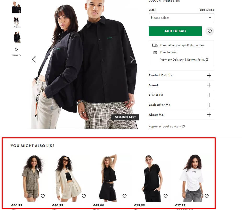
Real customer reviews help shoppers learn more about a product, and recommendations can sway them to make a purchase. Retailers should experiment with where the average customer ratings and reviews are placed on each product page to determine how they impact sales, starting with their best sellers.
Metrics to monitor: Once each version of the product page is live, retailers should measure:
- Click-through rates
- Conversion rates
- Bounce rates.
Experiment #4: Test the CTA
Each product page on an eCommerce site should include a call to action such as “add to cart” or “buy now.” Retailers should experiment with different calls to action to see which is more effective. They can also change the design elements of their CTAs, such as the font color or button layout.
Metrics to monitor: Measuring the number of sales is the best way to test a CTA.
Experiment #5: Test videos vs. images
It’s possible that switching product images could lead to more sales. However, a retailer may not know whether it was a new image or video that drove the change. To see how customers respond to static product images vs. videos, retailers can test different versions of their websites.
Metrics to monitor: Like the first experiment, a retailer can measure their success by recording:
- Click-through rates
- Time spent on page
- Bounce rates
- Conversions

Experiment #6: Make small changes to page layouts
Effective product pages have many different elements. In general, they should include the
- Product image
- Description
- Availability, and price.
However, placing all these elements together could potentially clutter the product page. Retailers can rearrange product page design features to see which layout is best for their customers.
Metrics to monitor: Ideally, a good layout will increase the length of time a customer spends on the site. Retailers can identify the best layout by recording the amount of time visitors spend on the page and the bounce rate.
Experiment #7: Play with personalized campaigns
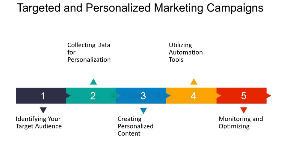
If a retailer can add personalized recommendations based on a customer’s behavior to the site, they should test it. They can run one version of a product page that doesn’t offer recommendations and another that shows tailored on-page ads based on the products a certain user has been browsing through.
Metrics to monitor: Personalized recommendations can increase the amount of time visitors spend surfing on the site and the average dollar value they generate per transaction.
Experiment #8: Shorten product descriptions
Some retailers take a storytelling approach with their product descriptions. While this method is great for SEO, some customers might find it tedious. A/B testing for retailers can help them decide whether longer descriptions or bulleted lists appeal to their customer.
Metrics to monitor: To measure the results of this test, marketers should track:
- Click-through rates
- Bounce rates
- Conversions
Experiment #9: Add a chat feature to product pages
Chatbots powered by artificial intelligence have given eCommerce retailers a way to be available for customer service at any time. Some customers may want to ask a chatbot questions directly on the product page, particularly if they want to know more about a particular feature. Retailers can run this experiment to see if an on-page chatbot is desirable.
Metrics to monitor: If people don’t like this feature, marketers may see higher bounce rates and fewer conversions. They can also measure the amount of time visitors spend on the page.
Experiment #10: Change the font for product prices
Retailers can help customers make informed decisions by making pricing information appear larger, or by giving them more time to consider the product’s features first by making the prices smaller and less prominent. Some retailers will have price-conscious shoppers who want to know the price of an item before reading its description, while others will have customers who want the best product regardless of the cost.
Metrics to monitor: Retailers can track this experiment by measuring:
- Conversion rates
- Average price per sale.
Improving the checkout process: 10 CRO experiments
A complicated checkout process could inspire customers to abandon their carts before finishing their purchase. Retailers can prevent this before it happens with these experiments.
Experiment #11: Allow guest checkout
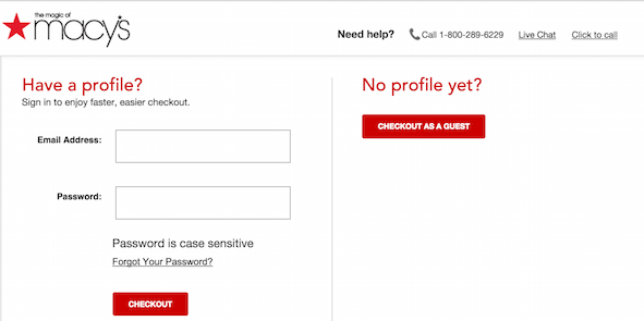
Retailers that require customers to create an account before checking out may be missing out on sales. They should launch a guest checkout option to see how it impacts their sales.
Metrics to monitor: This A/B test for retailers should improve sales and reduce abandoned cart rates.
Experiment #12: Explore variations with multiple checkout pages vs. one page
The checkout process could include a single form or several pages featuring multiple forms. To test which version customers prefer, retailers should launch two versions of their sites, one with a single-page checkout and another with a multipage checkout process.
Metrics to monitor: Measure the results by comparing:
- The average Checkout time
- Abandoned cart rates
- Total sales
Experiment #13: Rearrange the payment options
A retailer can determine which payment options are most appealing to their customers by rearranging them. They can prominently display third-party processors such as Apple Pay or PayPal on one version of the page and highlight credit card checkouts on the other.
Metrics to monitor: This conversion rate optimization tactic can be measured by:
- Recording sales for each payment
- Total sales for each version of the website.
Experiment #14: Redesign buttons
CTA buttons guide customers through the checkout process. An eCommerce retailer can change the design of its buttons to see if making them more prominent encourages more sales.
Metrics to monitor: Retailers can determine whether this experiment is successful by comparing:
- Conversion
- Abandoned cart rates.
Experiment #15: Promote special offers
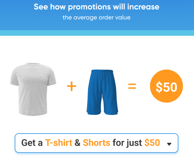
Brick-and-mortar retailers often encourage cashiers to upsell at checkout. eCommerce shops can see if this works online by promoting upgrades and comparable products during the checkout process.
Metrics to monitor: This A/B test for retailers is successful if it increases the average dollar value per sale. Retail marketers can also measure:
- Abandoned cart rates
- Total sales
Experiment #16: Allow some users to auto-populate fields
Most mobile devices and computers can auto-populate fields with information, particularly if a customer is signed into their Google or Apple account. One version of an eCommerce app can populate fields with existing account information, while the other version requires manual entry.
Metrics to monitor: Some customers may think auto-populating fields from their online accounts is less secure. See what they prefer by measuring:
- Conversions
- Cart abandonment rates
Experiment #17: Increase the shipping options aggresively
By rearranging the shipping options, including ship-to-store or ship-to-home, an eCommerce marketer can determine which options are most important to customers. Each version of the website should display the shipping options differently.
Metrics to monitor: Like other CRO techniques, this one can be measured using:
- Total sales
- Abandoned cart rates
- Average dollar value per sale.
Experiment #18: Optimize free shipping
In theory, free shipping will entice shoppers to buy more. After calculating their costs, retailers can experiment with various free shipping models to see which is most appealing.
Metrics to monitor: Retailers can determine the outcome of this experiment by measuring:
- Average dollar value per sale
- Total sales
Experiment #19: Display security certificates
To determine whether customers feel more secure during checkout, a retailer can test two versions of its site. On one version, the security certificate should be on display. On the other version, the retailer would not display the certificate.
Metrics to monitor: This experiment can be measured using:
- Cart abandonment rates
- Total sales
Experiment #20: Clearly display the return and refund policies

Being able to find the return and refund policies can make customers more comfortable shopping online. This CRO technique involves adding a link to the refund and return policies on the checkout page.
Metrics to monitor: Retailers can identify which version is best by measuring:
- Total sales
- Abandoned cart rates
- Return rates
Navigation, Layout, and UX optimization: 10 key experiments
Retailers can use these techniques to optimize the user experience for their customers.
Experiment #21: Vary the on-site headers
Change the font size and colors for the headers to see if it helps people navigate the site. Leave the second version of the website alone.
Metrics to monitor: For this test, measure:
- Time spent on page
- Page views
- Bounce rate
Experiment #22: Add more product categories
See if adding more product categories makes it easier for customers to find what they need. Launch one version of the site with additional categories and one without.
Metrics to monitor: This experiment should:
- Increase Time spent on page
- Decrease Bounce rate
- Increase Conversion rates.
Experiment #23: Change the homepage layout
The user experience starts at home. eCommerce marketers can change the layout, moving photos, headers, and navigation bars to see how it impacts the user experience.
Metrics to monitor: Compare layouts by measuring:
- click-through rates
- Average time spent on page
- Bounce rates.
Experiment #24: Change the site’s typography
Retailers can see which design elements are best for their customers by making fonts larger or smaller or changing the color. For example, they may find that a higher contrast between the font and the background is more engaging.
Metrics to monitor: Compare typography preferences by measuring:
- Average time spent on page
- Bounce rates.
Experiment #25: Optimize page loading speed
Speed is an important part of the user experience. To see how it impacts conversion rates, this A/B test for retailers involves optimizing one version of the site for faster load times and leaving the other version alone.
Metrics to monitor: This test should be measured:
- Average time spent on page
- Bounce rates.
Experiment #26: Make trust signals more prominent
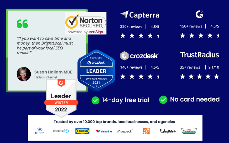
Adding trust signals, including testimonials and social media reviews, to the homepage can improve a retailer’s credibility with customers. In this A/B test, the retailer can launch one version of its homepage with prominent trust signals and one without.
Metrics to monitor: Trust signals should improve:
- Click-through rates
- Conversion rates
Experiment #27: Declutter the homepage
Clean up text and images on the homepage and make use of white space for a sleeker layout. Test the clean version against the classic version.
Metrics to monitor: Like with other UX tests, measure:
- Average time spent on site
- Click-through rates
- Bounce rates
Experiment #28: Clean up the copy
Experiment with punchy copy that clearly illustrates a product’s value. If customers have to search through an eCommerce site for potential benefits, they may leave.
Metrics to monitor: Test out various versions of the copy by tracking:
- Average time spent on the site
- Click-through rates
- Number of pages per session
- Bounce rates
Experiment #29: Try adding breadcrumbs
Once a customer gets deep into an eCommerce site, they can either leave or check out. Encourage them to stay by adding breadcrumbs to the top of each page that make it easy to navigate back a few categories.
Metrics to monitor: See if breadcrumbs are effective by measuring:
- Page views
- Time spent on site
- Bounce rates
- Page views per visit
Experiment #30: Try out a grid
Instead of displaying just one product on a page, make it easier for shoppers to compare their options by displaying similar products in a grid. Test the grid against single-product pages.
Metrics to monitor: See which method is more successful by measuring:
- Conversions
- Average dollar value per sale.
Email marketing optimization: 10 A/B tests
A/B testing for retailers is not limited to websites. It’s also helpful in email marketing campaigns.
Experiment #31: Test different subject lines
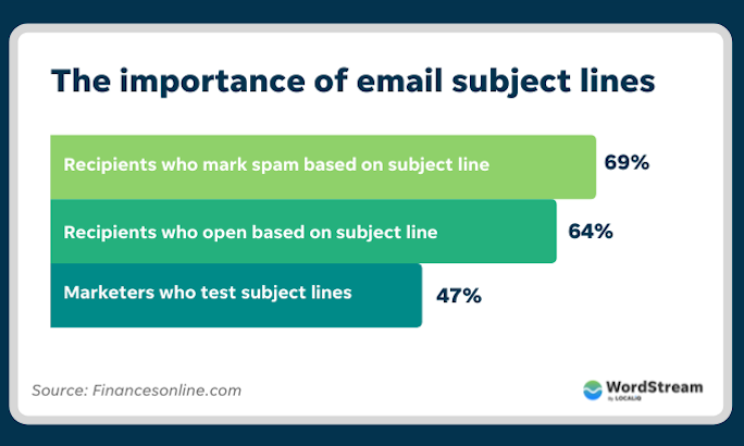
Use different subject lines and send them to small test groups. See which subject line drives more people to open the email.
Metrics to monitor: For this test, measure
- The open rate
- Click-through rate
- Unsubscribe rate
Experiment #32: Test different calls to action
Change up the CTA at the end of each email and track which one is more effective. One version of the email may say “Buy Now,” while the other says “Check Out Our Sale.”
Metrics to monitor: Track the click-through rates to see which CTA is most effective.
Experiment #33: Change up the images
Send out one email with a static product image and another with a lifestyle image. Make sure to use the same target audience for each test.
Metrics to monitor: Open and click-through rates are a good way to determine which photo is more successful.
Experiment #34: Switch email senders
Retailers can see if their generic department-level email address is ending up in recipients’ spam folders by sending out a second version of the same email from a new sender.
Metrics to monitor: To see which email is more successful, check
- Bounce rates
- Open rates
Experiment #35: Test different landing pages

Create two versions of a specific landing page related to the email blast. See which is more engaging.
Metrics to monitor: Track
- Click-through rates
- Time spent on page
- Conversions
Experiment #36: Cut emails short
Send out one version of a marketing email that is slightly longer and one that is short and more to the point. This is a good way for an eCommerce marketer to see their customers’ ideal email length.
Metrics to monitor: Calculate
- Click-through rate
- Open rate
- Unsubscribe rates
Experiment #37: Reorder keywords
Retailers can get people to open their email campaigns by offering a discount in the subject line. They can test it in different locations to see which is more effective. For example:
- “Take advantage of this discount code for 15% off.”
- “Get 15% off with this discount code.”
Metrics to monitor: Determine which email is more successful by measuring
- Open rates
- Click-through rates
- Conversions
Experiment #38: Test personalization elements
Add a subscriber’s name to the subject line and body copy of the email for a more personalized approach.
Metrics to monitor: For this test, measure
- Open rates
- Click-through rates
Experiment #39: Play with the timing
Instead of changing the email’s content, send the same version to test audiences at different times. This test also works on different days.
Metrics to monitor: Determine which day of the week and time of the day are preferred by measuring the open rates.
Experiment #40: Switch up the layout
Try moving the images and body copy to see which versions are more engaging. Send out one email with an image before the copy and one after.
Metrics to monitor: For this test, measure the
- Open rates
- Click-through rates
Personalization optimization: 5 experiments
Determine which personalization elements are most successful with these experiments.
Experiment #41: Test on-site retargeting
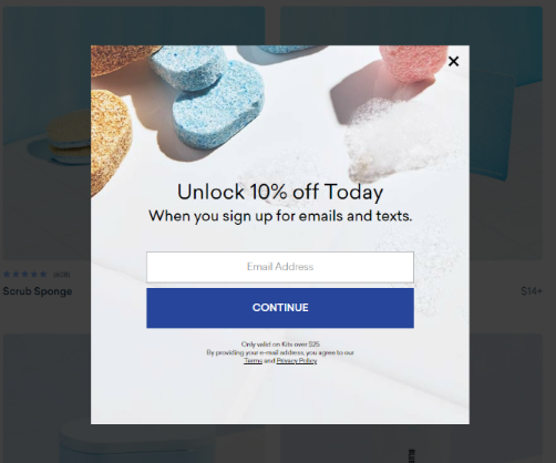
eCommerce marketers can create a separate version of their website in which personalized ads display based on a customer’s actions on the site.
Metrics to monitor: Test the effectiveness by measuring
- Time spent on site
- Conversion rates
Experiment #42: Create dynamic content for different demographics
Play with copy highlighting various product features and benefits based on demographics and other segment-specific characteristics.
Metrics to monitor: See if dynamic content works by measuring
- Click-through rates
- Bounce rates
- Sales
Experiment #43: Test email marketing with personalized recommendations
Go above and beyond a typical engagement email by adding personalized recommendations.
Metrics to monitor: See if these emails are successful by tracking
- Click-through rate
- Open rate
- Conversion rates
Experiment #44: Test out different audience segments
eCommerce marketers can find different ways to group their customers to see how they respond to personalized messages. They can switch up small groups until they find the right segments.
Metrics to monitor: See which segments are most effective by tracking
- Click-through rates
- Average time spent on page
- Conversion rates.
Experiment #45: Create personalized ads
Don’t limit personalization to the website. eCommerce marketers can use personalized recommendations in social media and pay-per-click ads too. They should test these elements on small audience segments.
Metrics to monitor: Personalization should
- Improve click-through rates
- Reduce bounce rates.
Crafting an A/B testing strategy
Retailers can follow these steps to craft their A/B testing strategy:
- Define a goal: What do you want to achieve with A/B testing?
- Research your target audience: This will help you decide which variables to test.
- Create two variants.
- Create a control version of your site and emails.
- Leave each version of your site up long enough to collect adequate data.
- Measure the outcomes and note your results.
- Refine your website and marketing campaigns based on the results.
How ContactPigeon’s CDP can assist retailers with A/B Testing
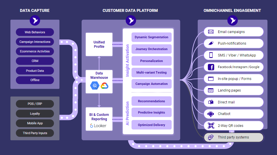
By centralizing customer data from various touchpoints such as online purchases, in-store interactions, and social media engagements, ContactPigeon’s CDP provides retailers with a comprehensive view of their customers’ behaviors and preferences. This rich data repository enables retailers to segment their audience more effectively, allowing for more targeted A/B testing experiments.
Moreover, CDPs facilitate ongoing optimization by continuously collecting and analyzing data, ensuring that A/B tests are based on the most up-to-date customer insights. Ultimately, integrating a CDP into their A/B testing strategy enables retailers to refine their offerings and deliver more personalized experiences that resonate with their target audience.
Email marketing
- ContactPigeon lets retailers test various subject-line styles to find out which ones are most successful.
- The site also allows retailers to experiment with CTA buttons, text, colors, and layouts to see what drives clicks.
- Retailers can compare email layouts and content blocks.
- Retailers can also test the optimal send times and days for maximum engagement.
On-site retargeting
- Retailers can use ContactPigeon to test variations in the timing of their personalized pop-up messages, such as immediately, after some page engagement, or after a user signals that they may exit the site.
- Retailers can compare different variations of their copy and offers as well.
SMS marketing
- With ContactPigeon, retail marketers can vary their promotional offers using discount language or urgency-based language.
- Retailers can also test different dates and times to get the best SMS response rates.
Conclusion: Maximizing ROI through A/B testing
Knowing what A/B testing is used for in marketing helps retailers deliver the best user experience for their customers. By isolating variables and testing them with smaller groups, retailers can get a feel for what converts and what doesn’t. A/B testing for retailers will aid businesses to stand out among the competition and attract new customers. With these experiments, they can create a tailored experience for each customer and boost their sales in the process. If you want to try A/B testing on your marketing campaigns, schedule a demo with ContactPigeon to see how we can help you.

Let’s Help You Scale Up


