Keeping up with top performers in eCommerce is essential for refining your strategies and maintaining a competitive edge. By monitoring the carefully-designed eCommerce websites of industry leaders you can gain valuable insights into the latest innovations, and best practices to identify potential areas for improvement. Studies show that effective PLP optimization can boost conversion rates and ROI by up to 223% (Mailmodo). This highlights the importance of continuously refining the structure of your website based on the latest market trends. In this article, we take a deep dive into actionable techniques from the best category page examples, giving you a unique advantage in the eCommerce landscape.
Best category page example #1: ASOS

Read below to discover the best category page examples that drive engagement and conversions in the eCommerce world.
- Filtering and sorting options: Effective filtering systems improve user experience by helping customers find products that meet their criteria quickly, leading to higher conversion rates.
- High-quality visuals and consistent image size: High-quality visual content is critical in online retail as it compensates for the inability to view the product in person.
- Clear product information: Clear and detailed product information helps customers make informed purchase decisions, reducing the likelihood of returns.
- Clear and accessible CTAs: Prominent ‘Add to Bag’ buttons and wishlist options make it easy for customers to take action, reducing friction in the shopping process and improving conversion rates
- Mobile optimization: A responsive design improves accessibility and usability for mobile users, reducing bounce rates and increasing conversions.
- Fast load times: Fast load times enhance the overall user experience and reduce the likelihood of cart abandonment.
Best category page example #2: IKEA

See below what IKEA did:
- Ensuring visual consistency and employing high-quality imagery: Ensuring visual consistency and high-quality imagery helps maintain a uniform look and feel, enhancing visual appeal and aiding product comparison.
- Faceted navigation and filtering: Intuitive filtering options (e.g., price, color, size, brand) help customers narrow down choices quickly.
- Customer reviews and ratings: Displaying product ratings and reviews builds trust and provides social proof.
- Quick view or hover features: This functionality can reduce bounce rates and improve user engagement by minimizing the clicks required to find the desired information.
- Pagination and infinite scroll: Use pagination or infinite scroll to manage how products are loaded and displayed, balancing performance with user experience.
Best category page example #3: H&M

Find out how H&M managed to create a user-friendly page:
- Clear and intuitive navigation: A well-structured navigation bar that categorizes products by type, gender, and collection, reduces friction in the shopping journey.
- High-quality product images and quick view option: High-quality images enhance the perception of product quality and increase engagement. The quick view feature streamlines the browsing process, which can lead to higher conversion rates.
- Comprehensive filter and sort options: Efficient filtering and sorting tools help users refine their search, making the shopping experience more personalized and efficient.
- Customer reviews and ratings: Reviews and ratings build trust and help customers make informed decisions.
- Personalized recommendations: The site offers product recommendations based on browsing history and previous purchases. Personalization can significantly enhance user engagement and satisfaction.
- Clear call-to-actions (CTAs) and pricing information: Effective CTAs guide users toward completing a purchase, while transparent pricing eliminates confusion.

Best category page example #4: American Eagle
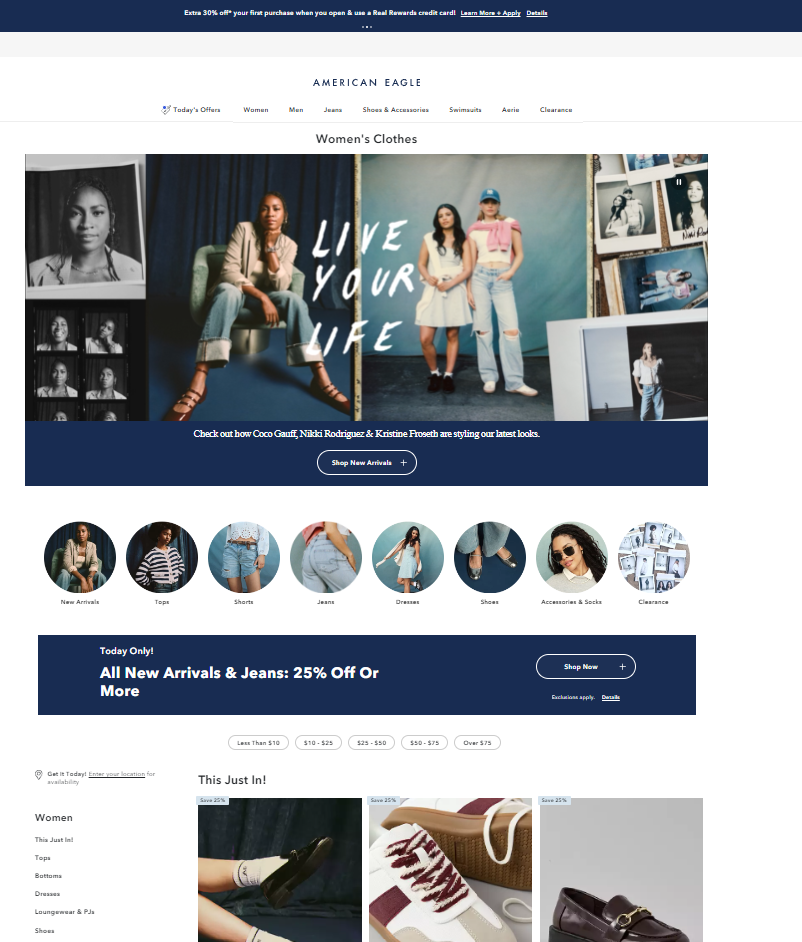
Mastering eCommerce design is essential for creating online stores that captivate customers and boost sales. Read below to understand how American Eagle managed that:
- Using high-quality images and ensuring visual consistency: High-quality images boost conversion rates significantly because customers can better visualize the product.
- Faceted search and filtering options: Faceted search improves the user experience by allowing customers to quickly narrow their product listings to those that meet their specific criteria.
- Responsive design and mobile optimization: Mobile-friendly sites are ranked higher in search results, enhancing visibility and accessibility.
- Clear pricing and discount information: Clear discount information increases conversion rates by creating a sense of urgency and value.
- Quick view functionality: This feature reduces the friction in the shopping process, which can increase conversion rates.
- SEO-friendly URL structure and meta descriptions: An SEO-friendly URL structure and meta descriptions improve search engine rankings, making it easier for potential customers to find products via organic search.
Best category page example #5: Marks & Spencer

The famous retailer Marks & Spenser included the following elements in its PLPs:
- User-friendly navigation: Clear navigation improves user experience by helping customers easily find the products they seek.
- Premium product imagery: Each product listing includes multiple high-resolution images. Users need detailed product images to make informed purchasing decisions.
- Tailored product suggestions: Personalized product recommendations can increase average order value and enhance user engagement.
- Responsive design: Mobile commerce ensures a seamless shopping experience across all screen sizes. It accounts for a significant portion of e-commerce sales.
- Strategic call-to-action buttons: Clear and strategically placed CTAs guide users toward making a purchase.
- Detailed product descriptions: Detailed product descriptions help customers make informed decisions and reduce return rates.
Best category page example #6: Nike

Take a look at Nike’s effective category page:
- Effective product presentation and navigation: This enhances user experience by reducing cognitive load and improving decision-making speed.
- Comprehensive filtering and sorting features: These features help customers quickly find relevant products, reducing bounce rates and increasing conversion rates.
- Optimized mobile experience: Mobile optimization is crucial as mobile commerce continues to grow.
- Strategic placement of calls to action (CTAs): Effective CTAs can significantly influence conversion rates by guiding users toward desired actions.
- Integration of social proof and customer reviews: Product ratings and reviews are displayed prominently, providing social proof that enhances trust and helps decision-making.
- Performance optimization: It is crucial for reducing bounce rates and improving SEO. It is important for user satisfaction and search engine rankings.
- Personalization and recommendations: It enhances user engagement and cross-selling opportunities. Personalized recommendations can increase average order value.
Best category page example #7: GAP

User experience is the key to turning casual visitors into loyal customers for any online business. Below are a few ways that you can adapt to elevate user experience.
- Streamlined and user-friendly layout: A clean design improves usability and can lead to higher conversion rates.
- Premium product imagery: It is essential for online shopping where customers cannot physically touch or try the products and is crucial for eCommerce success.
- Prominent and effective call-to-action buttons: The CTAs are designed to stand out without overwhelming the user and impact conversion rates.
- Faceted navigation and filters: Faceted navigation helps customers quickly find the products they are interested in, improving their shopping experience.
- Responsive design: Responsive design provides a seamless experience across all devices, including desktops, tablets, and smartphones. This adaptability is essential in today’s multi-device shopping environment.
- Customer reviews and ratings integration: Each product listing includes customer ratings, which provide social proof and help potential buyers make informed decisions.
- Breadcrumb navigation: Breadcrumb navigation at the top of the PLP allows users to easily trace their steps back, to previous categories or the homepage.
Best category page example #8: Zalando

Let’s see what Zalando did:
- Consistent and high-resolution product images: It is important to have visual appeal to increase user engagement and conversions.
- Dynamic filtering and sorting options: Effective filtering can enhance user satisfaction and increase conversion rates.
- Responsive design: Mobile-friendly websites are crucial for retaining customers and reducing bounce rates.
- Tailored product suggestions: Personalized recommendations based on browsing history and preferences, can increase average order value and customer retention.
- Quick view feature: The quick view option allows users to preview product details without leaving the PLP, enhancing the shopping experience by saving time and reducing the need for excessive navigation.
- Clear pricing and discount information: Prices and discounts are displayed with visual cues such as strikethrough pricing and percentage-off badges. This transparency in pricing can drive urgency.
Best category page example #9: Target

Take a page out of Target’s playbook:
- Dynamic and relevant filters: The PLP features a comprehensive filtering system, allowing users to narrow products by categories, brands, prices, ratings, etc.
- High-quality product images: Product images significantly impact the purchase decision. High-quality visuals help in conveying the product details better.
- User reviews and ratings: User-generated content like reviews builds trust and assists customers in making informed decisions, thus enhancing overall site credibility.
- Clear pricing and discounts: Clarity in pricing is crucial as it reduces the cognitive load on customers, making the purchase decision easier.
- Fast loading times: Fast-loading pages improve the user experience and reduce bounce rates, directly impacting sales and customer retention.
- Personalized recommendations: Personalized recommendations enhance user engagement by presenting relevant products, increasing the likelihood of purchase.
Best category page example #10: Amazon

Follow how Amazon has one of the best category pages:
- Personalized recommendations: Personalization increases engagement and conversion rates by providing users with relevant product suggestions.
- Robust search functionality: Enhanced search functionality reduces the time and effort required to find products, which improves user satisfaction and increases the likelihood of purchase.
- Comprehensive filtering and sorting options: Comprehensive filtering and sorting enhance the shopping experience by allowing users to refine their search, leading to quicker decision-making.
- Detailed product information: Providing detailed product information helps users make informed purchasing decisions, reducing the likelihood of returns and increasing customer satisfaction.
- Dynamic pricing and discounts: Dynamic pricing ensures competitive pricing, which can drive higher sales volumes.
Best category page example #11: Gucci

Here’s some tips from Gucci:
- High-quality visuals and consistent imagery: High-quality visuals enhance the perceived value of products and improve conversion rates.
- Efficient filtering and sorting options: Effective filtering and sorting help users quickly find the products they are interested in, enhancing the user experience and increasing the likelihood of purchase.
- Clear and informative product titles and descriptions: Clear titles and descriptions improve SEO and help users make informed decisions, reducing bounce rates and cart abandonment.
- Prominent call-to-action (CTA) buttons: Prominent CTAs streamline purchasing and encourage immediate action, boosting conversion rates.
- Responsive design and mobile optimization: With the increasing number of mobile shoppers, a responsive design ensures a smooth and engaging user experience.
Best category page example #12: Chanel

Dive into the strategies that Chanel uses:
- Clean and intuitive navigation: A well-organized navigation system reduces friction in the customer journey, enhancing user experience and increasing the likelihood of conversion.
- High-quality visuals and product imagery: High-quality visuals in eCommerce can significantly impact perceived product quality and trustworthiness.
- Consistent and informative product listings: Consistency in product listings enhances the shopping experience by making it easier for customers to compare products and make informed decisions.
- Mobile optimization: Mobile optimization has become crucial with a significant portion of eCommerce traffic, coming from mobile devices.
- Effective use of white space: White space improves readability and navigation, allowing users to process information and focus on key elements.
Best category page example #13: Jimmy Choo

Read what Jimmy Choo has done:
- High-quality visual content: High-quality images enhance user experience and increase conversion rates.
- Clear and comprehensive filtering options: Effective filtering options reduce customers’ time searching for products, improving the overall shopping experience.
- Consistent and intuitive layout: A consistent and intuitive layout enhances user experience, Streamlining the process for customers to locate what they need. Thus improving conversion rates.
- Quick view feature: Quick view functionality can significantly improve user experience by reducing the number of clicks and page loads needed to view product details.
- Prominent call-to-actions (CTAs): Effective CTAs guide users toward the next steps in their shopping journey, which can increase the likelihood of conversions.
- Responsive design: With mobile commerce accounting for a significant portion of e-commerce sales, having a responsive design is crucial.
Best category page example #14: Apple

Find out below the best practices that APPLE implements to its category pages:
- Intuitive navigation and clear product categorization: Clear categorization and navigation reduce bounce rates and increase the likelihood of conversion.
- High-quality visuals and consistent product presentation: High-quality visuals help build trust and provide a clear understanding of the product, which is crucial for high-value items like electronics.
- Comprehensive product information and specifications: Detailed product information is essential as it reduces the uncertainty and perceived risk of online shopping, which is critical for high-involvement purchases.
- Prominent call-to-action (CTA) and purchase options: Effective CTAs and multiple purchasing options cater to customers depending on their preferences and can significantly increase conversion rates.
- Personalization and product recommendations: Personalization in eCommerce is shown to boost engagement and sales.
Best category page example #15: Microsoft

Here’s how Microsoft has structured its category pages:
- Clear and prominent call-to-action (CTA) buttons: CTA buttons stand out due to their contrasting color and strategic placement, efficiently guiding users through the purchasing funnel.
- Effective use of filters and sorting options: Personalization enhances user experience by enabling customers to find products that meet their specific needs quickly, which is crucial for increasing conversion rates.
- High-quality visuals and product images: High-quality visuals are vital as they help the user understand the product and increase user engagement.
- Detailed product descriptions and specifications: Providing ample product information can significantly reduce bounce rates and improve customer trust and satisfaction.
- User reviews and ratings: Products with reviews have a 270% higher chance of being purchased than products without reviews.
Best category page example #16: Lowe

Effective retail marketing strategies can amplify your brand’s reach and drive higher foot traffic and sales, read below to understand how through Lowe’s strategy.
- Clear and intuitive navigation: Effective navigation is crucial for user experience, allowing customers to find products quickly.
- Prominent search functionality: A prominent and efficient search bar can improve the user experience and lead to higher conversion rates.
- High-quality visuals and product thumbnails: Visuals play a critical role in online shopping. High-quality images help customers make informed decisions and reduce return rates.
- Customer reviews and ratings: Reviews and ratings build trust and provide social proof. Moreover, products with reviews are seen as more credible and reliable.
- Effective use of filters and sorting options: Filters and sorting options help users narrow choices and find products that meet their needs. This functionality is vital for large catalogs.
- Clear pricing and availability information: Transparency in pricing and availability is essential for customer trust. Clear pricing and stock information can reduce cart abandonment rates.
Best category page example #17: GameStop
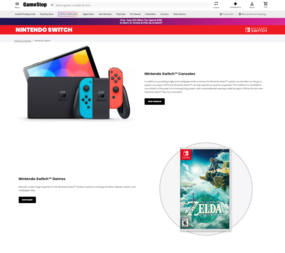
The American video game, consumer electronics, and gaming merchandise retailer, GameStop has nailed PLP optimization:
- Clear and consistent navigation: This helps users easily locate different product types.
- Faceted search and filters: Faceted navigation improves the user experience by enabling them to find products that meet their specific criteria without going through all the listings.
- High-quality product thumbnails and consistent layout: Justification: Visual consistency and high-quality images enhance user engagement and can increase the likelihood of conversions.
- User reviews and ratings: Including reviews and ratings builds trust and helps users make informed purchasing decisions.
- Responsive design: A responsive design ensures that the site is accessible and user-friendly on all devices, which is essential for maintaining a competitive edge.
- Prominent search bar: A well-placed search bar improves usability and helps users find what they are looking for more efficiently.
Best category page example #18: Holland&Barrett

Here are some examples of the British-based multinational chain of health food shops, Holland & Barrett:
- Clear product images and consistent branding: Consistent branding also reinforces brand identity and reliability.
- User-friendly navigation and filters: Users expect sites to allow them to filter products within categories, and efficient filtering improves user satisfaction and conversion rates.
- Product availability, stock indicators, prices, and discounts: Availability indicators create a sense of urgency and help manage customer expectations, discounts also increase perceived value and urgency.
- Effective use of CTAs (Call-To-Action): Well-designed CTAs can increase conversion rates. CTAs enhance user engagement and reduce friction in the shopping process.
- Mobile optimization: Ensuring a mobile-optimized shopping experience is critical for capturing and retaining mobile shoppers.
Key learnings from the best category page examples of 2024
- Filter and sort option usage heatmap: Visualize which filtering and sorting options (e.g., size, color, price, brand) are most frequently used across different PLPs to understand customer preferences and behaviors.
- Load time vs. conversion rate scatter plot: Analyze the relationship between page load times and conversion rates to highlight the importance of performance optimization.
- Mobile vs. desktop user behavior comparison: Create a table comparing key metrics (bounce rates, conversion rates, average session duration) for mobile vs. desktop users to identify opportunities for mobile optimization.
- Customer review impact analysis: By using a Bar chart showing average conversion rates for products with and without user reviews and ratings to demonstrate the impact of social proof.
- Quick view feature usage vs. conversion rates: Use line graph illustrating the correlation between quick view features and conversion rates across different PLPs.
Discover additional insightful resources for PLP optimization
- 784 ‘Intermediary Category Page’ Design Examples
- 54 eCommerce Homepage Best Practices That WORK [2024]
- Category Page Best Practices for eCommerce [2022]
- eCommerce Marketing Strategy: A Step by Step Guide for 2024
How to optimize a PLP using a CDP

Capitalizing a Customer Data Platform (CDP) to create unique customer profiles and optimize the Product Listing Page (PLP) can significantly enhance user experience, drive conversions, and improve overall customer satisfaction. Here are five specific strategies for retail executives to consider:
- Personalized product recommendations: Using the data gathered by the CDP, retailers can implement personalized product recommendations on the PLP. By analyzing customer behavior, purchase history, and preferences, the CDP can dynamically display products that are relevant to each user. If a customer frequently purchases sportswear, the PLP can prioritize showing the latest sports apparel and accessories. This increases the likelihood of engagement and conversion by catering to the customer’s specific interests.
- Dynamic sorting and filtering options: A CDP can help tailor sorting and filtering options based on the customer’s past interactions and preferences. This allows for a more intuitive and efficient browsing experience. For a customer who often filters products by price range or brand, these filters can be pre-selected or highlighted, making it easier for the user to find what they’re looking for.
- Behavioral triggers for real-time customization: By leveraging real-time data, retailers can adjust the PLP based on the customer’s current session behavior. This includes recognizing new vs. returning customers and modifying the content accordingly. If a new visitor shows interest in a particular category but doesn’t make a purchase, the next time they visit, the PLP can prominently feature popular items, specifically in that category, alongside any ongoing promotions or discounts.
- Geo-targeted content and promotions: CDPs can utilize geographic data to customize the PLP with location-specific content and offers. This can be particularly effective for seasonal products or region-specific trends. A retailer can highlight winter clothing for customers browsing from colder regions while showcasing summer attire for those in warmer climates. Additionally, local promotions or in-store events can be prominently displayed.
- Enhanced product insights and reviews: Incorporating insights from customer data can enhance product descriptions and reviews, making them more relevant and convincing for potential buyers. Displaying reviews and ratings from customers who match the browsing profile (e.g., similar demographics or purchase history) can increase the perceived relevance and trustworthiness of the feedback. Highlighting frequently purchased together items or popular picks among similar users can also guide purchase decisions
Create your very best category page
Optimizing PLPs with comprehensive filtering, high-quality visuals, clear CTAs, and personalized recommendations can significantly enhance user experience and drive conversions. Utilizing a CDP for real-time customization, geo-targeted content, and enhanced product insights further tailors the shopping experience, ultimately improving customer satisfaction and sales.
To create top-performing category pages, it is essential to focus on continuous optimization using data-driven strategies and experimentation. This ensures that every element of the Product Listing Page (PLP) contributes to a seamless and engaging shopping experience.

Let’s Help You Scale Up

