The Category page groups individual product pages together based on a similar theme. Having well-structured category pages is important for every eCommerce brand as it improves rankings for specific keywords and makes product exploration easier for consumers. This generates higher sales and better conversions as a result.
In this article, you’ll find a great list of Category Page best practices from category page designs to layout structures. Let’s skyrocket your eCommerce sales this year.
Table of Content
What is a category page in eCommerce?
A category page (or product listing page) is one of the most important assets of any eCommerce store. It’s the page where products are shown and it plays a significant role in conversions since it’s one of the strongest pages UX-wise, SEO-wise and thus, Sales-wise. The structure and the names of an e-shop’s categories are subject to numerous factors and are of crucial importance that’s why category page optimization is a must today for any eCommerce business
Why is Category Page optimization crucial for any eCommerce business?
Besides the website’s homepage, the category and subcategory pages on eCommerce sites can account for the majority of search traffic. We know that 39% of all web traffic comes from search traffic, compared to 35% from organic and 4% from paid ads. So, optimized category pages are and should be the most important asset of your eCommerce site.
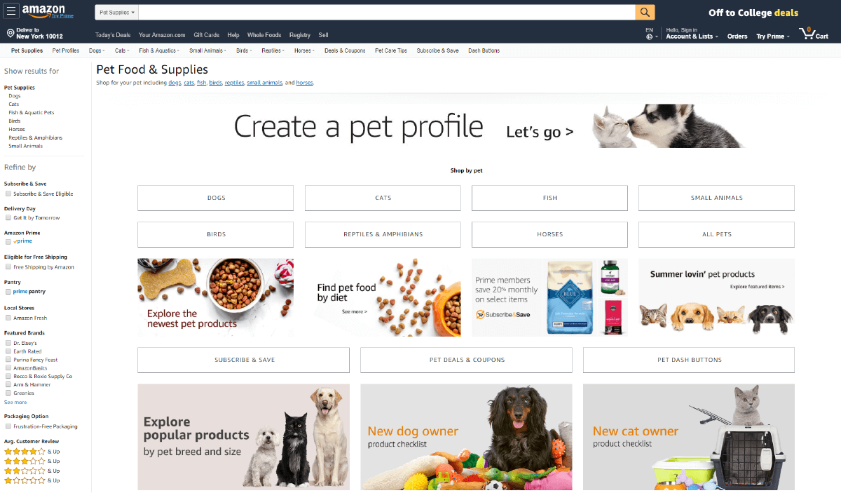
Amazon uses multiple levels of category and sub-category pages to help customers navigate thousands of products.
22 Category Page Best Practices for eCommerce
Creating optimized category and subcategory pages for eCommerce is vital in order to match users’ searches. This not only makes the customer’s shopping journey smoother, but it also helps the search engines better crawl and understands your eCommerce site’s structure.
CRO Best Practices for Category Pages
Conversion Rate Optimization (CRO) refers to marketing optimization, website optimization, landing page optimization (LPO), growth hacking, optimization and testing, customer experience (CX), usability (UX) or marketing experimentation.
When implemented correctly, CRO increases the percentage of visitors to your website and converts them into buyers. CRO can also help lead customers to take a specific desired action on a webpage. Here are some CRO best practices for your category pages:
- Customer Reviews: This is super important both sales-wise and SEO-wise. Make sure you collect customer reviews and try to showcase them to your category pages. Actually, showcase them on every page of your store! Thank us later for this one. ?
- Use Browse Abandonment automation: You probably already have Abandoned cart automation to your eCommerce store. However, browse abandonment is also a big problem and not many eCommerce managers do something about it. Browse abandonment accounts for 97% of the lost visits within a customer life-cycle. Use a cutting edge eCommerce marketing automation platform like ContactPigeon to bring back visitors to your online store after they’ve left your website and convert them.
- Nail your search engine: Make sure your Search functionality has the autocomplete functionality and that it delivers relevant results.
- Speak your customer’s language: Use simple words for product descriptions. Remove any terminology that your supplier gives and rewrite them in an easily understandable way. Test your description against the Fletcher reading scale, and make sure that it can be read by a 9th grader.
- Try featuring 1 product per parent category: Don’t be fooled. More features do not equal more revenue. A simple sorting feature creates a better user journey.
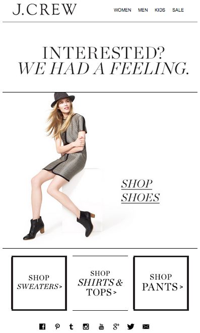
J.Crew browse abandonment email example
UX Best Practices for Category Pages
Just like it applies for your homepage, the more seamless the UX, or user experience, the better. UX best practices impact how your user interactions with your business via your website, mobile site, and apps.
Below we’ve listed the top UX best practices to help you better understand your users’ needs and values.
- Try to use 7 parent categories max: Less is more. Don’t overwhelm shoppers. Be specific and clear with parent categories, using common terminology.
- Category images: For all parent categories, use large, high quality and contextually relevant imagery.
- Optimize your filters: Create or keep the most relevant, remove the rest. Make sure that 100% of your site it’s fully browsable only via faceted navigation
- Design best practices: Concentrate on user experience with website designs that are clear and simple. Know your audience and create a visual hierarchy, highlighting the most important elements by making them larger and placing them on the interface.
- Category landing page design: Brief and to the point is best for landing page design. Be sure to keep paragraphs under 3-4 lines, with descriptive subheads after every 2 paragraphs. This is because most people, 79%, only scan content, while a mere 16% actually read every word.
- ECommerce product listing page design: These pages are the result of either category pages or internal search results. It’s important to create informative and clear headers for users with short descriptions.
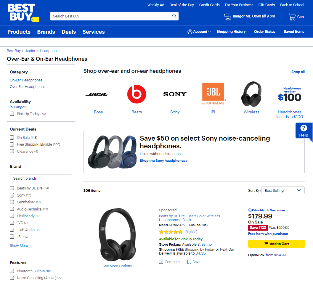
Best Buy’s category page offers many filters to help visitors find the product they are looking for. This includes store availability, brands, prices, features, and others.
SEO Best Practices for Category Pages
Implementing SEO best practices when optimizing category pages is a simple way for you to drive conversions. Creating a hassle-free user experience has several components.
- Loading Speed: Speed is a super important ranking factor according to Google. Therefore it is important to optimize the page loading speed of your category page. A decent loading time is around 5 seconds.
- Site’s Hierarchy/Taxonomy: Follow the 3-clicks away rule here. This means your users should be able to find any information on your website with no more than three clicks. One way to optimize your website for the 3-clicks rule is by building an effective eCommerce product category hierarchy. Start with a set of broad main product categories. Add one or two levels of subcategories below. The lower the category, the more specific it is.
- Category Description: Write detailed long and optimized category descriptions using related keywords. Any known SEO tool can help you but you can also achieve great (and free!) results with google’s autocomplete functionality and tools like Ubersuggest.
- Internal linking: Try linking to a subcategory from the category description of a parent category. This may prove quite useful seasonal campaigns as you could boost them for a while.
- Optimize keywords: Pick the right keywords for the category. Also, given the competition of some keywords, try finding long-tail alternatives that maximize the chance of being found by search engines.
Mobile Best Practices for Category Pages
Mobile UX optimization is a must when it comes to category page best practices in 2020. From legible text to reduced clutter, optimizing your website using mobile best practices will help you create an awesome UX, thus, boost your conversions. Here are some examples of mobile best practices you can’t overlook:
- Breadcrumbs: The breadcrumbs should be clearly visible.
- Brand Visibility: Make sure your company’s logo is visible.
- Watch your loading speed: Optimize your site loading speed on a mobile connection.
- Mobile optimized design: Make sure the category page loads properly. The layout should be adjusted so each page component fits mobile screens for easy viewing and navigation.
- Try infinite scrolling: Consider using a screen capturing tool like Hotjar to measure the impact vs the paginated version of your category page.
- Don’t repeat: Never use the same target keyword twice.

6 Really Beautiful Category Pages We Admire
Here are 6 examples of beautiful category pages that nailed it.
Category Page example #1: Target
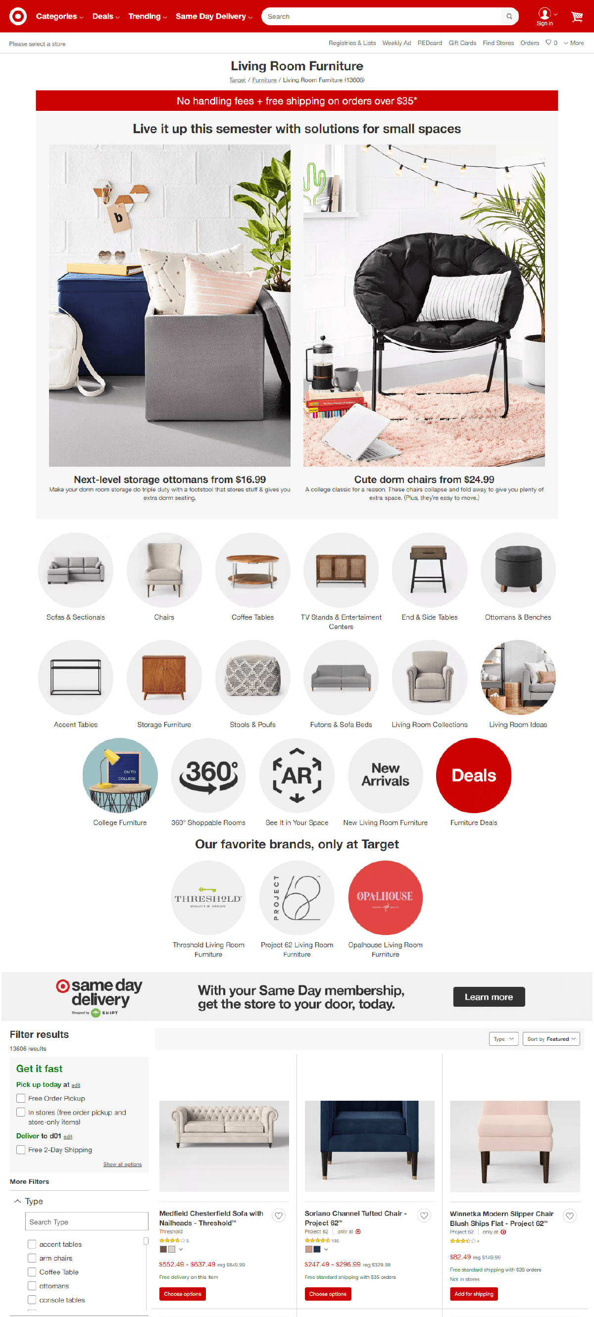
Why we liked it: Target.com uses a clean and clear design that promotes subcategories while exposing the product list.
Target’s category page has all of the components for UX/Mobile/SEO optimization. At the top of the page, you can see a traditional category page display such as Furniture, Toys or Electronics. It is easy to navigate links to subcategories.
At the bottom of the page, Target highlights individual product listings, encouraging fewer clicks by having products visually displayed. It also provides plenty of category filters to allow visitors to narrow down the products quickly
Category Page example #2: IKEA
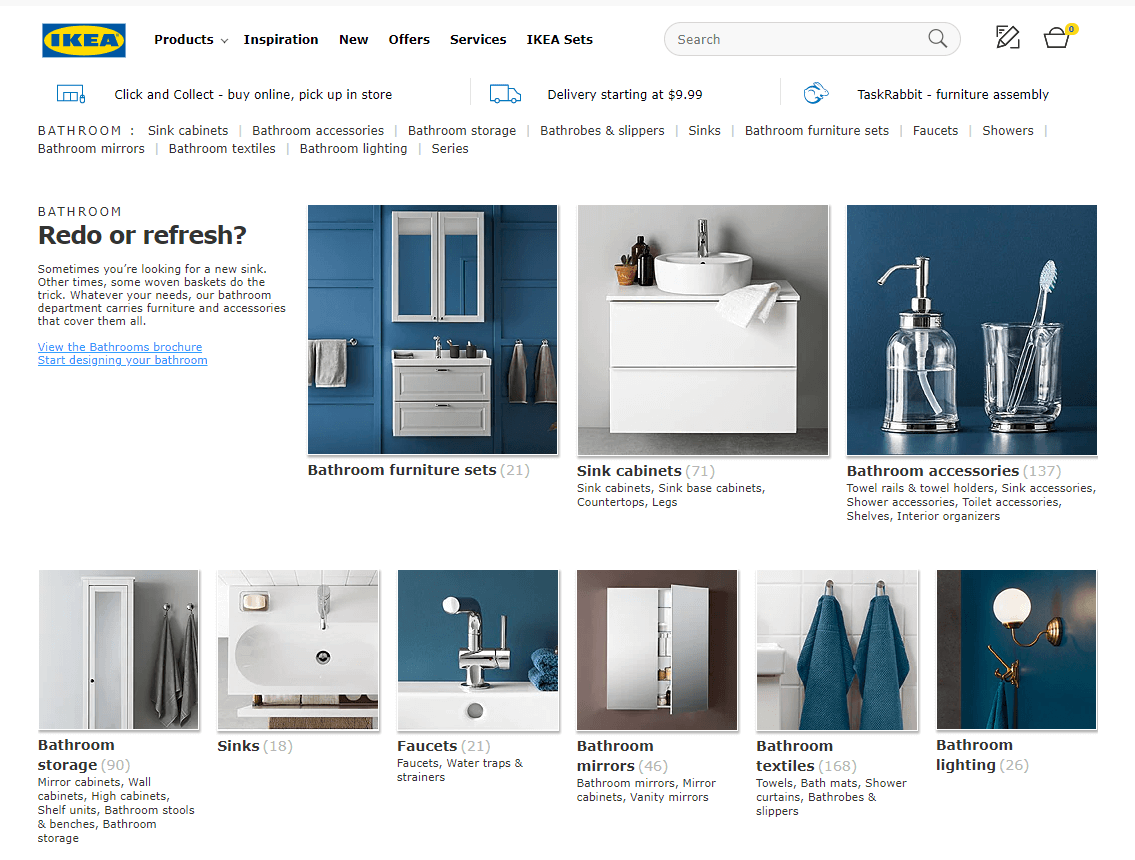
Why we liked it: IKEA makes shopping easy by using subcategories to specify the users’ search before showing products on their intermediary category pages.
Tip: Intermediary category pages are used whenever further navigation or scope definition is needed before it makes sense to display a list of products to the user.
Ikea is a leader in UX category page design with subcategories to choose from to help the user select a more well-defined scope before displaying any products. Their site is beyond UX, SEO and Mobile optimized. This means a seamless shopper journey across all devices, thus, a high sales conversion rate.
Category Page example #3: H&M
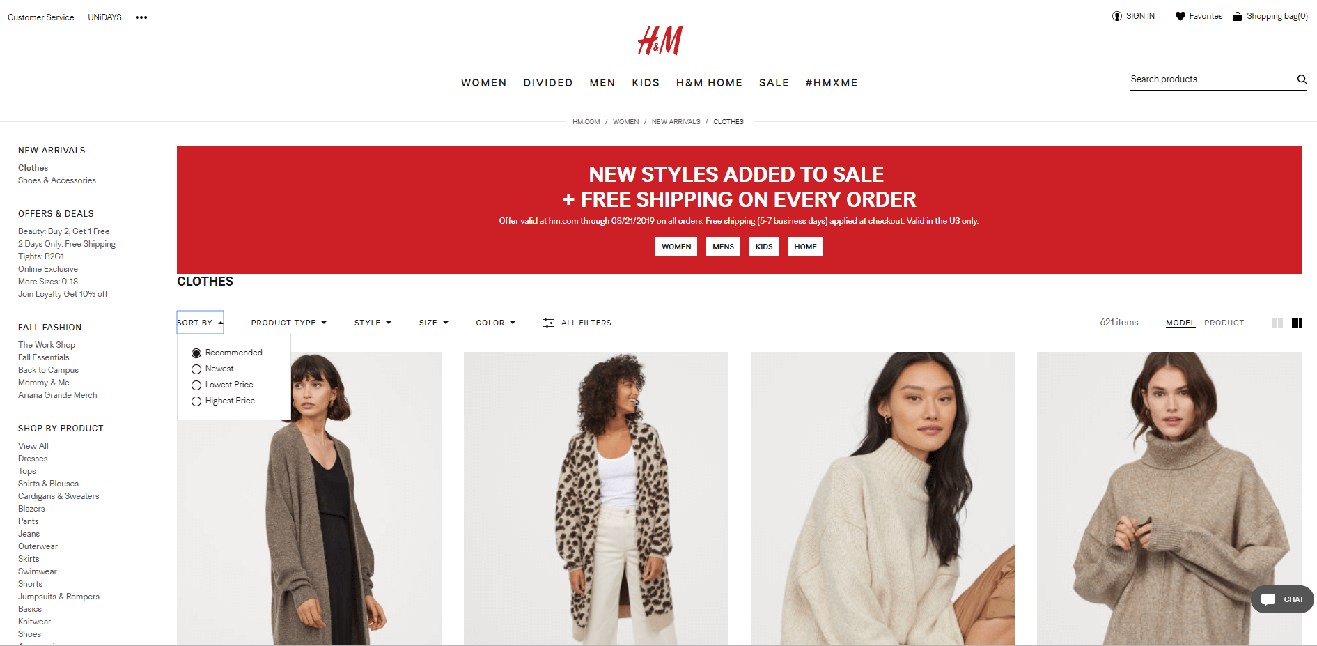
Why we liked it: H&M effectively draws shoppers to their products by highlighting a “What’s New” category filter.
A category filter such as “What’s New” creates an awesome UX. That’s because it shows users the new products that have been added to your online store since their last visit to your site. The filter allows users to shop with a minimal number of clicks since they don’t need to visit multiple pages for new items.
Category Page example #4: Macy’s
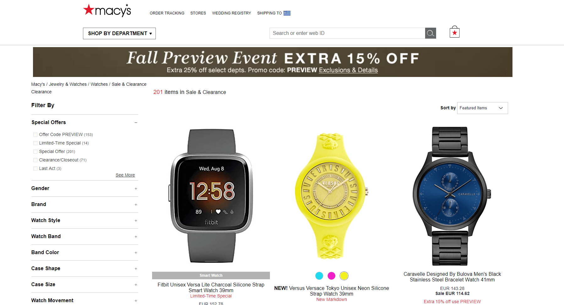
Why we liked it: Macy’s website uses intermediary category pages and thumbnails for the featured sub-categories to help narrow down users’ searches.
Before shoppers get lost in Macy’s expansive online shop, the company helps users narrow down their selection to a more well-defined scope, using thumbnails for the featured sub-categories to highlight the differences between the sub-category options. Simplified shopping is key to an unforgettable UX.
Category Page example #5: RevZilla
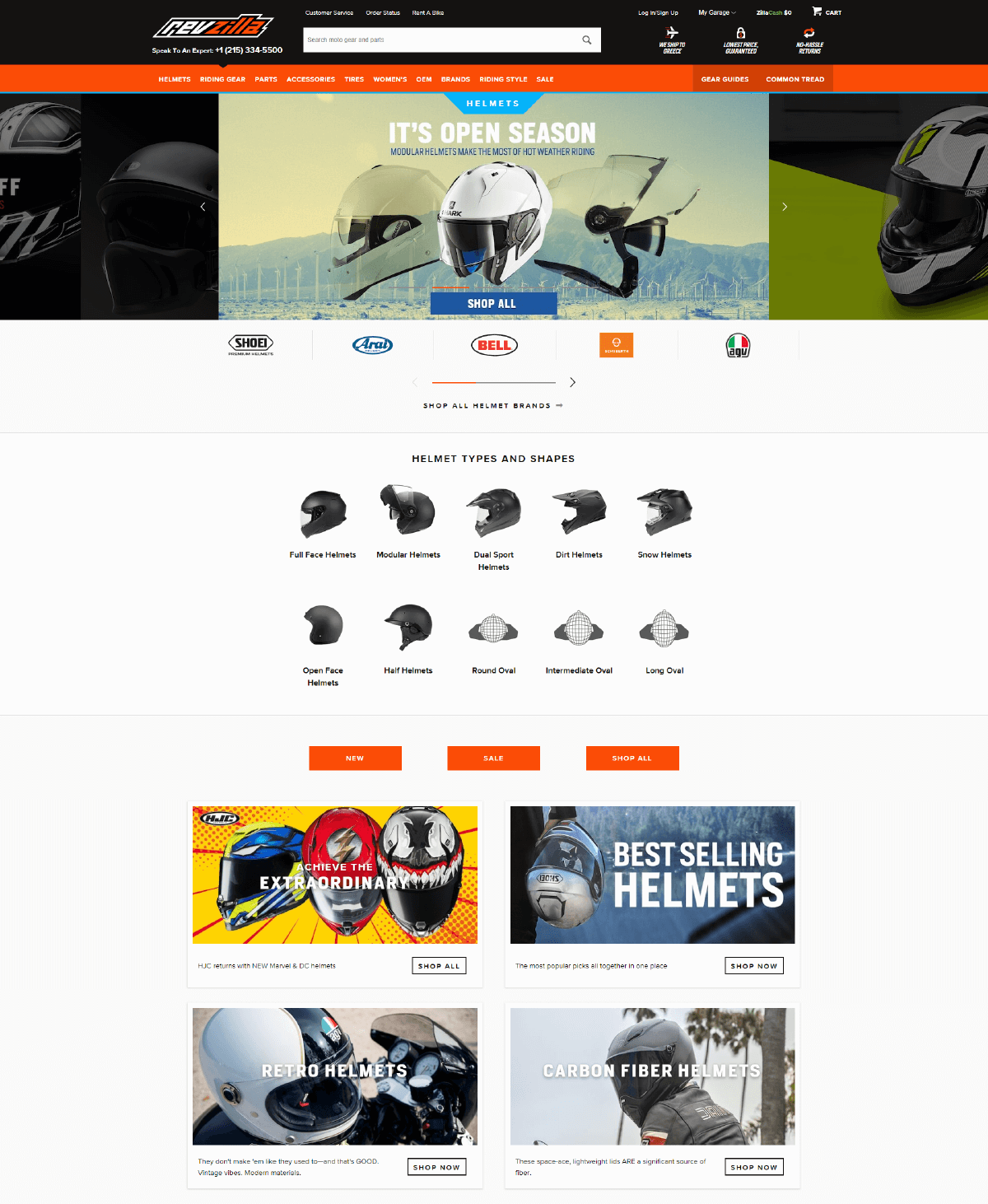
Why we liked it: Revzilla makes buying the right helmet easy with their filters to sort and rank products according to several criteria.
Users can filter results according to what color, shape, gender, category, size and type of helmet they are looking for. Furthermore, RevZilla provides a unique filter option — visitors can opt to display products that have a “video review”.
Category Page example #6: Ulta Beauty
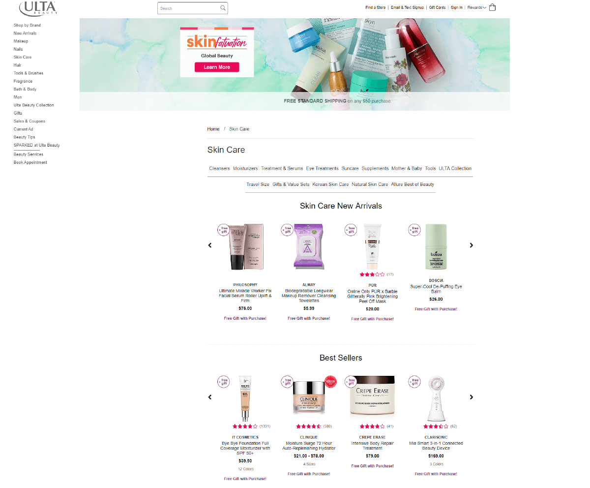
Why we liked it: Ulta creates high visibility for its header with fresh and relevant visuals that also promote their products.
Headers should be designed to be informative and helpful to your shoppers. Ulta does this and more. The brand also visually displays their featured products, breaking up mundane text headers with special offers and discounts. That is the ultimate UX!
5 Common mistakes you should avoid in your Category Page
- Very long descriptions
- Bad mobile UX
- Slow loading speed
- Avoid horizontal scrolling carousels, people are used to scrolling (infinitely) vertically, plus your phone’s screen is vertical, so we should all obey to its “laws” (think of Instagram, Snapchat and all major mobile apps)
- Using too many filters
Conclusion
Category page optimization requires a lot of dedication and time. Every eCommerce marketer needs to consistently and constantly be conducting A/B tests their shop category pages, implementing category page best practices to increase eCommerce sales.
Remember, tips and best practices can guide us in eCommerce optimization and A/B testing, but there are no hard and fast rules. What worked for someone else’s eCommerce store won’t necessarily work for you. You should never blindly copy case studies and competitors. Be sure to adapt to your brand and users’ needs.
Found this post helpful? Check out our previous posts on Checkout Best Practices and great examples of Product Pages.

Let’s Help You Scale Up
Spending time on Linkedin? Follow us and get notified of our thought-leadership content: