It’s not an easy task setting up an e-commerce business. You have to spend time finding the perfect layout, organizing your product photos and creating gripping descriptions. So, even after all that time spent if your checkout process is confusing or seems uncertain to your customers, you will never be able to maximize conversions for your business. We have seen this getting in the way, therefore, in this blog post we have gathered some of the eCommerce checkout best practices from leading brands to give you some guidelines that will help you improve your checkout process and, as a result, increase your sales?
What makes a smooth eCommerce checkout process in 2023?
The answer is simple: ease of use! Try avoiding elaborate forms, extra steps and asking too much information from customers for the completion of the order (i.e. shipping and billing address).
Here are some best practices that can help you set and optimize the checkout process for your e-shop:
-
-
Checkout Best Practice #1: Offer Guest Checkout. Now.
-
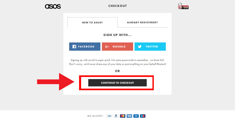
Ok, this is eCommerce checkout best practices 101. Guest checkout is one of the most famous tactics nowadays and a must in your marketing strategy. Make sure you have the registration form further down the checkout process so you give visitors a chance to browse products in your e-shop and finally proceed to the purchase. By implementing this process it actually increases the chances of converting your visitors into paying customers.
Try to make your visitor registration as smooth as possible by showing visually any errors or missing fields. Also, add an auto-filling option for existing customers and help them retrieve forgotten passwords.
A classic mistake is requiring your visitors to take time out and provide you with all the extra information needed to enrich your database in this step of their checkout process. We know how important is for your marketing team to gather all the data that will help you in the long run for segmentation and personalization of your marketing campaigns but, at the checkout process just ask for the information needed for the payment and the actual shipping of the order.
At the end of the day, “one size fits all” approach doesn’t work for all e-shops. Especially in 2021. Your registration forms and the information required depends on your brand and your audience. Start experimenting with A/B testing in order to identify what works best for you.
-
-
Checkout Best Practice #2: Optimize your shopping cart page
-
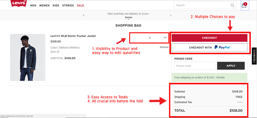
Just like in-store physical purchases, visitors want to have a clear picture of what their cart contains. In order to ensure smooth user experience and drive conversions, your cart page should display the following visual features:
-
-
- Showcase products with their corresponding images
- Give customers the chance to change quantities or remove products from their cart if they have changed their minds
- When it comes to final pricing it needs to be very transparent. Show user’s the total amount of their order after taxes and shipping costs. Research shows that one of the key reasons behind cart abandonment is hidden costs at the checkout process.
- Give visitors the opportunity to save their cart for later, or specific products as favorites for them.
-
Another optimization technique for decreasing abandonment rates is the enclosed checkout process. With this term, we mean the design approach where we exclude from checkout pages the navigation menu and other visual elements of the site.
This way you reduce the distractions and you make clear that your visitor is in the check out process and simultaneously informing them about the remaining steps for completion. Ideally, just a single link in your logo that gives a user the choice of returning back to the homepage.
-
-
Checkout Best Practice #3: Billing and shipping
-
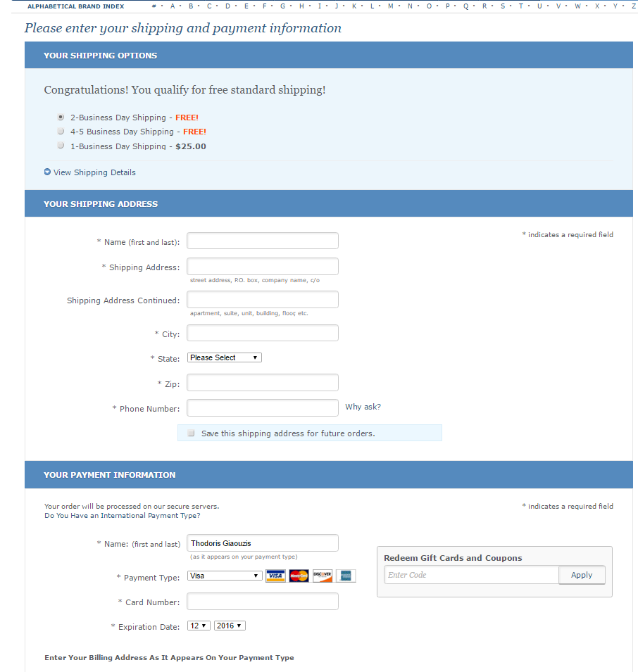
The billing & shipping forms are most likely the most time-consuming portion of the checkout process. This is why you should provide support throughout this process. Make sure your shipping section has the following essentials:
-
-
- Add various delivery time options required for the shipment of your products plus make the cheapest one default.
- Create a pop-up with real-time customer support service information.
- Provide crystal-clear descriptions for the information needed and show examples if possible.
- Give your customers the option to click on the corresponding “Ship to this address” button or checkbox. This option ensures them that they don’t have to waste their time typing the same information twice.
-
Tip: Make sure that you provide timeframe about when your customers will be receiving their order. This way they’ll know when to expect their order so they can arrange delivery and it will be easier for them to organize their busy schedule.
-
-
Checkout Best Practice #4: Make payment easy and secure
-
In this step, you should make sure that you give all the possible payment options to your users while at the same time create confidence that they will type sensitive data to a secure web environment. Include visual cues of security such as secure shopping certificates or logos in order to show that you provide a safe online payment environment.
-
-
Checkout Best Practice #5: Don’t forget the order confirmation
-
Congrats, your customers have checked out and placed an order! But, the process should not stop here. You need to send a thank you note and don’t forget this order’s confirmation email. In the confirmation email, you need to show all the details of their order including an estimation on delivery time.
This email is also a verification that the order contains actually the selected products they choose. Also, keep in mind that sometimes people order on behalf of a third party (i.e. your boss) so making this page easily printable (i.e. pdf, word, etc) is very convenient and helps users keep a valid copy.
Last but not least, when sending your confirmation email, avoid sending it from a noreply@example.com or info@example.com as you’ll make it very impersonal and cold. You should reply instead from a customer service account. This way it will be easier to follow up in case something goes wrong with this specific order.
Quick eCommerce tip: In 2021 online shopping is not something new. Customers expect a confirmation email as a standard service from any eshop during their shopping experience. Though, there is plenty of brainstorming to do, to make their journey much more unique and interesting by ex. by adding a gif on your confirmation email.
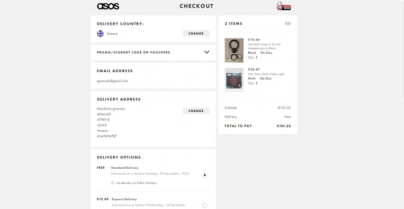
Checkout pages examples
Here are some awesome examples of checkout pages from top brands globally. Why not learning from the best eh?


Bonus tip: Cart abandonment email
The ugly truth is that at the end of the day almost seven out of ten visitors will abandon the checkout process no matter how hard you try to optimize it. This means that your efforts should be non-stop after your visitors leave your site. Guess what though? There are checkout best practices to deal with this problem too. You can bring them back to their carts to complete their order by using personalized triggered emails. Check these 5 Tips for a Successful Cart Abandonment Email that will help you set-up your successful email strategy and boost your e-shop’s sales.
Conclusion
Year after year consumers get more mature and demand better and better online shopping experiences from the eCommerce brands. This is why 2021 is a great opportunity for any eCommerce Manager to rethink, redesign and evolve their enterprise’s checkout process and strategy, based on consumer data and best practices for maximum results. We hope we helped towards this direction with this article. Don’t forget though: Testing is the key to success so grab on your excel and schedule your next checkout optimization experiments for this year!
[cta id=”1284″ vid=”0″]


