

Terabytes of data, from website behavior stats to eCommerce transactions and campaign performance metrics, pass through retail businesses each day. Getting more out of the massive dataset to create a clear and compelling view of the metrics (KPIs) that matter is foundational to decision making for any enterprise.
That’s why we decided to perform a major facelift to enhance our reporting capabilities through intuitive dashboards, as well as introducing new views, to help boost your marketing planning and execution.
All the changes are live as of November, so you may have already noticed some of the enhanced dashboards within your ContactPigeon account.
Let’s go over the key changes and see how you can use the insights for better campaign planning.
Click to Jump Ahead
Homepage Dashboard
The main homepage dashboard right after you sign-in now includes a one-glance view of all the key eCommerce and campaign performance statistics.
The very first section is the key metrics cluster. The idea behind this view is to present the most useful KPIs from the chosen period and compare them to a previous period. It provides a quick pulse-check of how your business is trending overall. All green is what you should always be aiming for, but don’t worry since the combination of campaign and sales KPIs on the same view can help you troubleshoot and turn a red to green in no time. Seeing in seconds what you need to do in order to improve the sales is the magic of this dashboard.
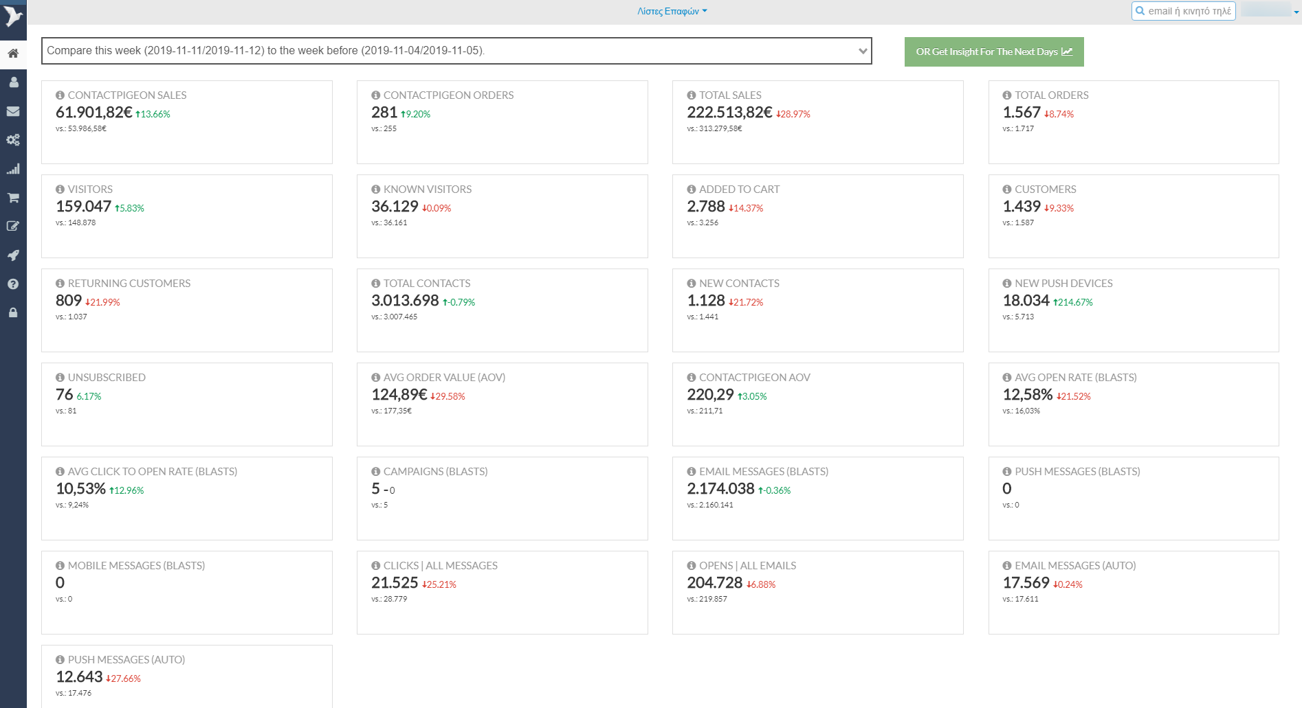
New homepage dashboard captures all the key metrics for eCommerce and campaigns in one view.
Dashboard KPIs and definitions
There are several types of metrics covered in this dashboard.
Sales KPIs
- Total Sales: Total value of revenue generated within the selected time period.
- Total Orders: Total number of orders placed within the selected period.
- ContactPigeon Sales: Sales attributed to campaigns generated by ContactPigeon within the selected time period.
- ContactPigeon Orders: Number of orders attributed to campaigns generated by ContactPigeon, within the specified period.
- Average Order Value (AOV): Average order value of the customers during the selected period.
- ContactPigeon AOV: Average order value from orders attributed to ContactPigeon within the specified time period.
Conversion KPIs
- Visitors: Total number of visitors to the website, known and unknown, at the given time range.
- Known Visitors: Identified visitors to ContactPigeon for the selected time period.
- Added to Cart: Number of known visitors that added a product to the cart within the selected time period.
- Customers: Number of customers who made a purchase during the selected period.
- Returning Customers: Customers who had made at least one order prior to the selected time period.
- Total Contacts: Total number of subscribers, including do-not-contact subscribers.
- New Contacts: Number of unique new subscribers added in this period.
- New Push Devices: Number of new devices that consented to receive push notifications this period.
Campaign Performance KPIs
- Campaigns (Blasts): Total number of campaigns across email, SMS / Viber / WhatsApp, push notifications that are sent to more than 100 recipients within this time period.
- Average Open Rate (Blasts): Average open rates for the bulk campaigns sent within the specified period.
- Average Click to Open Rate (Blasts): Average click rate relative to the open messages.
- Email Messages (Blasts): Number of bulk emails sent within the period.
- Email Messages (Auto): Number of automated emails triggered within the period.
- Push Messages (Blasts): Number of push notifications delivered for the period.
- Push Messages (Auto): Number of automated push notifications delivered for the period.
- Mobile Messages (Blasts): Number of bulk SMS / Viber / WhatsApp messages sent within the period.
- Clicks | All Messages: Total number of clicks across all ContactPigeon campaigns – email, SMS / Viber / WhatsApp, push notifications.
- Opens | All Email: Total number of opens across all ContactPigeon email campaigns.
- Unsubscribed: Number of emails unsubscribed during the selected period.
Comparison between time periods
You will have the option to see KPIs at a specified point in time and compare them to a corresponding duration from the previous period.
Performance overview across the 3 periods:
- Yesterday: Data for the previous calendar date.
- Week to Date: Data from the beginning of the week (Monday) till the previous calendar date. For example, if we are on a Friday, it will run the data from Monday to Thursday.
- This Month: Data for the first day of this month to the previous calendar date. Aka Month to date.
The comparison will be made to the same time-frame in the previous period, whether that’s from the previous week, month, or year.
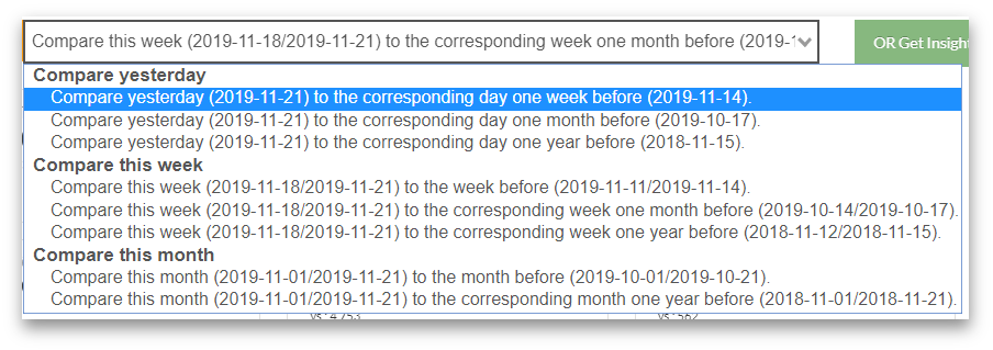
You can select the date periods for comparison over time.
Given the seasonality nature of retail, observed even among any given day of the week (e.g., peaks during weekends), we ensured the comparison to be always made against the same set of corresponding days within the week. For example, if the current period is a Monday and the comparison is against the previous month, the dashboard will only pick the corresponding Monday from the same week of the previous month.
With this setup, you will have the most accurate comparison as possible!
Understand what’s working well
So now that you have an overview of KPIs across the time periods, it helps to also understand what’s causing the trends. This way, you have the insights to keep doing what works or adjust your campaign plans in order to improve the stats again.
Beneath the KPIs, you will find the email campaign and sales activities across the two time periods. This gives a detailed look into the sent campaigns, along with the opens, clicks, and revenue generated from each campaign.
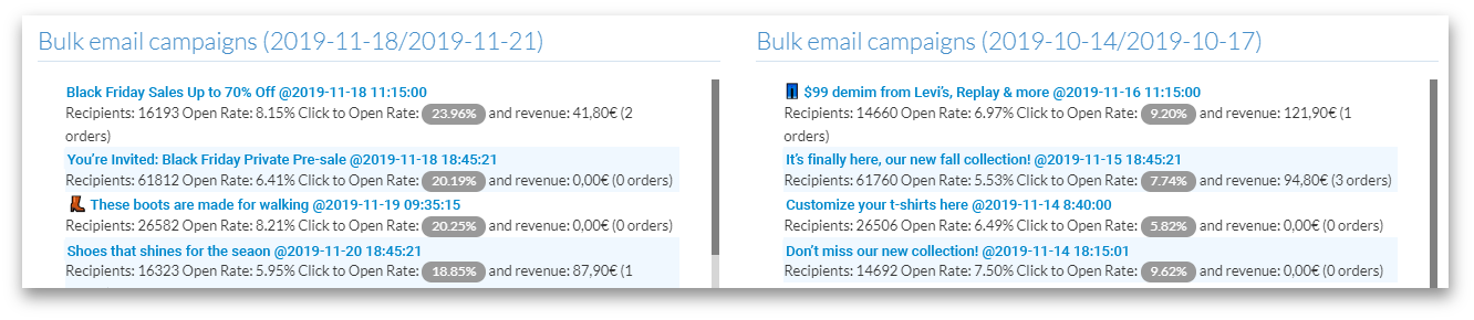
Compare campaigns sent across time periods.
The dashboard also gives a quick glance into which brands and product categories are sold attributed to your marketing campaigns.
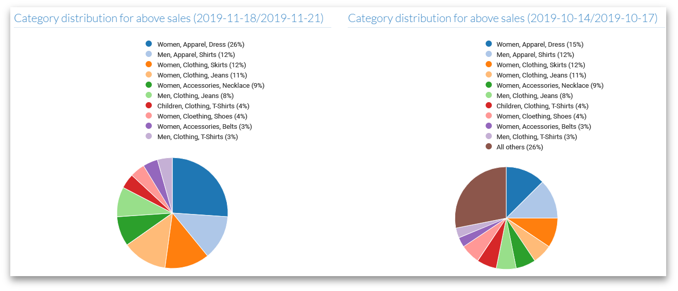
Comparison of best categories and brands over time.
Having this comparative view gives you a way to zoom into the campaign(s) that have the maximum impact within the period, so potentially great results can be replicated again in the future!
List Statistics Dashboard
The statistics within your contact lists also had a facelift. While understanding how the list grows is helpful, we believe it’s more important to have insights into how your subscribers react to your campaigns, increasing this way the quality of the list and this new view provides the visual to do just that.
View changes in click to open ratio for changes in the quality of your lists and campaigns.
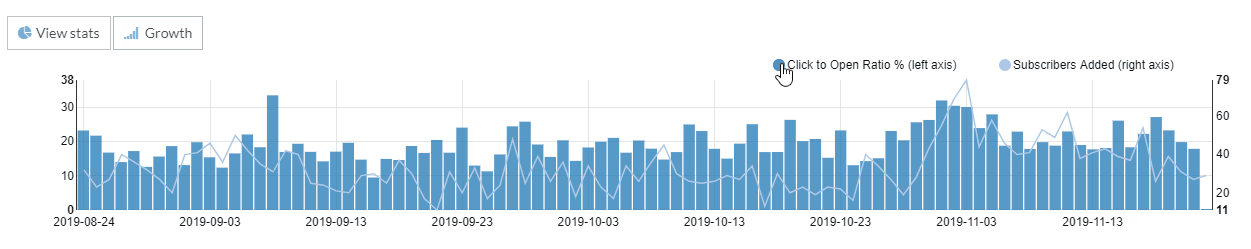
Click to Open Ratio Bar Chart
In this graph, we added a new metric, the Click to Open Ratio (bar chart). It calculates the daily percentage of the list subscribers that clicked a link after reading an email. Attractive content that is of interest to the list subscribers is going to have a higher Click to Open Ratio.
Now, the peak and valleys of the bar chart directly correspond to the timing of your email campaigns. If you send campaigns on a regular basis, then the pattern of this chart offers an excellent overview across time on how the recipients of this contact list are responding to your messages. A certain trend of increasing Click to Open ratio indicates that the audience is responding well to your marketing, whereas decreasing bars may be a cause of concern on the quality of your email campaigns.
Tip: If you notice a downward trend of the Click to Open ratio, reach out to your ContactPigeon account manager, and we’d be happy to provide you an assessment on the campaigns and ideas to improve them.
Subscriber Growth
Don’t worry, the growth stats of your contact lists are still there. You can find the daily increase in subscribers within this list on the right axis of the dashboard.
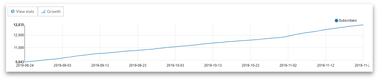
Monitor growing contacts and subscribers.
Alternatively, you can view the overall growth trend of the contact list by just hitting the “Growth” option. It will bring up the overall volume of the contact size for the last quarter.
Navigation menu got a facelift
And finally, we re-arranged the navigation bar to make it more structured and, hopefully, easier for you to find the feature you need.
One of the changes to highlight is the consolidation of campaigns. Whereas before email campaigns, SMS, Push notification resided in different places on the menu, now everything is grouped within Campaigns. With this change, we hope to highlight the importance of adopting a multi-channel marketing strategy and the shift towards a channel-agnostic mindset.
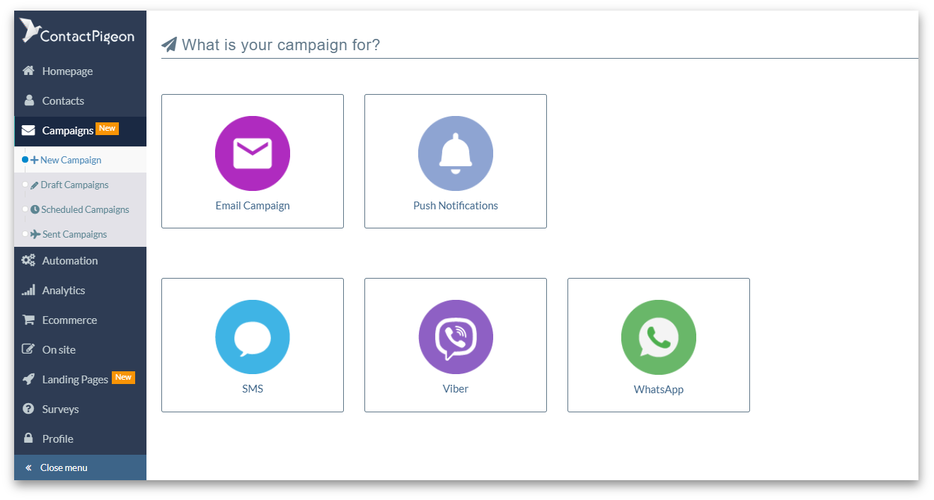
Updated navigation menu and campaign selection.
That’s Not All, Folks
That’s right, we have more exciting introductions underway in the next month. As a sneak peek, you will find changes to how you can build super personalized landing pages and connect with subscribers via mobile messaging. So stay tuned.
As always, we welcome any feedback to the changes we’ve introduced in the platform, as well as, any new ideas to make ContactPigeon better. Leave a comment, or contact us directly.
Have a successful Black Friday ahead!