Building a fashion eCommerce business into a unicorn is not an easy feat, even if you’ve got all the funding in the world. It takes more than money to make it happen. From its humble beginning in 2007, Farfetch, a luxury fashion brand, now serves diverse customer segments across 190 countries.
So, what has Farfetch done to set it apart from other eCommerce retailers? In this Farfetch case study, we’ll be exploring some of the specific eCommerce marketing strategies the company used to achieve its current revenue and status. You’ll be able to gain useful insights on tactics and ideas on how to apply them to grow your business with reasonable investments.
This is a lengthy post, so here is a table of content to make it easier for you to jump ahead.
- Farfetch Case Study: The Background
- Farfetch’s eCommerce Marketing Strategy For Scaling Consistent Growth
- Growing Buyer Traffic Through Search Engine Optimization
- Paid Search Advertising With Intelligent Optimization Tools
- A Different LinkedIn Advertising Goal: Talent Attraction
- Highly Consistent Organic Marketing Across All Social Media Channels
- Farfetch Case Study: A Peek Into Farfetch’s eCommerce Website
- Analyzing Farfetch’s Home Page
- Analyzing Farfetch’s Category Page
- Analyzing Farfetch’s Product Page
- Analyzing Farfetch Checkout Process
- Top eCommerce Marketing Tools Used By Farfetch
- Farfetch Case Study: Impressive Stats You May Not Know
- Do you have what it takes to become a unicorn?
Farfetch Case Study: The Background
The world’s most successful businesses are usually founded based on a deep love for something or necessity to solve an important problem. For Jose Neves, a Portuguese entrepreneur who founded Farfetch in 2007, it was his deep passion for fashion.
Using Farfetch as an outlet for expressing that love, his core mission is to help small independent boutique owners gain access to broader markets beyond their local economies while retaining their brick and mortar identity.
This concept, along with superb execution in operations and smart use of eCommerce marketing automation, propelled Fartech’s success in the competitive fashion retail sector. In Q4 2019, Farfetch’s gross profit reached $176.1 million USD, an increase of 87% from a year before.
The company today sells products from over 700 boutiques and brands from around the world. It has formed exclusive strategic partnerships with top tier brands like Chanel, Chalhoub Group & JD.com, launched a technology accelerator (Dream Assembly), and successfully IPO on the New York Stock Exchange in 2018. Prior to that, Farfetch has raised more than $740 billion from private investors and venture funds.
Farfetch’s eCommerce Marketing Strategy For Scaling Consistent Growth

In the words of Jose Neves, ”building an eCommerce site is easier than it has ever been with companies like Shopify, but building a successful commercial operation is harder than it has ever been”. Looking at the this statement, we bet that marketing is one of the hardest part.
The true test for determining the effectiveness of an eCommerce marketing strategy is by the final outcome. Let’s take a look at Farfetch’s marketing strategies that led to its impressive revenue outcomes.
Growing Buyer Traffic Through Search Engine Optimization
What better time to engage prospective buyers than when they are actively searching for the products you are selling?
Recognizing the value of this traffic source, Farfetch’s digital marketing efforts attract over 4 million visitors per month from proven search engine optimization strategies. This traffic volume represents real people actively searching for luxury fashion brands like Versace, Givenchy, Burberry, Saint Laurent and Valentino. Besides the popular brand names, other small sellers from around 35 countries are thriving on the platform as well.
This result is achieved through laborious efforts by an in-house team focusing on SEO tactics for both on and off site across major markets including Americas, EU, and APAC. It’s reflected in the details on how each category page and product page are structured, worded, and technically optimized for browsing. Similarly, it can be seen in the voluminous content covering fashion trends, brand collaborations across the internet that serves as backlinks to the Farfetch brand.
Based on our search traffic analysis, the top-selling products on Farfetch include designer clothes, shoes and jewelry. While Farfetch had built a global capacity for shipping products across 190 countries, the majority of its buyers are from the United States, United Kingdom, Brazil and Germany.
Key takeaways for your eCommerce business
- Invest in SEO early. Implementing SEO requires patience and dedication as results are not immediately visible, but it pays off big in the medium to long run since it generates organic traffic which can sustain overtime without need to continuously pour out performance spend.
- Start out with some quick wins. These are on-page optimizations that can benefit both your search ranking and customer browsing experience. These can be more user friendly navigation and layout, more efficient use of graphic assets for faster page load. For starters, check out our tips on optimizing eCommerce category, product, and checkout pages.
- Broaden your reach with partnerships. This approach works for both content and sales. The idea is to co-create and co-share content with your brand partners, affiliations, and other collaborators within your network.
Paid Search Advertising With Intelligent Optimization Tools
To grow awareness and capture new demands in your target market, you can’t rely on a single traffic source. Farfetch’s digital marketing team recognized this fact as well, which is why they invest consistently in paid search advertising. Successful brands like Zara, IKEA and Tesco have been also increasing their performance spend.
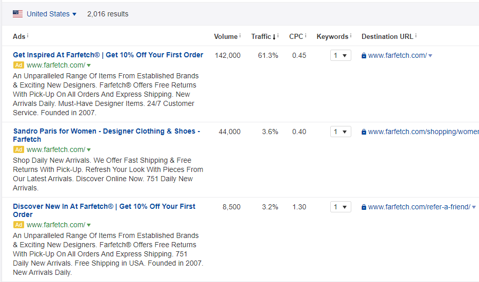
From some of Farfetch’s AD copies in the screenshot above, customers can immediately see the key value propositions – fashion inspirations, designer brands, and convenience of online shopping there (e.g., fast shipping, free returns, 24/7 customer services).
Just like search engine optimization, the essence of paid search is to attract people in need of Farfetch products when they are searching for them.
One thing to note is the average cost of visitor acquisition generated through paid search (PPC) is substantially higher than the average spent on 4 million monthly visitors through organic search.
At the same time, Farfetch also runs localized advertisements across a number of target countries and platforms to bring buyer traffic with high purchase intent.
Key selling points in Farfetch’s paid search ad copies:
- Build Trust. This may not seem to be a significant variable, but emphasizing the fact that the company has been around since 2007 inspires trust. People want a brand they can trust today, tomorrow, and years into the future. Similarly, calling out high available customer support (24/7) is also a great way to inspire trust.
- Clarity in Value Proposition. In some of its Ad copies, you’ll find this term ‘global free return’. This type of guarantee is uncommon among many online fashion stores. However, it’s an effective way to instill confidence in its products for first-time prospective buyers across all geographies.
- Highly Targeted Ads and Landing Pages. It is not enough to display one Ad message for all the potential buyers. The digital marketing team at Farfetch had done a good job in matching landing page content with search intent. Many search Ads contain URLs of landing pages meant for a specific gender or product type.
A Different LinkedIn Advertising Goal: Grasp for Talent
Why would a fashion eCommerce company devote efforts in talking about technology and culture?
Well, scaling a business to be an unicorn requires more than money. It takes a lot of great talent, across multiple disciplines, to build an empire. And that in itself calls for constant recruitment through proactive efforts to attract and retain talents.

With over 670 million users across 200 countries, LinkedIn offers a substantial growth channel for Farfetch. Interestingly, the Farfetch marketing team uses LinkedIn advertising differently.
Instead of promoting its marketplace or products, Farfetch leverages a combination of blog posts and LinkedIn promoted content to target different talent communities. The screenshot above is just one example of how Farfetch how they leverage tech content to attract engineers.
Some other interesting topics we found on Farfetch’s blog includes –
- How Autonomy Combines Four Main Drivers That Motivates People In Organizations
- How To Build A Performance Culture At Scale
- How Cross Company Knowledge Sharing Has Improved Our Work
The Farfetch Plug-in Program
Continuing on the topic of grooming great talents, Farfetch has a well-promoted graduate program aptly named Plug-In. Plug-In is a 6-month internship program that helps the company train and “nurture” new talents.
Within the context of LinkedIn advertising, we see that proactively building an inbound talent pipeline and promoting it’s attractive workplace culture are two of the most influential key success factors worth noting.
Highly Consistent Organic Marketing Across All Social Media Channels
The nature of eCommerce and fashion businesses warrants maximum use of visual content. Besides using powerful eCommerce marketing automation tools, Farfetch is highly active on social media. From Facebook, Instagram, to Pinterest, Farfetch’s social media engagement numbers are great proof of growing brand awareness.
Innovate use of social media platforms
Instagram: Marketing Beyond Still Photos.
According to TechCrunch, around 7 million of Instagram’s 1 billion users have downloaded its IGTV. Beyond what other eCommerce and fashion brands are doing with still images, Farfetch is proactively leveraging IGTV to grow its brand awareness.
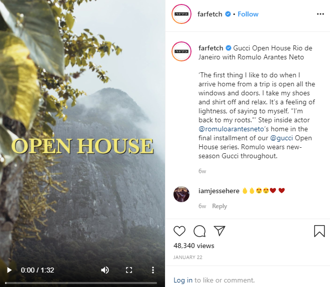
One good example is the Open House video promoting the luxury brand Gucci (screenshot above). The 1:32 minutes video had gotten about 48,340 views within a week of publication. It is important to note that Farfetch marketing efforts had brought them over 2 million followers on Instagram.
Pinterest: Making Your Brand Name Pinned For Timely Recall.
With over 10 million monthly views coming from Pinterest, Farfetch has about 6 pin boards where the brands they offer are pinned and promoted with great visuals. Some of these boards include event dressing, jewelry, kids, sneakers, and accessories.
An interesting practice Farfetch has adopted is to link each of the view pins to the exact product on the image or relevant category on its website.
Farfetch Case Study: A Peek Into Farfetch’s eCommerce Website
Having a sizable marketing budget to drive traffic to your website is one thing, converting visitors into buyers is an entirely different challenge. In practical terms, the conversion rate is directly related to the ROI of your marketing spend.
In this section, we look into some of the specific things that Farfetch eCommerce team did well on which led to its sizable turnover and billion-dollar valuation.
Analyzing Farfetch’s Home Page
What We Liked
#1: Geolocation
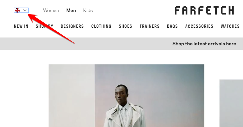
The very first time we visited Farfetch’s website, the regional option was one of the first things we noticed. We liked the fact that the website doesn’t prompt you to choose a region but rather automatically detects your current location and directs you to the appropriate regional site.
For an eCommerce website that serves multinational customers, this is an added convenience for seamless shopping experience. In case the customers don’t want to shop on the default regional site, they have the option to pick others. This is “Localization 101” but many international brands fail to implement it correctly.
#2: Clear Product Category Structure
Without clear category links, navigating an eCommerce website will be walking in a maze without a roadmap. On Farfetch’s website, the category links are arranged in a clear way that minimizes the time shoppers spend finding the category they want.
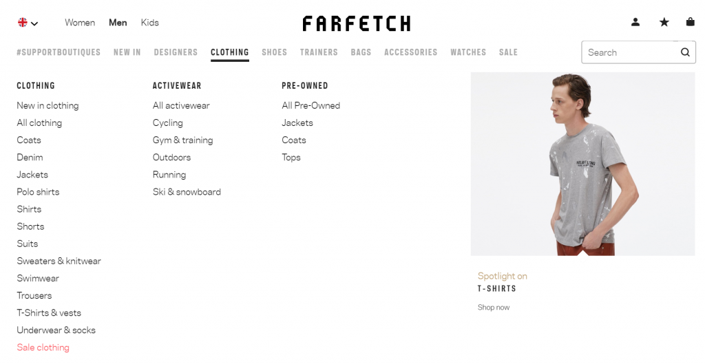
The first level is organized by gender type – separating into men, women, and kids category links. Within each of these three general categories, it further breaks down the products by fashion subcategories (e.g., Clothing, Shoes, Bags, etc) along with special categories for new items, designers, and Sale. The last level links to more granular categories that further divides the product by its functions (e.g., Coats, Denim, Jackets).
This type of tier structure makes it easy for visitors to quickly locate what they are looking for, without being overwhelmed with categories choices and products upfront. It also is beneficial for search engines to understand the overall site structure, and hence lead to better organic search results.
#3: Easy To Find Search Form
Right on the top right corner of the home page, there is a simple, yet clean looking search function. We love that it is clean cut and easy to find. From there, shoppers can search for the specific product or brand. The search functionality is among the most vital features on any eCommerce website, particularly for retailers like Farfetch where thousands of SKUs are offered.
What We Believe Can Improve
#1: Minimalist Homepage for New Visitor
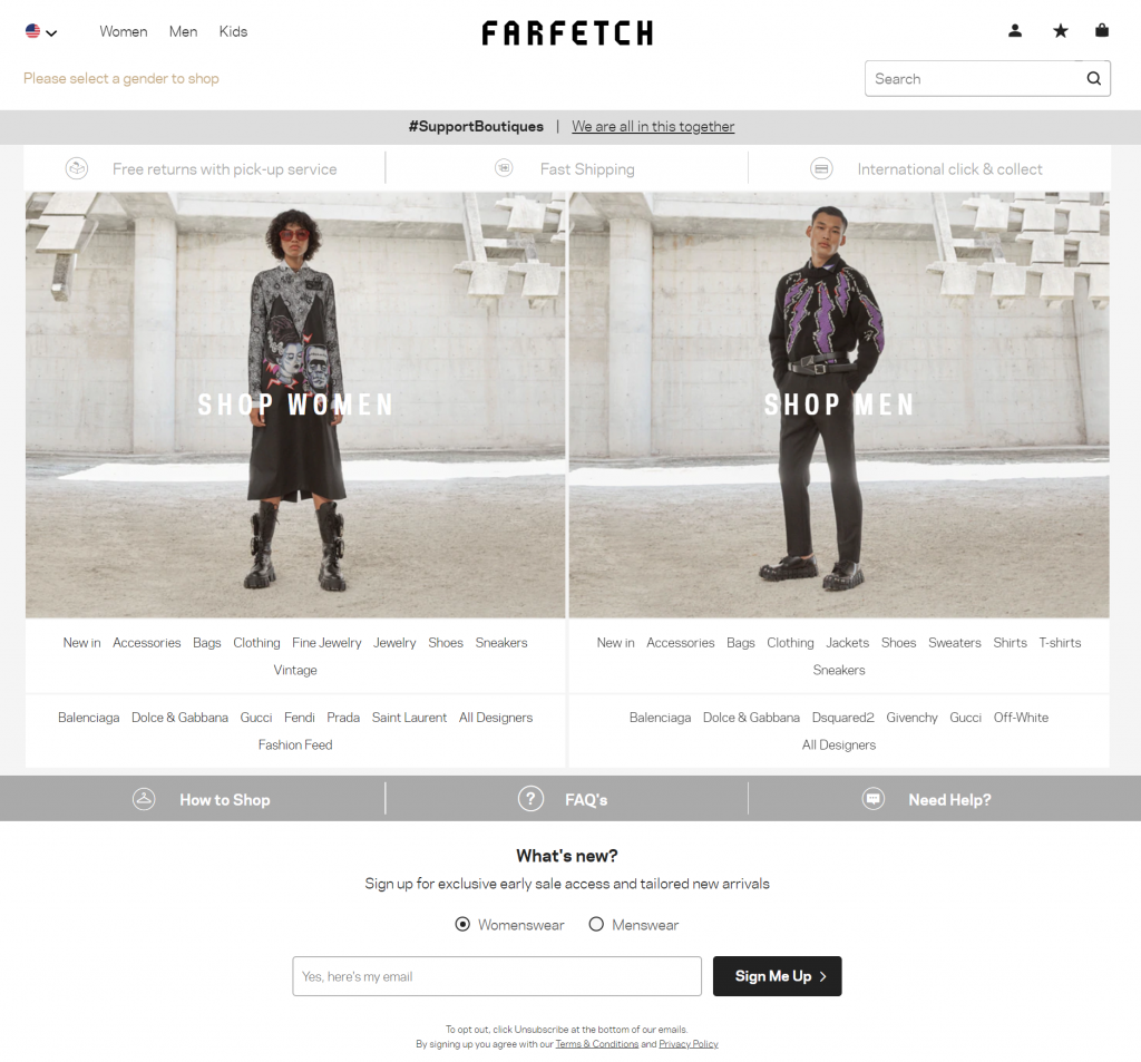
For first time (or unknown) visitors, Farfetch kept the homepage to the minimum, offering options to pick either women or men. While this may be a tactic to get shoppers to start browsing products immediately, there may be opportunity on the homepage to further promote the brand. This can be a short and sweet message about the core mission of the brand – bring fashion brands and boutiques to fashion enthusiasts worldwide.
Analyzing Farfetch’s Category Page
What We Liked
#1: Flexible sorting options
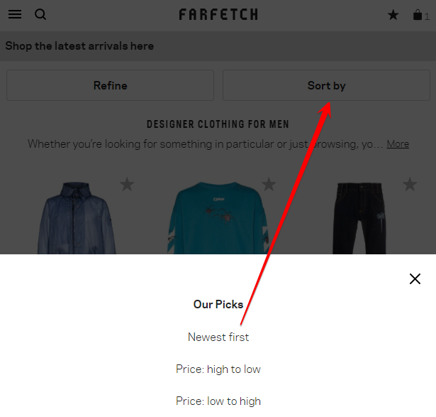
On any of the product category pages, there is a drop-down list of sorting options. Depending on the visitors’ interests, they can easily sort the products on a number of attributes that they may value, whether that be pricing, discounts, editor picks.
#2: Granular filtering options
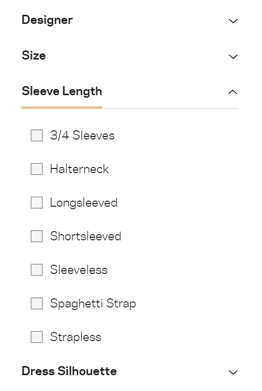
Farfetch’s product category page also offers a nifty filter mechanism that makes finding the right products easy. There is an option to filter on a range of variables such as size, color, price, and product features (e.g., sleeve length on clothing). This is a must for retailers with large product counts.
What We Believe Can Improve
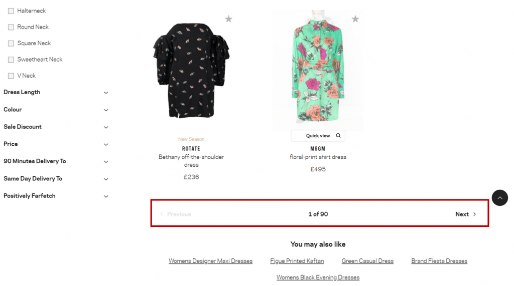
#1: Keep Pagination On The Top and Bottom
Farfetch carries a lot of brands and products, which even after applying the right filters leads to pages of products. Currently, as the category page is designed, it forces the shoppers to scroll all the way down before getting to the pagination option. The option also forces the shopper to browse page by page, without the options to go to a specific one. This makes it cumbersome to jump ahead to a specific range of products given that the sorting order is set.
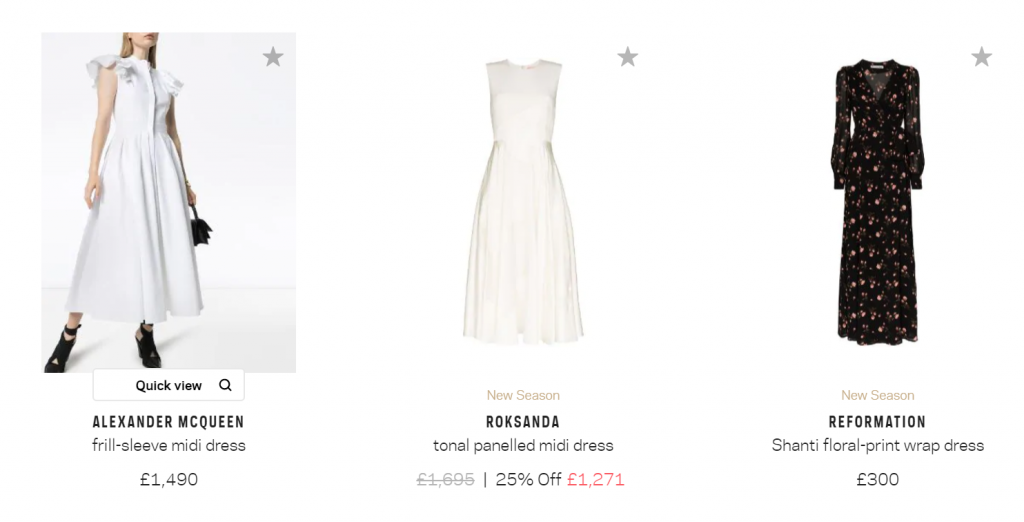
#2: Offer Outfit Views as an Optional Product Setting
Sometimes it helps to visualize how a piece of clothing may look on the body. While Farfetch does offer outfit views for each product, it requires the shopper to hover over the product image in order to see them. It may be convenient to allow shoppers to easily flip between outfits and product views as default view setting.
Analyzing Farfetch’s Product Page
What We Liked
#1: Multiple product images
As mentioned earlier in the paid-advertisement paragraph, getting prospective buyers to land on a product page is one thing, convincing them to complete an order is another challenge. Since there won’t be any sales representatives around to clarify things, online stores have to rely on product visuals and descriptive text to do all the selling.
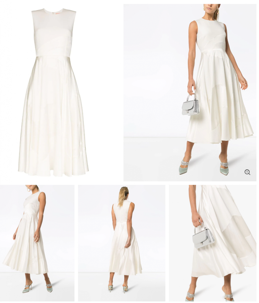
Farfetch does a great job in showcasing a number of crisp and professional looking images that present the product at different angles.
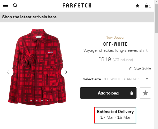
#2: Clear delivery expectation
A common reason for high eCommerce cart abandonment rate is mismatched delivery expectations. Instead of allowing buyers to reach the checkout page and get surprised by delivery time estimation, Farfetch makes this clear right on the product page.
What We Believe Can Improve
#1: Surprising absence of customer reviews
Farfetch had built a great brand known for successful delivery across 190 countries. Giving their satisfied customers a way to leave product reviews could be a great way to grow their conversion rate for good.
There is an opportunity to showcase customers reviews on product quality, expectations, delivery and customer service. The voice of the customer can be a strong selling point.
Analyzing Farfetch Checkout Process
What We Liked
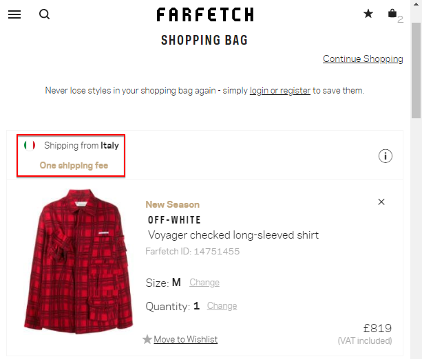
#1: Transparent fulfillment location
On Farfetch’s checkout page, there is a clear indication of where the product is being shipped from. Depending on the shoppers’ location and other preferences, they have the option to change the geography which may impact the final shipping costs.
#2: Guest shopping option
Farfetch gives the shopper the option to complete the purchase as a guest. This eliminates the hassle of having to create a new account.
#3: Optimized Checkout Header Bar
At checkout, the default navigation menu is removed to minimize potential distractions may lead shopper astray from the final goal – complete the checkout. Instead, the header shows a secure checkout badge, brand logo, and options for customer support. The minimal header is effective in reinforcing one key message – build trust and confidence for customers to finalize the transaction.

#4: Exit intent pop-up
As shoppers try to exit the checkout process a pop up appears to ask them to confirm whether they meant to leave the checkout process. This is a super clever way to reduce checkout abandonment rate!
What We Believe Can Improve
#1: Limited currency options
While the website gives local currency options for buyers within Europe, United States, and some other geographies, most regions among the 190 countries they serve have to be in USD. This means that the potential benefits of automated language and currency localization are still untapped to a great extent.ContactPigeon offers unique capabilities for growth oriented retailersWhile the website gives local currency options for buyers within Europe, United States, and some other geographies, most regions among the 190 countries they serve have to be in USD. This means that the potential benefits of automated language and currency localization are still untapped to a great extent.
Top eCommerce Marketing Tools Used By Farfetch
A deeper look into Farfetch’s marketing capability underscores heavy reliance on powerful eCommerce marketing automation tools in its pursuit for consistent growth. Here are some of the tools the eCommerce business uses.
- Kenshoo – A platform that provides enterprise-level advertising intelligence across the leading channels like search, social and display.
- Google Analytics 360 – Farfetch makes use of this tool to manage and improve advertising ROI across Google’s Ad platforms including search, display and video.
- Riskified – An omnichannel eCommerce funnel optimization software solution used by Farfetch to optimize the purchase processes while expanding from one market to another.
- Marketo – A renowned engagement platform. It has multidimensional and omnichannel marketing capabilities. The main downside is the price tag and time to implement to be customized to specific eCommerce build. Other options for omnichannel customer engagement platforms that deliver high ROI includes ContactPigeon marketing cloud.
How Farfetch can further boost its growth with ContactPigeon
- Integrated omnichannel marketing campaigns that connect both online and offline customer behaviors (2-way QR codes, Integrated Customer Profiling) to form a truly Unified Customer Experience.
- Ease of integration with eCommerce platforms, with access to multiple marketing channels under one platform
Tip: If you are interested in more fashion retail case studies take a look at our other in-depth articles:
- How ZARA Dominates the Ecommerce Fashion Industry
- New Look: The Marketing Strategy Behind the UK Fast-Fashion Retailer
Farfetch Case Study: Impressive Stats You May Not Know
- Farfetch had raised over $741.4M across 7 rounds – Angellist
- Over 3,900 employees across different countries – LinkedIn
- Recorded over $6.2 billion valuation after its 2018 IPO – CNBC
- Average order value per customer stands at $680 – The New York Times
- Website content can be accessed in 15 different languages – Wikipedia
- Products on its website are supplied and sold by 500+ boutique brands across 35 countries – Farfetch
Breaking Farfetch news
-
- Despite Loss, China Leads Farfetch Growth for 2020 – Read more here
- Farfetch posts first quarter growth despite coronavirus uncertainty – Read more here
Resources about other renowned fashion retailers
- How ZARA Dominates the Ecommerce Fashion Industry
- Why ASOS is the Absolute UK Ecommerce Success Story
- New Look: The Marketing Strategy Behind the UK Fast-Fashion Retailer
- SUPERDRY case study: The marketing strategy behind one of the top UK clothing retailers
- The Marks and Spencer eCommerce Case Study: 3 Growth Lessons for Retailers
Do you have what it takes to become a unicorn?
Going from idea to unicorn in just 13 years is no simple feat. It takes some element of luck, but more importantly, a whole lot of dedication and hard work. To reach sustainable growth, you need great talent and culture, the right technology and tool stack, optimized processes, and finally impeccable execution when it comes to marketing strategy and delivery.
According to Jessica Jackley, the co-founder of Kiva, “entrepreneurship is the pursuit of opportunity regardless of resources currently controlled”.
The big question is – should you be waiting for sufficient funding before you can put the full growth potential of your eCommerce business to work? If the answer is no then don’t fret. We are here to help. Let’s schedule a free eCommerce marketing automation consultation to show you how you can optimize your eCommerce marketing efforts.
Before you leave, which one of the Farfetch marketing strategies would you replicate? Share your thoughts in the comment section below.

Let’s Help You Scale Up
Spending time on Linkedin? Follow us and get notified of our thought-leadership content:


![Benchmarking Growth Strategies of Top Fashion Retailers [Study]](https://blog.contactpigeon.com/wp-content/uploads/2025/11/top-fashion-retailers.jpg)