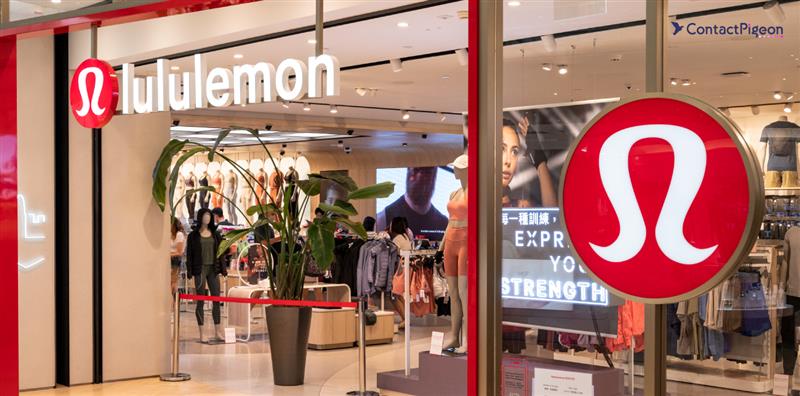
The Lululemon marketing strategy has played a crucial role in establishing the company as a leader in the athletic apparel industry, particularly in yoga and athleisure wear. This article will dissect the essential elements of Lululemon’s renowned approach, examining how the brand effectively employs various tactics and methods to engage customers across multiple channels. With recent initiatives that have driven significant growth, understanding Lululemon’s marketing techniques can offer valuable insights for retail executives, eCommerce professionals, and marketers looking to enhance their strategies. Read on to discover actionable takeaways from Lululemon’s successful marketing approach that can help elevate your brand’s performance and improve customer experiences.
The history of Lululemon
Lululemon was founded in 1998 by Chip Wilson in Vancouver, Canada, originally as a design studio that also served as a yoga studio. In 2000, Wilson opened the first official Lululemon store in Vancouver’s Kitsilano neighborhood, focusing on high-quality, functional yoga clothing.
The brand expanded into Canada and the U.S. in the early 2000s, emphasizing a community-driven shopping experience with local events and workshops. Lululemon went public in 2007, which helped fuel its growth and brought challenges like quality control issues. In 2010, the brand faced criticism for pilling pants. In 2013, it dealt with a major recall due to sheer yoga pants, leading to leadership changes, including Chip Wilson’s resignation and Laurent Potdevin’s appointment as CEO.
Under CEO Calvin McDonald, the Lululemon marketing strategy shifted to broaden its product range beyond yoga to include running and training apparel and invested in men’s clothing. The company also embraced digital initiatives and expanded globally, emphasizing sustainability through eco-friendly practices.
Key components of Lululemon’s business model
Lululemon Athletica’s business model centers on premium product offerings and strong community engagement, which fosters brand loyalty through free fitness classes and events. Its direct-to-consumer strategy enhances customer experiences and provides valuable insights through eCommerce and retail locations. Seamless integration of online and offline channels and a commitment to product innovation and sustainability appeal to eco-conscious consumers. Strategic partnerships with fitness influencers further position Lululemon as a lifestyle brand. These components collectively drive growth and uphold the brand’s reputation in the athletic apparel market.
- Premium product offering: The Lululemon marketing strategy focuses on high-quality, premium athletic apparel. Using innovative fabrics, such as Luon, and attention to design detail have helped the brand establish an excellent reputation.
- Community engagement and experience: The company fosters a strong community connection by hosting free yoga classes, fitness events, and workshops in its stores. This community-driven approach enhances brand loyalty and encourages customer engagement, transforming stores into local hubs for fitness enthusiasts.
- Direct-to-consumer (DTC) sales: Lululemon prioritizes its direct-to-consumer sales model through its retail stores and eCommerce platform. This strategy allows the brand to control the customer experience and gather valuable consumer preferences and buying behavior data.
- Omnichannel strategy: The brand effectively integrates online and offline channels, ensuring a seamless shopping experience. Lululemon’s eCommerce platform complements its physical stores, offering features like buy online, pick up in-store (BOPIS), and easy returns.
- Product innovation and sustainability: The Lululemon marketing strategy strongly emphasizes product innovation, regularly updating its offerings to meet customers’ needs. Additionally, the brand is increasingly focused on sustainability, using eco-friendly materials and practices to appeal to environmentally conscious consumers.
- Collaborations and partnerships: Lululemon engages in strategic partnerships and collaborations with fitness influencers, athletes, and wellness brands to enhance its market reach and brand visibility. These partnerships help position Lululemon as a lifestyle brand rather than just an apparel company.
- Technology integration: The brand leverages technology to enhance customer experience, including a robust online presence, a user-friendly mobile app, and initiatives like the Lululemon Studio, which integrates at-home fitness experiences with its products.

Build smarter customer journeys and activate AI-driven personalization for repeat purchases.
Lululemon: The best videos every retail executive should watch
Lululemon – Business design teardown
Lululemon stock deep dive
Lululemon’s business performance: Metrics and charts
Lululemon Athletica’s business performance is marked by impressive growth metrics and strategic achievements that highlight its position in the athletic apparel market. Visual representations, including charts and graphs, provide a clear overview of these trends, showcasing the effectiveness of Lululemon’s innovative business strategies. Together, these insights illustrate the company’s robust performance and ongoing commitment to excellence in the fitness industry.
Revenue of Lululemon from 2008 to 2023

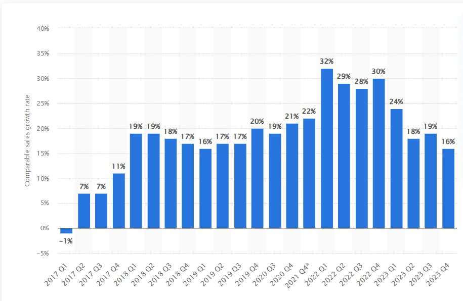
Comparable sales growth of Lululemon worldwide from 2017-2023 by Quarter
Net income of Lululemon worldwide from 2010-2023

Gross profit of Lululemon worldwide from 2010-2023

Key takeaways from Lululemon’s revenue & performance (2015-2024):
Lululemon’s revenue surged from $2.1 billion to over $8 billion, fueled by global expansion and a growing digital presence. The brand broadened its product line to include men’s apparel and home fitness while maintaining high gross margins through efficient operations. Community engagement and sustainability are central to its strategy, enhancing brand loyalty. However, increased competition and underperformance in its fitness tech offerings have required strategic pivots.
- Revenue growth and global expansion: Lululemon’s revenue surged from $2.1 billion in 2015 to over $8 billion in 2023, expanding from North America to Europe and Asia, particularly targeting the high-growth market in China. By 2023, digital sales accounted for around 40% of revenue as the brand enhanced its online platform.
- Community and brand loyalty: The Lululemon marketing strategy emphasizes direct customer engagement through controlled channels, enhancing brand loyalty and customer experience. Its community hubs and in-store activities foster deeper connections with consumers, encouraging repeat purchases.
- Operational efficiency and gross margins: Maintaining gross margins of 55-60%, Lululemon’s premium positioning and streamlined supply chain helped it navigate pandemic-related disruptions in 2020 and 2021, emerging stronger through increased supply chain resilience.
- Strategic innovation and technology investments: The brand invested in omnichannel capabilities, including curbside pickup and virtual shopping experiences, boosting customer convenience and sales.
- Sustainability initiatives: Lululemon set ambitious sustainability targets to reduce carbon emissions and incorporate recycled materials by 2025, responding to rising consumer demand for eco-friendly practices.
Lululemon’s business model
Lululemon has developed a unique business model centered on high-quality, stylish activewear and community-driven marketing strategies that target a health-conscious audience. By focusing on premium products, a strong community presence, and innovative marketing tactics, Lululemon has become one of the leading brands in the athleisure industry. Below are some key strategies driving the Lululemon marketing strategy.
- Direct-to-consumer model: Premium quality and personalized shopping experience: Lululemon operates a direct-to-consumer (DTC) model, giving it control over pricing, quality, and customer experience while fostering a personalized shopping environment.
- Community-based marketing – Building a loyal customer following: Lululemon builds customer loyalty through community-based marketing, including events, in-store classes, and the “Sweat Collective,” which offers discounts to fitness instructors.
- Innovative marketing – Leveraging social media and experiential content: The brand leverages social media and experiential marketing to promote an aspirational lifestyle. Through real customer stories and user-generated content, Lululemon fosters a sense of community.
- Product innovation and expansion: Lululemon invests in product innovation, expanding beyond yoga apparel into men’s activewear and personal care items.
- Sustainability initiatives – Building brand love for environmental responsibility: Sustainability is integral to Lululemon’s brand, with initiatives like “Be Planet,” focusing on reducing waste and using sustainable materials. The “Like New” program promotes sustainable consumption by allowing customers to trade in used items for credit, resonating with eco-conscious consumers.
- Global expansion strategy – Increasing market presence: Lululemon has successfully expanded beyond North America into Asia, Europe, and Australia, adapting its marketing and products to local preferences.
Digital marketing strategies of Lululemon
To grasp the essence of Lululemon’s digital marketing success, it’s essential to look at the distinct elements driving its online strategy across various platforms. From active social media engagement to targeted email campaigns and strategic paid advertising, Lululemon has crafted a powerful digital presence that resonates with its fitness-focused community. Let’s dive into how their social media initiatives are key to fostering strong connections with a diverse customer base dedicated to active and wellness-driven lifestyles.
Lululemon marketing strategy: Social media
What we liked:
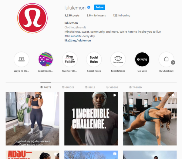
- Consistent branding and visual identity: Lululemon’s social media profile has a clear, consistent visual style, centered around their recognizable logo, clean design, and red color scheme. This branding consistency across posts and stories helps maintain brand recognition and appeals to their target audience, who expect a premium, cohesive aesthetic from the brand.
- Engaging content and community involvement: Lululemon uses hashtags like #thesweatlife, fostering a sense of community and encouraging followers to share their experiences. This hashtag strategy increases engagement and allows followers to feel more connected to the brand. Additionally, they highlight community events and user-generated content, which can inspire followers to participate and feel valued.
- Diverse content format with reels, guides, and stories: Their use of different Instagram features such as Reels, Guides, Stories, and traditional posts helps cater to varied consumption preferences. This mix not only keeps the content fresh but also leverages Instagram’s algorithm, as the platform rewards brands that utilize multiple content formats. Reels, in particular, can boost reach and engagement significantly due to Instagram’s prioritization of video content.
- Engagement with followers through meaningful conversations: Lululemon actively engages with followers in the comments, as seen in responses to customer queries and feedback on specific product posts (such as trail running shoes). This two-way communication demonstrates attentiveness to customer needs and adds a personal touch to the brand. Listening and responding to feedback, especially regarding product sizing or availability, is an effective strategy to build loyalty and show that the brand values customer input.
Lululemon marketing strategy: Email marketing
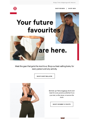
- Clear visual branding and consistent aesthetic: Each email maintains Lululemon’s recognizable brand style, with high-quality images, clean layouts, and a balance of active and lifestyle imagery. This consistent visual branding helps reinforce brand recognition and appeals directly to their target audience by showcasing relatable, aspirational lifestyles.
- Personalized and targeted messaging: The messaging in these emails, such as “Your future favorites” and “Just for you,” feels personal and tailored to the recipient. This approach helps increase engagement by making customers feel like the products are handpicked for them. Personalization in subject lines or introductory text is a proven strategy to improve open rates and clicks.
- Focused and simple CTAs (Calls to Action): Each automated email features simple, effective CTAs like “Shop Bestsellers” and “Shop Women’s Pants.” These CTAs are direct and actionable, reducing decision fatigue and making it easy for customers to know what to do next. Keeping the CTA clear and minimizing clutter is known to boost conversion rates.
- Effective use of social proof and product highlights: Lululemon emphasizes its best-selling and highly popular collections, such as the “Align Collection” and “Metal Vent Tech 2.0.” By highlighting collections that have a strong reputation, they leverage social proof to encourage purchases. This approach taps into FOMO (fear of missing out) and reinforces that these are trusted, popular choices.
- Responsive design with mobile optimization: The emails have a mobile-friendly layout, with vertically aligned elements, clear typography, and large buttons that are easy to click on smaller screens. Mobile optimization is essential for modern email marketing, given the high percentage of users who open emails on mobile devices. This design choice likely enhances the user experience across devices, improving engagement.
Lululemon marketing strategy: Paid ads

- Visual consistency and branding: Lululemon’s ads maintain strong brand consistency, emphasizing fitness and athleisure through clean imagery and recognizable branding. Repeating phrases like “lululemon® Europe – Official Site” enhances brand familiarity, increasing trust and click-through rates (CTR).
- Localized messaging: Using German text, such as “In denim Element,” demonstrates effective localization for local audiences. However, some ads include English alongside localized headlines, which may create inconsistency. Lululemon could improve by ensuring consistent language usage in specific regions.
- Ad copy analysis: The copy creates a sense of urgency with phrases like “Beat the rush” and highlights unique selling points like “must-haves” and “free delivery & returns.” While effective for attracting customers, the copy could be more personalized by emphasizing specific product benefits, such as sweat-wicking and mobility.
- Visual elements and product focus: The ads prominently feature clothing and accessories, showcasing texture and quality through close-up images. Including visuals of people using the products in dynamic settings could enhance emotional appeal and relatability.
- Call to action (CTA): While the CTAs are clear, they are somewhat generic. More specific CTAs, like “Shop Women’s Bestsellers” or urgency-based language such as “Limited Time Offer,” could strengthen user intent and increase CTR.
- Keyword targeting: The use of keywords like “Europe” and “lululemon® Tennis Gear” targets brand-related searches effectively. Incorporating long-tail keywords reflecting diverse customer intents, like “best workout clothes for winter,” could attract new customers.
- Seasonal focus: The ad copy targets holiday gifting, leveraging seasonal shopping trends. More targeted messages around specific holiday personas, such as “Gifts for Runners,” could better address distinct audience segments.
Analysis of Lululemon’s eCommerce strategy
Home page analysis:
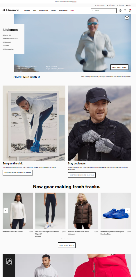
Things we liked:
- Hero banner and clear messaging: The hero banner with dynamic imagery and clear messaging (e.g., “Cold? Run with it.”) is highly effective. It immediately communicates product value and caters to the season, increasing relevance. The use of aspirational imagery of people actively engaging in outdoor activities effectively targets Lululemon’s core audience.
- Product highlights with clear CTA: The homepage efficiently uses a combination of imagery and text to guide users toward action. The “SHOP WHAT’S NEW” and “SHOP WOMEN’S RUNNING CLOTHES” buttons are prominently displayed, making navigation easy. The addition of seasonal descriptors such as “Bring on the chill” provides context, further enhancing the appeal to customers seeking solutions for winter running.
- Product variety display: The section labeled “New gear making fresh tracks” features a variety of products, which works well to cater to diverse customer needs. Offering a preview of multiple product types directly on the homepage is a great way to drive interest and increase average order value (AOV). The clear labeling and varied product categories here enhance the discovery process.
Things we didn’t:
- Lack of personalization elements: The visually appealing homepage lacks personalization features. Implementing tailored experiences, like product recommendations based on browsing behavior, could enhance engagement and boost return visits.
- Limited focus on social proof: The homepage is missing social proof elements, such as customer reviews or testimonials. Adding testimonials or customer images could significantly impact sales.
- No emphasis on user-generated content (UGC): The site could better utilize user-generated content. A dedicated section for customer photos tagged with “#Lululemon” could foster engagement, especially among younger demographics.
- Missed opportunity for visual hierarchy in lower sections: The lower sections lack visual hierarchy, causing product cards to blend and potentially leading to decision fatigue. Structuring content with distinct visual breaks could improve navigation and help users find relevant information more easily.
- Absence of trust signals for first-time shoppers: The homepage lacks trust-building elements, such as secure payment badges or satisfaction guarantees. These signals are crucial for reducing bounce rates and can boost conversions.
Category page analysis:
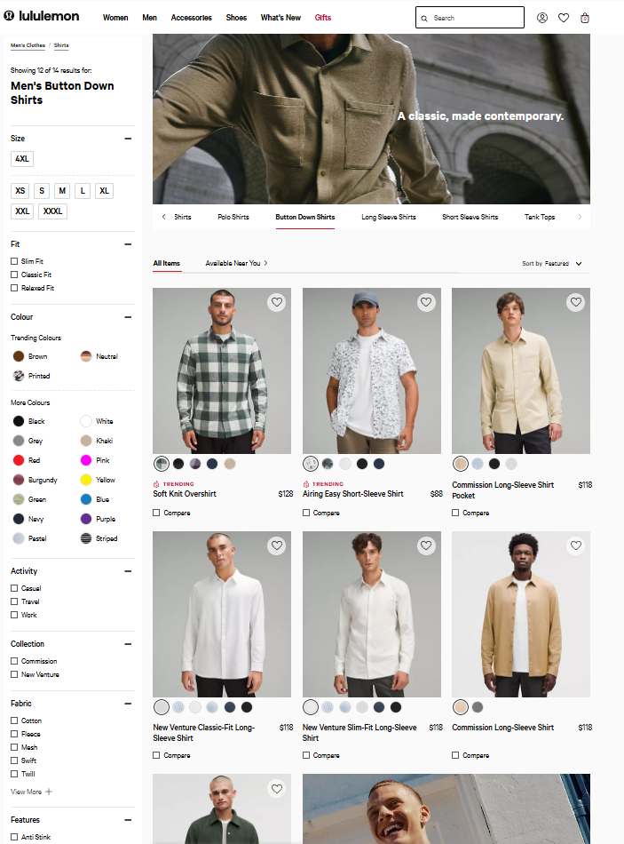
Things We Liked:
- Effective filtering options: The category page offers detailed filtering options for size, color, fit, activity, collection, fabric, and features, enhancing the browsing experience.
- “Trending” label: A “Trending” tag on products like the “Soft Knit Overshirt” highlights popular items, increasing conversion likelihood.
- Visual appeal and consistency: High-quality, consistent product imagery aligns with Lululemon’s minimalist brand aesthetic. Uniform images reduce cognitive load, making comparisons easier, while lifestyle shots add visual interest without overwhelming the page.
- “Compare” feature: The “Compare” checkbox allows customers to evaluate multiple items side by side, adding value for indecisive shoppers.
Things we didn’t:
- Lack of reviews and ratings: The category page does not display product ratings or reviews, which are crucial for first-time buyers. Studies show that adding star ratings can increase conversions.
- Limited call to action (CTA) variation: Current product tiles mainly feature “Add to Wishlist” and “Compare” CTAs. Including a prominent “Add to Cart” button could expedite purchases for users ready to buy, potentially increasing conversions, especially among loyal customers.
- Missing personalization or “recently viewed” section: The absence of personalized elements, like “Recommended for You” or “Recently Viewed,” limits user engagement.
- Overwhelming filter options Without Categorization: While the filtering options are extensive, they may overwhelm users. Organizing filters into collapsible sections could create a cleaner interface.
- Absence of value proposition or incentives: The category page lacks indications of incentives like free shipping or easy returns. Including these trust signals can ease decision-making for new customers.
Product page analysis:
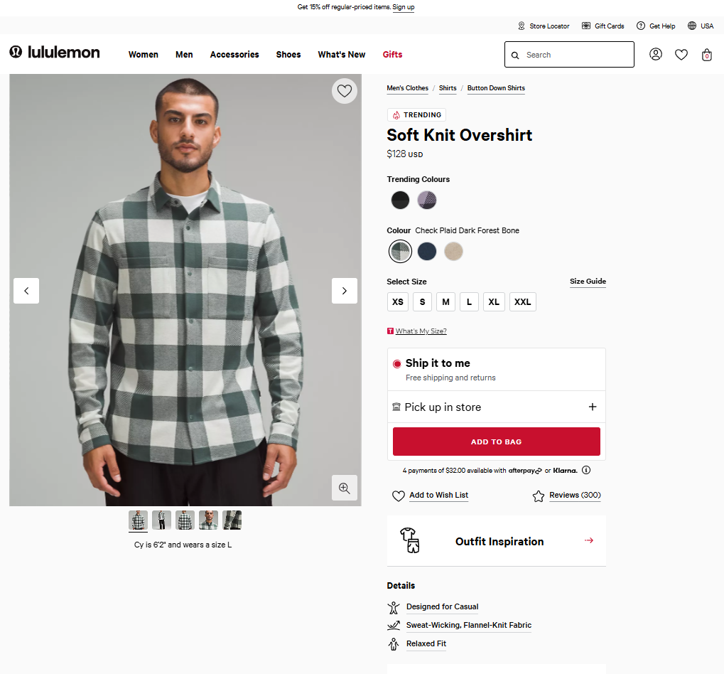
Things we liked:
- Comprehensive product presentation: The product page features high-quality images from multiple angles, allowing users to get a complete view of the product. The ability to zoom in enhances this feature, giving users a better sense of the fabric and quality.
- Detailed size information: Including a “What’s My Size?” guide alongside the size selector is highly beneficial, reducing size-related friction. Fit-related uncertainty is one of the major reasons for cart abandonment in apparel, and providing size guidance has been shown to reduce returns and improve conversion rates significantly.
- Multiple purchase and delivery options: The product page offers options for “Ship it to me” and “Pick up in-store.” These fulfillment choices cater to a variety of customer preferences, enhancing convenience and flexibility.
- Payment flexibility: Lululemon offers installment payment options such as Afterpay and Klarna. This is a strong tactic, especially for premium-priced items, to make the purchase more approachable.
- Social proof through reviews: Displaying a review count (300) prominently on the product page is an effective way to establish social proof. Customer reviews have a major influence on purchase decisions.
Things we didn’t:
- Lack of urgency or scarcity messaging: The product page does not utilize urgency or scarcity indicators like “Limited stock available.” Implementing these cues can create FOMO and improve conversion rates by encouraging immediate action.
- No customer photos or user-generated content: The absence of customer-uploaded images limits trust and visualization.
- Absence of clear product differentiation: While the page includes generic product details, it lacks unique selling propositions (USPs) that highlight how the item stands out from others. Emphasizing distinct features can help customers understand its value.
- Limited trust signals for new shoppers: There is no mention of a return policy or secure checkout, which can deter first-time buyers. Adding trust signals like “Free returns within 30 days” can build confidence and improve conversion rates.
- Insufficient personalization elements: The product page lacks personalization features like “Recommended Products” or “Recently Viewed Items.” Incorporating these could enhance cross-selling opportunities.
Checkout page analysis:

Things we liked:
- Clear order summary and payment options: The checkout page features an easy-to-read order summary with item prices, shipping, and tax details. It includes multiple payment options like “Checkout” and “PayPal,” which can reduce friction and boost conversion rates.
- Attention-getting alert to prevent cart abandonment: The message “Attention: your items are not held. Check out securely now.” creates urgency, effectively reminding customers to complete their purchases.
- Guest checkout option via PayPal: The “PayPal” button enables guest checkout, making the process quicker for users who don’t want to create an account.
- Free shipping and returns highlighted: Prominently stating “Free Shipping + Free Returns” builds consumer confidence and encourages purchases.
- Option to save items for later: The “Save for Later” feature allows customers to set aside items for future consideration, serving as a reminder to complete their purchases and enhancing retention.
Things we didn’t:
- No trust signals on payment security: The checkout page lacks trust badges or secure payment assurances. Adding elements like “Secure Checkout” or recognized security logos can enhance customer confidence.
- Lack of clear progress indicators: There’s no progress indicator showing the current step in the checkout process. A progress bar can reduce anxiety and decrease checkout abandonment.
- No cross-sell or up-sell opportunities: The checkout page misses opportunities for cross-selling or upselling. Including suggestions for complementary products can boost average order value (AOV).
- Absence of loyalty program integration: There’s no reminder of Lululemon’s membership benefits during checkout. Highlighting perks like discounts and exclusive access can encourage sign-ups.
How ContactPigeon’s retail CDP could assist Lululemon’s growth
Here are some tailored proposals on how ContactPigeon’s Customer Data Platform (CDP) could amplify Lululemon’s marketing strategy:
- Personalized omni-channel engagement: Lululemon can use ContactPigeon’s CDP to unify customer data from in-store, online, and mobile interactions, enabling personalized experiences and targeted promotions based on individual behaviors, such as workout preferences and shopping history.
- Dynamic customer segmentation for targeted launches: Advanced segmentation tools allow Lululemon to group customers by interests and purchase behavior, facilitating precise targeting during new product launches, and enhancing engagement with collections like yoga and running gear.
- Automated customer journeys: ContactPigeon’s CDP can create tailored customer journeys based on workout preferences. For example, yoga buyers would receive content related to wellness and yoga gear, while runners get targeted running-related recommendations, boosting repeat purchases.
- Predictive analytics for retention: By utilizing predictive analytics, Lululemon can forecast future purchases and identify at-risk customers. This enables proactive re-engagement with personalized offers or exclusive access to new products, enhancing retention and customer lifetime value.
- Real-time campaign optimization: Real-time analytics from ContactPigeon’s CDP allow Lululemon to adjust marketing strategies based on customer behavior. For instance, if a jacket style gains popularity, Lululemon can quickly promote it to targeted segments, driving faster inventory turnover.
Lessons learned from the Lululemon marketing strategy
- Community engagement as a loyalty driver: Lululemon’s community-driven approach, hosting events like yoga classes and workshops, strengthens brand loyalty by transforming physical stores into community hubs. Retailers can enhance customer loyalty by fostering community engagement through in-store events and local partnerships.
- Omnichannel integration for seamless experiences: Integrating both online and offline channels ensures a cohesive customer experience. Lululemon’s omnichannel strategy, featuring initiatives like buy-online-pick-up-in-store (BOPIS), can serve as a model for providing a consistent and seamless shopping experience across all customer touchpoints.
- Direct-to-consumer (DTC) control: Prioritizing direct-to-consumer sales through their retail and eCommerce channels allows Lululemon to directly manage customer experiences and gather critical data. Retailers should consider expanding DTC efforts to maintain full control over the customer journey and collect valuable insights.
- Technological investments in customer experience: Utilizing technology, such as a user-friendly mobile app and the Lululemon Studio for at-home fitness, enhances the customer experience. Retailers should explore technological integrations that provide convenience and added value, ensuring customers have multiple ways to engage with the brand.
- Data-driven personalization: Lululemon’s targeted email marketing and personalized messaging, such as “Just for you,” boost engagement. Leveraging customer data to tailor communications and product recommendations can significantly increase open rates and conversions, enhancing overall customer satisfaction.
Build Lululemon Level Loyalty With Data, Community, and Menura AI
Select a Lululemon growth lever to see how ContactPigeon and Menura AI turn community signals, product affinity, and omnichannel behavior into automated journeys that lift repeat purchases and CLV.
Interesting statistics about Lululemon
- Revenue growth: Lululemon's net revenue reached approximately $9.6 billion in the fiscal year 2023, marking a 19% increase from $8.1 billion in 2022 (Source: Statista, Eightception).
- Store expansion: As of January 2024, Lululemon operated over 700 retail stores worldwide, with the majority located in the United States (about 350 stores), followed by China (nearly 130) and Canada (69) (Source: Statista, Eightception).
- E-commerce success: In 2020, Lululemon's direct-to-consumer (DTC) sales surpassed those from physical stores for the first time, with DTC accounting for over 50% of total revenue (Source: Statista).
- Workforce composition: The company employs around 38,000 people, with more than half based in the United States. Notably, a significant portion of its workforce is female (Source: Statista).
- Brand awareness in the UK: In the UK, Lululemon enjoys a brand awareness rate of 45% among sports and outdoor online shop users, with a loyalty rate of about 57% among those who have used their products (Source: Statista).
- Future projections: Analysts forecast that Lululemon's annual sales could increase by approximately 15% in the coming years, indicating continued growth potential in the athleisure market (Source: Statista).
Latest news about Lululemon
- Lululemon sees 34% revenue growth in China for Q2 2024 (global.chinadaily.com).
- Lululemon cuts guidance, misses sales estimates after botched product launch (CNBC).
- Fanatics boosting growth with branded and female-focused collabs (FashionUnited).
- Lululemon Athletica Inc (LULU) Shares Up 6.09% on Nov 1 (GuruFocus).
- Lululemon shop coming to Geneva Commons (ShawLocal).
Discover additional must-read reports about Lululemon
- Lululemon Athletica Inc. Strategic SWOT, PESTLE Analysis, and Financial Insight - Quaintel Research
- Lululemon Stock Rising After It Cut Guidance. This Is Why. - Barron’s
Interested in replicating the Lululemon marketing strategy?
Transform your retail strategy with ContactPigeon’s robust Customer Data Platform (CDP), designed to enhance omnichannel engagement, refine your customer segmentation, and drive sales through tailored marketing campaigns. Schedule a demo now to find out how our customized solutions can foster your business growth, similar to the success experienced by the Lululemon marketing strategy!


