Product pages have become one of the most important decision points in eCommerce, which is why the best product page examples in ecommerce are worth studying closely. They are where shoppers compare options, check details, judge trust, evaluate delivery, and decide whether a product is worth adding to the cart. Yet many retailers still treat PDPs as static information pages when they now need to work much harder across UX, personalization, SEO, mobile, and AI-assisted discovery.
Baymard’s latest product page UX benchmark found that 62% of mobile eCommerce sites have “mediocre” or worse product page UX performance, showing how much room there still is for improvement. In 2026, the very best product pages are not just visually polished. They remove doubt, answer practical questions, adapt to shopper intent, and turn product interest into measurable action across the customer journey.
What makes the best product pages in 2026?
The best product pages in 2026 do more than showcase a product, which is exactly why the best product page examples in ecommerce offer useful lessons for retailers. They help shoppers understand, compare, trust, and buy with confidence. That starts with above-the-fold clarity: a clear product title, price, CTA, variants, availability, reviews, and delivery promise should be easy to spot immediately. Strong product pages also use richer media, including images, video, 360 views, AR, scale shots, model photography, and UGC, to make the product feel easier to evaluate before purchase. Just as importantly, they support decisions with comparison tables, size guides, ingredients, specs, compatibility details, and FAQs.
Baymard’s product-page research gives several practical topics to weave into this section, including visible size selectors, in-scale images, human-model images, guest wishlists, price-per-unit, total order cost estimates, and return-policy visibility. In 2026, the best product pages also need to reduce risk through reviews, guarantees, return policies, payment options, security signals, and clear delivery dates. They should be mobile-first, with sticky CTAs, thumb-friendly variant selectors, and compressed content sections that make browsing easier on smaller screens. Beyond UX, high-performing pages also need strong SEO and AI readiness, from Product schema, Merchant listings, Product variants, and return or shipping markup to conversational product guidance, guided selling, and natural-language PDP Q&A for AI-assisted product discovery. Finally, every key element should be testable, including CTA copy, media order, review placement, delivery messaging, bundles, and recommendation blocks.
The 2026 PDP conversion stack
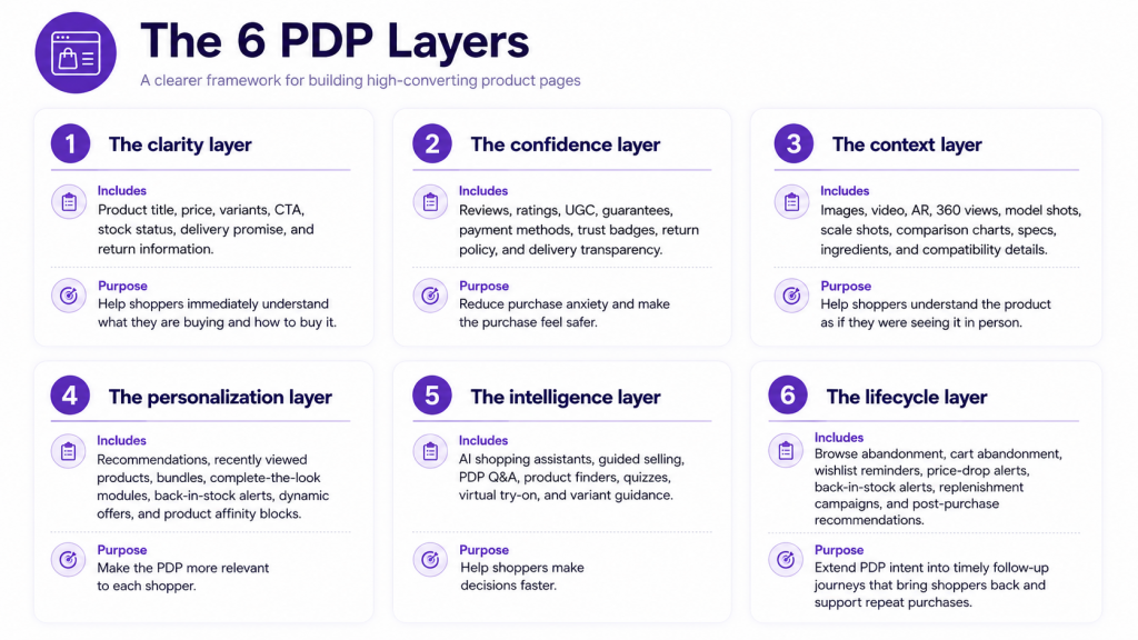
A high-performing product page is built in layers, not just blocks of content. Each layer plays a different role, from helping shoppers understand the basics to building confidence, adding context, personalizing the experience, and turning product interest into action after the visit. The table below breaks down what each layer includes and why it matters for eCommerce product pages in 2026.
Why product pages are now personalization surfaces
Product pages are no longer static pages that only display product information, and the best product page examples in ecommerce show how much more strategic they have become. In 2026, every interaction on a product page can reveal something useful about shopper intent, preference, hesitation, or urgency. A product view, variant selection, color choice, size click, review filter, size guide visit, video view, or delivery information click all help show what the shopper is trying to understand before making a decision.
These signals are especially valuable because they capture behavior at the point where interest is strongest. A shopper who opens the return policy may need reassurance, while someone who clicks a bundle or related product may be open to a higher-value purchase. An out-of-stock size selection, a wishlist click, an AI assistant question, or an abandoned add-to-cart can also indicate where the journey needs support. This is what turns the product page into a personalization surface, connecting on-page behavior with smarter recommendations, a stronger cart abandonment strategy, back-in-stock alerts, dynamic offers, and more relevant follow-up across email, SMS, push, and on-site messaging.
Best product page example #1: Amazon
Why we liked it:
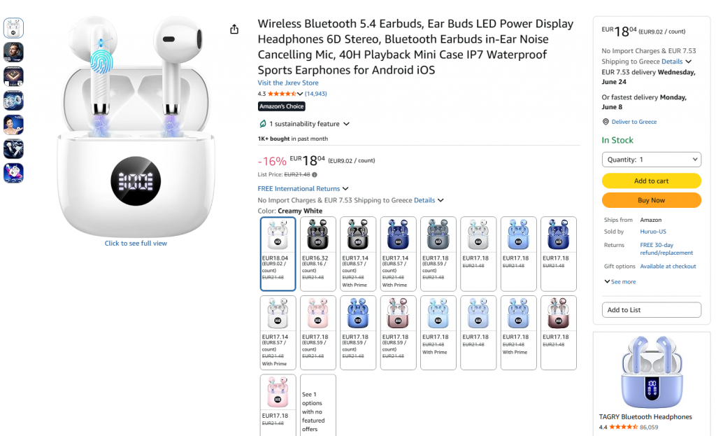
Amazon keeps the main decision-making details close to the buying area: product title, ratings, review count, price, delivery date, returns, color options, stock status, quantity selector, and CTA. The page also uses strong trust signals, including review volume, “Amazon’s Choice,” purchase activity, delivery information, and return details, helping shoppers evaluate the product quickly.
What to implement:
Keep the decision-making details visible early. Show price, reviews, delivery, returns, availability, and product options near the CTA, then use related products and comparison modules to support discovery and increase AOV.
Best product page example #2: Apple
Why we liked it:
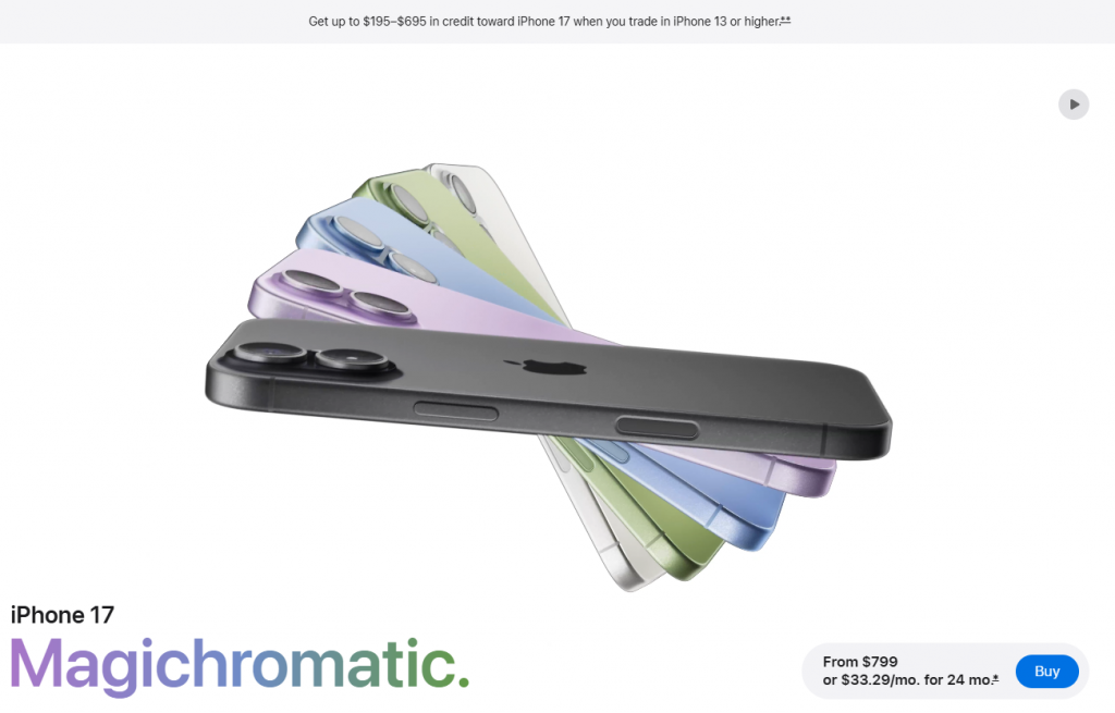
Apple turns a high-consideration product page into a guided product journey. The page uses strong visuals, clear feature highlights, color exploration, pricing visibility, and a simple buy path to help shoppers understand the product before choosing a configuration. For products with multiple models, colors, storage options, payment plans, and trade-in choices, this reduces friction and makes the decision feel easier.
What to implement:
Use a guided PDP flow when products have multiple variants, plans, bundles, or add-ons. Keep visuals, key benefits, pricing, and configuration steps connected, so shoppers can explore the product and make choices without feeling overwhelmed.
Best product page example #3: Nike
Why we liked it:
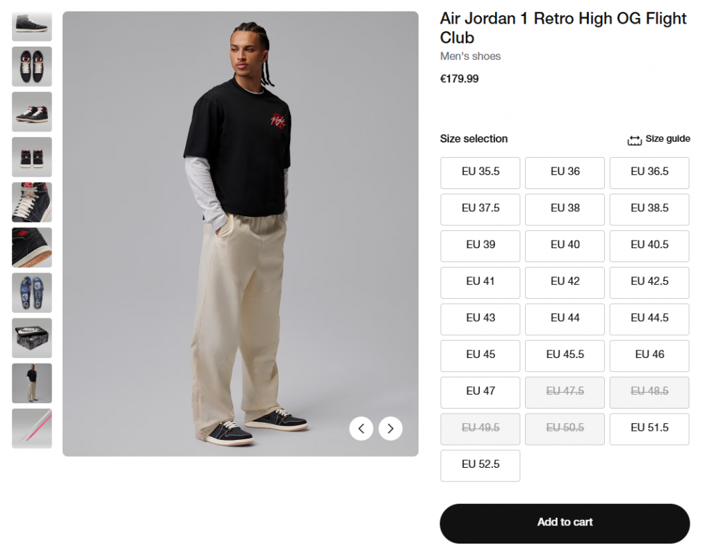
Nike makes the product easy to evaluate with strong lifestyle imagery, close-up shots, size availability, a visible size guide, and a clear add-to-cart path. The page also supports discovery through wishlist behavior, styling context, and “How Others Are Wearing It,” helping shoppers imagine the product in real use.
What to implement:
For fashion, sportswear, accessories, and beauty brands, use lifestyle images, UGC, size guidance, and “Complete the Look,” “Pairs well with,” or “Shop the routine” modules. These elements help shoppers validate the product and discover complementary items without interrupting the buying flow.
Best product page example #4: Gymshark
Why we liked it:
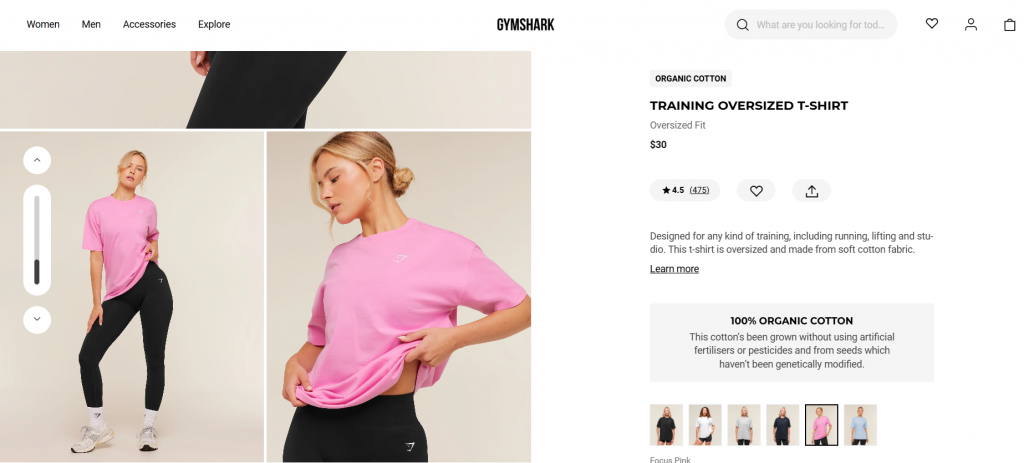
Gymshark makes the product easier to judge before purchase with strong model photography, close-up visuals, fit information, color options, ratings, and a clear product description. The page also highlights material quality, such as the organic cotton callout, helping shoppers understand both how the item looks and what it is made from.
What to implement:
Do not rely only on flat product images. Show the product on real models, include close-up fabric shots, highlight fit and material details, and place reviews or ratings close to the decision area to build confidence.
Best product page example #5: Target
Why we liked it:
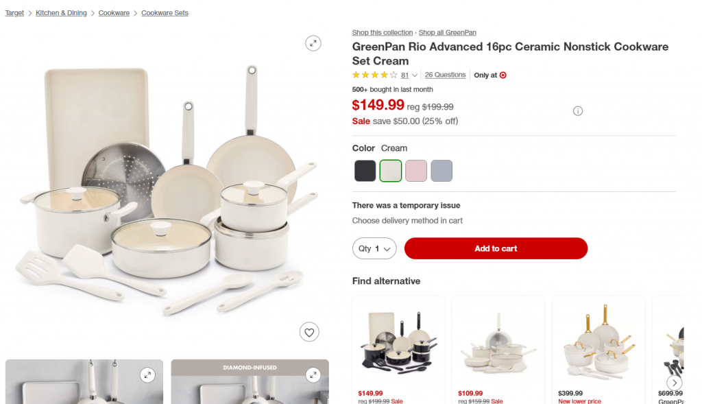
Target combines clean product photography with lifestyle and detail images that help shoppers understand what is included, how the cookware looks in use, and which features matter. The page also keeps key decision signals visible, including reviews, questions, sale price, color options, availability issues, alternatives, payment options, and wishlist or registry actions.
What to implement:
Blend brand photography, lifestyle visuals, feature callouts, and customer-style proof inside the PDP experience. When a product is unavailable or limited, show clear alternatives, delivery or payment options, and comparison-friendly product suggestions instead of letting the shopper hit a dead end.
Best product page example #6: The Ordinary
Why we liked it:
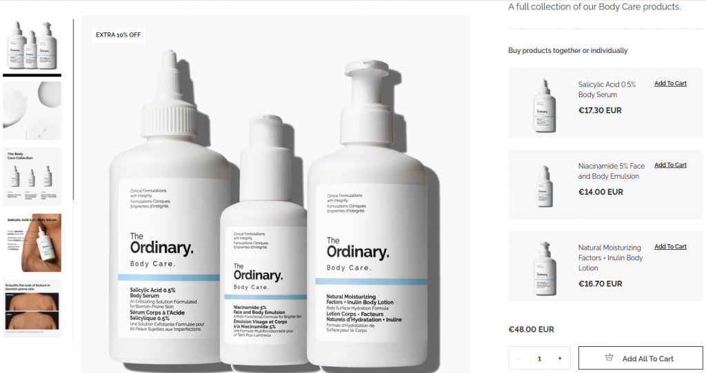
The Ordinary makes a more technical skincare purchase easier to understand by combining clear product visuals, ingredient-led positioning, before-and-after content, and bundle buying options. The page also lets shoppers buy the full collection or individual products, which supports both education and higher basket value.
What to implement:
For skincare, supplements, electronics, appliances, or any complex category, use ingredient or spec breakdowns, usage guidance, FAQs, before-and-after visuals, and AI-assisted support. When products work well together, let shoppers buy individually or add the full routine, kit, or bundle in one step.
Best product page example #7: Warby Parker
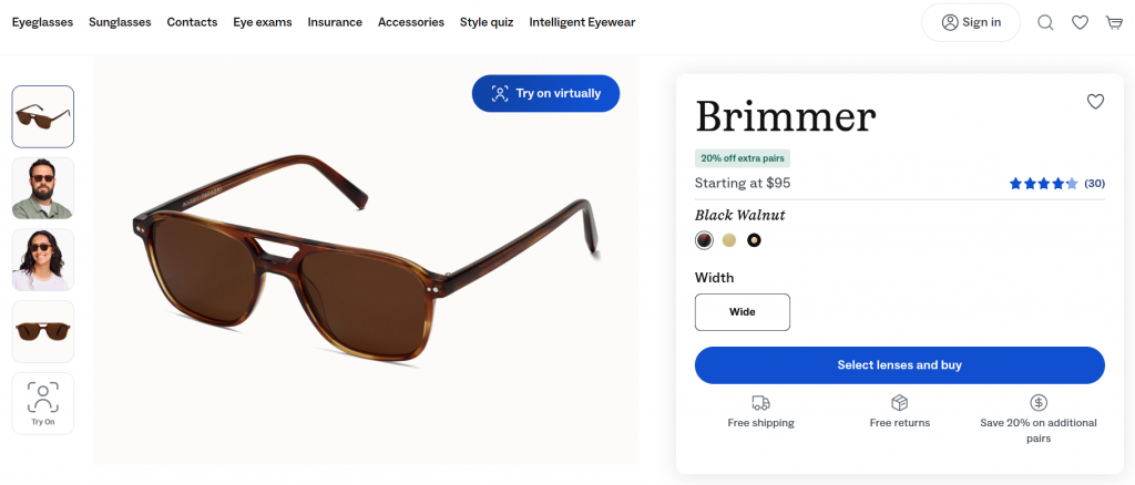
Why we liked it:
Warby Parker reduces purchase anxiety by making virtual try-on part of the main product experience. The page also keeps key reassurance points close to the buying area, including free shipping, free returns, lens inclusions, reviews, width selection, and clear pricing.
What to implement:
When shoppers need to “try before they buy,” use virtual try-on, AR, model selectors, size simulation, or interactive visualization. Pair it with clear pricing, returns, shipping, and product-inclusion details so customers feel safer buying online.
Best product page example #8: Lush
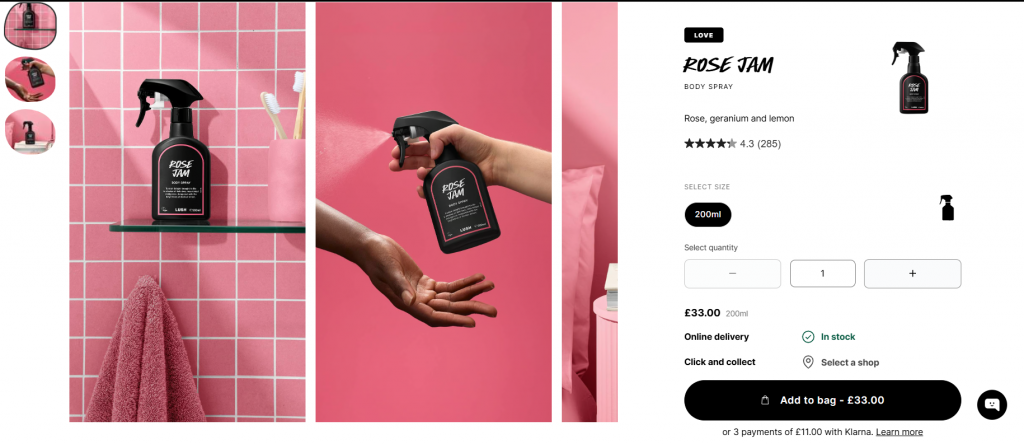
Why we liked it:
LUSH uses the PDP to explain more than the product itself. The page combines bold lifestyle imagery, scent notes, vegan badges, usage information, ingredients, reviews, and related discovery sections to help shoppers understand the product and the brand values behind it.
What to implement:
Use PDPs to educate when your product depends on ingredients, sustainability, sourcing, fragrance notes, or usage rituals. Add clear badges, how-to-use sections, ingredient details, reviews, and related products so shoppers can understand both the product and the reason to buy.
Best product page example #9: Allbirds
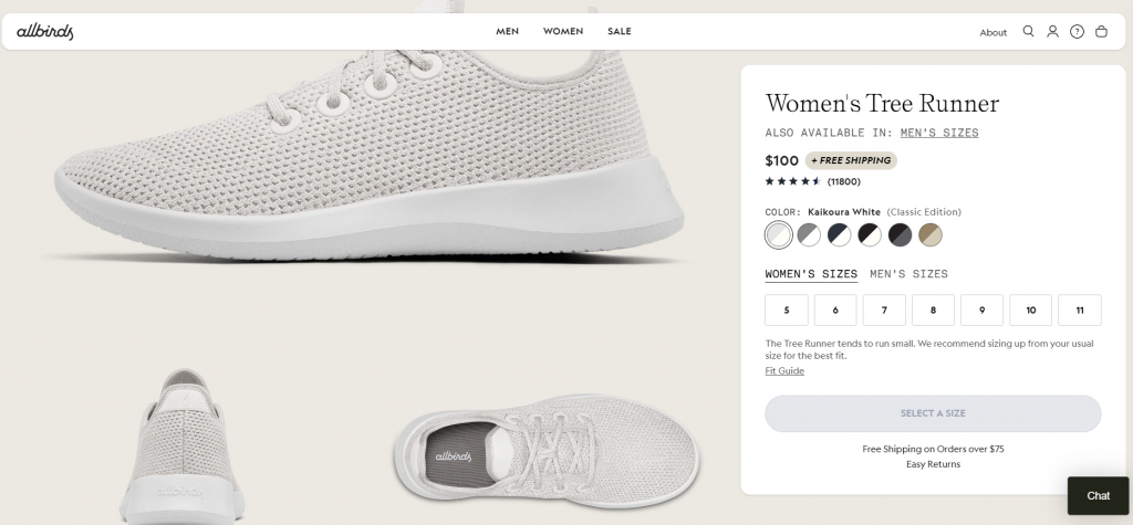
Why we liked it:
Allbirds keeps the buying decision simple with clear pricing, reviews, color options, size selection, fit guidance, free shipping, easy returns, and a visible CTA. The page also supports deeper consideration with material details, sustainability messaging, technical information, and use-case tags like traveling, walking, commuting, and everyday wear.
What to implement:
Make fit, comfort, materials, and sustainability easy to understand before checkout. For products with missing sizes or color options, use back-in-stock alerts or email capture to turn out-of-stock moments into future revenue opportunities.
Best product page example #10: Away
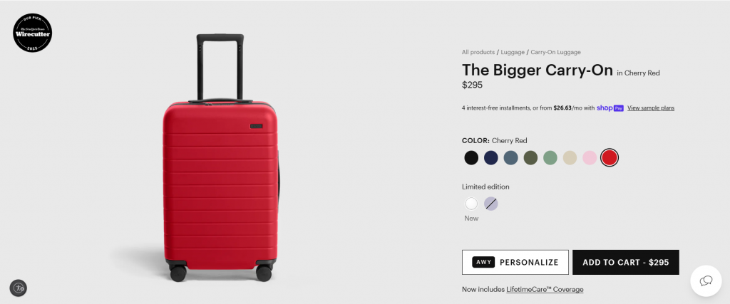
Why we liked it:
Away keeps a high-consideration product easy to understand with clear pricing, color options, personalization, payment options, and a strong add-to-cart path. The page also uses product visuals, feature icons, collapsible sections, warranty information, and compatibility details to answer practical questions without overwhelming the shopper.
What to implement:
Use expandable sections, option explainers, product Q&A, and feature callouts to reduce uncertainty around variants, sizing, durability, and warranty. For products with accessories or add-ons, include cross-sell modules that feel useful, like packing cubes, compatible accessories, or bundles.
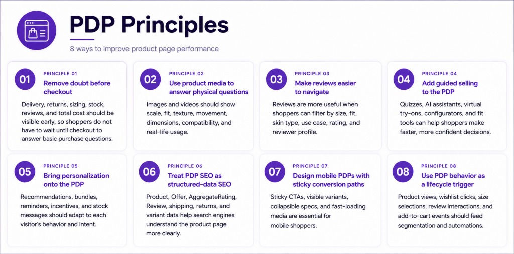
Key learnings from the best product page examples of 2026
The strongest product pages are designed to answer questions before they become objections, and the best product page examples in eCommerce prove how much this matters in 2026. From media and reviews to personalization, mobile UX, SEO, and lifecycle triggers, each PDP element should help shoppers move from interest to confident action.
Turning PDP intent into revenue
By 2026, the gap between a “browser” and a “buyer” will be closed by how intelligently a brand responds to real-time intent, a lesson clearly reflected in the best product page examples in eCommerce. While the CDP provides the foundational infrastructure, understanding a shopper’s size, price sensitivity, and category affinity, Menura AI is the conversational engine that brings that data to life on the Product Detail Page.
Instead of leaving shoppers to navigate complex specs or sizing charts alone, Menura AI acts as an on-page concierge. It transforms the PDP from a static display into an interactive commerce layer where customers can:
- Instantly Compare Variants: Understand the nuanced differences between models or styles without opening a dozen tabs.
- Solve the “Fit” Friction: Get personalized size recommendations based on their unique purchase history and real-time intent signals.
- Demystify Specs: Ask direct questions about ingredients, materials, or compatibility and get immediate, accurate answers.
- Build Bundles on the Fly: Dynamically create kits or “Complete the Look” sets that match their specific taste and budget.
Book a demo with ContactPigeon and discover how to turn every product view, wishlist click, and cart signal into a smarter customer journey.