As eCommerce continues to transform at an incredible speed, keeping your business ahead of the curve means looking to the industry’s leading websites for inspiration. By examining the very best home page examples of 2024, you’ll gain insights into proven eCommerce strategies that are driving results. After all, first impressions are crucial—94% of initial opinions of a website are influenced by its design, and a well-crafted design can increase the likelihood of exceeding business goals by 69%. (Go Globe)
This article highlights the most outstanding home pages in eCommerce so far this year, helping you understand what sets these examples apart and how you can apply similar strategies to your own online store. Unlike other lists, this guide doesn’t just showcase pretty websites; it dissects the critical elements that make these home pages convert and succeed, giving you a competitive edge in optimizing your own site.
Best home page example #1: Lululemon

Why we liked it:
- Highly visual product display: Lululemon uses high-quality, lifestyle-focused images that emphasize its apparel in real-world settings. Visual storytelling is essential for engaging customers, especially in fashion. It taps into the consumer’s desire for a product and an experience that aligns with brand identity.
- Product categorization and navigation: The homepage likely features intuitive navigation with clear categories such as “Men,” “Women,” “New Arrivals,” and “Best Sellers.” Well-organized categories make it easier for users to locate products and provide a frictionless shopping experience. Clear navigation is proven to reduce bounce rates and improve conversions.
- Prominent “Call to Action” and sales events: Lululemon often places visible “Shop Now” buttons alongside promotional banners for seasonal collections or special discounts. These CTAs help users move quickly from browsing to purchase, capitalizing on promotional urgency.
- Mobile-first interface: Given that Lululemon’s demographic is highly active and mobile-focused, their homepage is optimized for mobile, ensuring smooth, fast-loading experiences. Mobile-first design directly correlates with improved SEO and higher mobile conversion rates.
- Community engagement features: Lululemon is known for its community-based marketing, often featuring user-generated content (UGC) or collaborations with influencers and fitness enthusiasts on its homepage. Social proof is a powerful tool that enhances brand credibility and authenticity.
Best home page example #2: home24

Why we liked it:
- Clear value proposition: The homepage immediately communicates the brand’s focus on home and living products, which is critical for first-time visitors. A clear value proposition improves conversion rates, as customers quickly understand what the site offers.
- Multi-language and international support: The homepage is multilingual, with localized options for various countries, enhancing accessibility and user experience globally.
- Responsive and minimalist design: The site employs a simple, responsive design with minimal distractions, focusing on a clean user interface. This ensures a seamless experience across devices.
- SEO and content structure: The homepage uses concise headers and structured sections, which enhance search engine optimization (SEO). Well-structured websites rank higher on search engines.
Best home page example #3: Zalando

Why we liked it:
- Personalized navigation: The homepage is segmented by customer demographics (Women, Men, Kids), streamlining user journeys and reducing cognitive load. According to Baymard Institute, personalized navigation improves the browsing experience, increasing conversions.
- Social proof and brand authority: Featuring top brands (Nike, Adidas, etc.) reinforces credibility and meets customer expectations. Nielsen reports that brand familiarity is crucial for 60% of consumers when making online purchases.
- User engagement through interactive features: Options to follow brands and create style profiles encourage personalization, increasing customer loyalty. Personalization can increase revenue by up to 15%, as per McKinsey.
- Mobile optimization: The homepage is well-optimized for mobile devices, ensuring seamless access across platforms. Google states that 53% of mobile users abandon sites that take over three seconds to load, highlighting the importance of mobile speed and usability.
Best home page example #4: Macy’s

Why we liked it:
- Prominent sales and promotions: Macy’s strategically highlights major promotions and sales creating urgency and encouraging conversions. Promotions are shown at the top of the homepage, drawing immediate attention and fostering impulse purchases, a tactic that can increase average order value (AOV) and reduce cart abandonment.
- Personalized and segmented shopping experiences: Macy’s uses customer data to offer tiered loyalty benefits, like free shipping for Macy’s Star Rewards members. Segmenting customers into different tiers, such as Platinum, Gold, Silver, and Bronze, provides personalized incentives, which enhances customer retention and lifetime value (CLV).
- Omnichannel fulfillment options: The homepage promotes flexible delivery and pickup options, including same-day delivery, buy online pick-up in-store (BOPIS), and curbside pickup. Offering multiple fulfillment methods is crucial in modern retail, where convenience plays a pivotal role in customer satisfaction and can significantly increase conversion rates.
- Clear and accessible navigation: Macy’s homepage features intuitive and comprehensive navigation menus that categorize products effectively, from clothing to home goods. The layout is clean, and the drop-down menus help users quickly locate items, reducing friction in the buying journey. Studies show that efficient site navigation is directly linked to higher conversion rates.
Best home page example #5: Adidas

Why we liked it:
- Dynamic personalization: The homepage leverages targeted content based on user preferences and browsing history. Personalization is critical.
- Social proof with reviews and ratings: Product ratings are easily visible, instilling trust and reducing decision-making time, which increases the likelihood of purchase.
- Efficient product search & filtering: Advanced filtering options streamline the shopping experience, improving usability and increasing average order value (AOV) by helping users find products faster.
- Seamless user experience: Fast page loading times and intuitive navigation reduce bounce rates, a critical factor as 53% of users abandon a site that takes longer than 3 seconds to load.
Best home page example #6: Crate and Barrel

Why we liked it:
- Personalized shopping experience: The site integrates location-based services, showing shipping details based on zip codes and offering information about local stores. Personalized recommendations enhance customer engagement, a proven tactic for conversion optimization.
- Promotions and Financing: The display of offers like “Up to 30% off” and financing options on the header makes incentives immediately visible, which increases the average order value and motivates higher spending.
- Visual merchandising and free shipping prominence: Free shipping highlights specific categories like pillows or rugs reducing abandonment risk. Visual merchandising for seasonal collections is highly appealing and helps in directing traffic to high-margin products.
- Mobile optimization and app integration: With dedicated mobile app promotion and an optimized mobile interface, Crate & Barrel meets omnichannel customer expectations, catering to mobile-first shoppers, which is crucial for modern eCommerce.
- Content-rich pages: By including lifestyle content like design services and product-focused blog posts (e.g., recipe suggestions for cookware), the site integrates rich content to build emotional engagement and improve time-on-site metrics.
Best home page example #7: GAP

Why we liked it:
- Free shipping thresholds: The site prominently displays free shipping over €50 within Greece. This incentivizes larger basket sizes, reducing cart abandonment.
- Streamlined returns process: Offering free returns through a designated courier simplifies the return process, enhancing customer trust.
- Localized content: The homepage uses both Greek and English, catering to local and international audiences, and improving user experience.
- Prominent category navigation: A well-structured menu allows quick access to product categories, ensuring minimal friction in product discovery. This is a key factor in lowering bounce rates.
Best home page example #8: Marks & Spencer

Why we liked it:
- Personalized content and segmentation: The homepage dynamically adjusts based on user browsing behavior, offering personalized product recommendations, and driving higher engagement and conversions.
- Optimized visual hierarchy: The layout emphasizes key categories and promotions through well-placed banners and highlighted call-to-action (CTA) buttons, optimizing the user journey. The clear hierarchy aligns with usability principles, reducing cognitive load and guiding users smoothly from discovery to purchase.
- Fast load times and performance optimization: The site prioritizes quick load times by optimizing images and caching. This is crucial for enhancing user satisfaction and increasing retention.
- Trust signals and social proof: Key trust elements, such as customer reviews and clear return policies, are easily visible on the homepage. By displaying these prominently, Marks & Spencer reduces purchase anxiety, leveraging trust as a critical factor in conversion optimization.
Best home page example #9: Nike

Why we liked it:
- Personalization and segmentation: Dynamic content adapts to user preferences, offering tailored product suggestions (e.g., based on gender or sport). Personalized experiences improve engagement and conversion.
- Clear CTA placement: Bold, action-oriented calls-to-action (e.g., “Shop Now”) strategically placed above the fold, driving immediate user interaction.
- Rich visual media: High-quality product imagery and videos enhance product understanding, reducing return rates.
- Trust signals: Visible membership benefits and guarantees increase customer confidence, a known driver of eCommerce success.
Best home page example #10: Netflix

Why we liked it:
- Simplified user onboarding: The homepage prominently displays a clear and direct Call-to-Action (CTA) encouraging users to start their subscription immediately, reducing friction. Netflix simplifies registration by asking for minimal information upfront, motivating users to engage in the service as quickly as possible without unnecessary steps.
- Data-driven personalization: Netflix uses personalized recommendations and leverages machine learning algorithms to customize content, similar to how eCommerce platforms recommend products based on browsing history or past purchases.
- Minimalist design for enhanced usability: Netflix’s clean, uncluttered design with ample white space ensures that users can navigate without distractions. By focusing on usability and reducing cognitive overload, Netflix keeps users focused on content consumption and engagement.
- Transparency that boosts trust: Netflix communicates its pricing and cancellation policies upfront. By minimizing hidden information, Netflix builds trust—a key principle in eCommerce conversions.
- Urgency creation: Netflix frequently highlights its free trial offer on its homepage, creating a sense of urgency for users to sign up. This mirrors limited-time offers (LTOs) and discounts commonly used in eCommerce to drive conversions.
Best home page example #11: American Eagle

- Clear CTAs and promotions: Prominent banners highlighting sales immediately capture attention, guiding users toward deals. Timely offers are critical for driving conversions, especially in retail.
- Mobile-first design: The site offers seamless mobile navigation, a must-have for today’s shoppers, as mobile traffic dominates retail. Responsive design boosts user experience and conversions.
- Personalized content sections: Segmented shopping paths guide users quickly, reducing friction and catering to specific audiences—improving user satisfaction.
- Intuitive navigation: The drop-down menus and categorized shopping paths simplify product discovery, aligning with research that shows reducing clicks improves conversion rates.
Best home page example #12: Urban Outfitters

Why we liked it:
- Visual hierarchy and lifestyle imagery: Urban Outfitters often uses high-quality, large images that showcase their products in a real-world, lifestyle context. This appeals emotionally to users and has been proven to increase engagement and conversion rates, especially among younger demographics.
- Category navigation and personalization: The site uses intuitive navigation with a clear categorization of products. Categories such as “New Arrivals” and “Best Sellers” are prominently featured, which guides users to the most desirable products without needing to search extensively. Personalization elements drive repeat purchases and improve user retention.
- Limited-time offers and urgency triggers: Urgency triggers align with behavioral psychology principles such as FOMO (Fear of Missing Out), effectively increasing conversion rates, particularly in the fast-fashion sector.
- Simplified checkout and fast load times: A clean, accessible user interface that minimizes the steps to checkout is vital. Urban Outfitters likely employs this strategy, as streamlining the checkout process has been shown to reduce cart abandonment.
- User-generated content: Urban Outfitters’ use of reviews, ratings, and user-generated content (e.g., photos tagged from social media) likely builds trust and increases purchase confidence. This aligns with the growing consumer preference for authenticity over brand-generated content.
Best home page example #13: Target

Why we liked it:
- Scarcity tactics: Offers and limited-time deals are strategically placed. Studies show that these tactics, such as flash sales, enhance conversion rates by tapping into FOMO (fear of missing out).
- Omnichannel integration: The site emphasizes seamless pickup and delivery options. Offering omnichannel services significantly improves customer satisfaction and drives repeat business.
- Seasonal themes: Seasonal promotions like Halloween costumes and fall decor cater to timely consumer needs. Forbes recommends dynamic, timely content as a way to boost relevance and sales during peak periods.
- Streamlined navigation: Categories and deals are easy to locate, ensuring users can browse with minimal friction. Clear, intuitive navigation is critical for reducing bounce rates and improving user experience.
Best home page example #14: Grammarly

Why we liked it:
- Clear value proposition: The homepage immediately highlights its core value—AI writing assistance—paired with a strong “Sign Up, It’s Free” CTA. This clear messaging aligns with conversion optimization strategies that emphasize simplicity and clarity.
- Trust signals: Grammarly prominently displays logos of well-known companies that use its product (e.g., Zoom, Atlassian). This builds trust, leveraging brand association—a proven method for increasing credibility and conversions.
- Transparency: Offering multiple pricing plans (Free, Pro, Enterprise) is a best practice for appealing to different customer segments. Clearly showing the benefits of each plan and the cost breakdown (e.g., monthly vs. yearly) enhances decision-making.
- Personalization: The homepage highlights benefits tailored to various business functions (e.g., customer support, marketing, IT). This personalized content marketing strategy increases engagement by aligning product features with customer pain points.
Best home page example #15: Etsy

Why we liked it:
- Targeted recommendations: Etsy provides dynamic, personalized product recommendations based on browsing behavior and user preferences. This approach leverages data to display items that resonate with the visitor, which can significantly enhance conversion rates.
- Product variety: Etsy’s homepage features large, high-resolution product images with clear “Add to Favorites” call-to-actions on hover. This emphasis on quality visuals supports the emotional appeal of handmade and unique products, which is a key selling point of Etsy.
- Responsive design: Etsy’s homepage adapts seamlessly to different screen sizes, offering an optimized mobile experience. Etsy ensures fast load times and easy navigation, aligning with Google’s mobile-first indexing which prioritizes mobile-optimized sites for better SEO ranking.
- User-generated content: Etsy effectively incorporates user-generated content (UGC), such as reviews, ratings, and testimonials on the homepage, creating trust and credibility. Featuring “Star Seller” badges and high review counts for products on the homepage capitalizes on social proof.
- Niche focus: Etsy’s homepage communicates its unique selling proposition (USP) — focusing on handmade, vintage, and unique products. This strong niche positioning sets it apart from mass-market competitors, enhancing brand loyalty.
Best home page example #16: Amazon

Why we liked it:
- Personalization best practices: Amazon’s homepage dynamically curates content for each user based on previous behavior, browsing history, and purchase patterns. This level of personalization increases engagement and conversion rates.
- Data-driven product recommendations: Amazon highlights the sections on its homepage by using collaborative filtering and real-time data. This upselling and cross-selling technique maximizes cart value.
- Search optimization: Amazon’s homepage utilizes a mega-menu with clear product categories and a prominent, auto-suggesting search bar. Search results are algorithmically fine-tuned to prioritize relevance, reducing friction.
- Dynamic marketing campaigns: Amazon uses the homepage to promote seasonal sales and limited-time deals with countdown timers, creating urgency and increasing impulse purchases. Limited-time offers trigger fear of missing out.
Best home page example #17: Zoom

Why we liked it:
- Clear value proposition: The homepage succinctly communicates Zoom’s core offerings—video, voice, and chat solutions—through a headline and subheading. This clarity addresses visitor intent directly, reducing cognitive load.
- Seamless navigation: The menu provides straightforward, minimalistic navigation that categorizes products intuitively without overwhelming visitors. This structure supports faster decision-making.
- Targeted messaging: The homepage detects location and offers relevant language options, demonstrating an understanding of diverse global users. This localization is key to engaging international clients.
- Customer-centric search functionality: An intuitive, prominent search feature allows users to find specific content quickly, particularly useful for B2B and SaaS markets where customers seek precise solutions.
Key learnings from the best home page examples of 2024
- High-quality visuals and lifestyle-focused imagery can significantly enhance customer engagement and convey brand identity effectively.
- Intuitive product categorization and clear navigation reduce bounce rates and improve user experience.
- Prominent calls-to-action (CTAs) and strategic promotions drive conversions by encouraging immediate action.
- Mobile-first design is essential for appealing to on-the-go shoppers and improving SEO.
- Incorporating social proof, such as user-generated content and customer reviews, builds trust and authenticity with customers.
- Personalized navigation and recommendations enhance the customer journey and increase loyalty.
- Clean, responsive design and minimal distractions ensure a seamless experience across devices, improving conversions.
- Clear value propositions help visitors quickly understand what a brand offers, improving engagement and retention.
Discover additional insightful resources for eCommerce website optimization
- The Very Best Category Page Examples in eCommerce (2024)
- 1018 Homepage Design Examples
- 54 eCommerce Homepage Best Practices That WORK [2024]
- Category Page Best Practices for eCommerce [2022]
- eCommerce Marketing Strategy: A Step-by-Step Guide for 2024
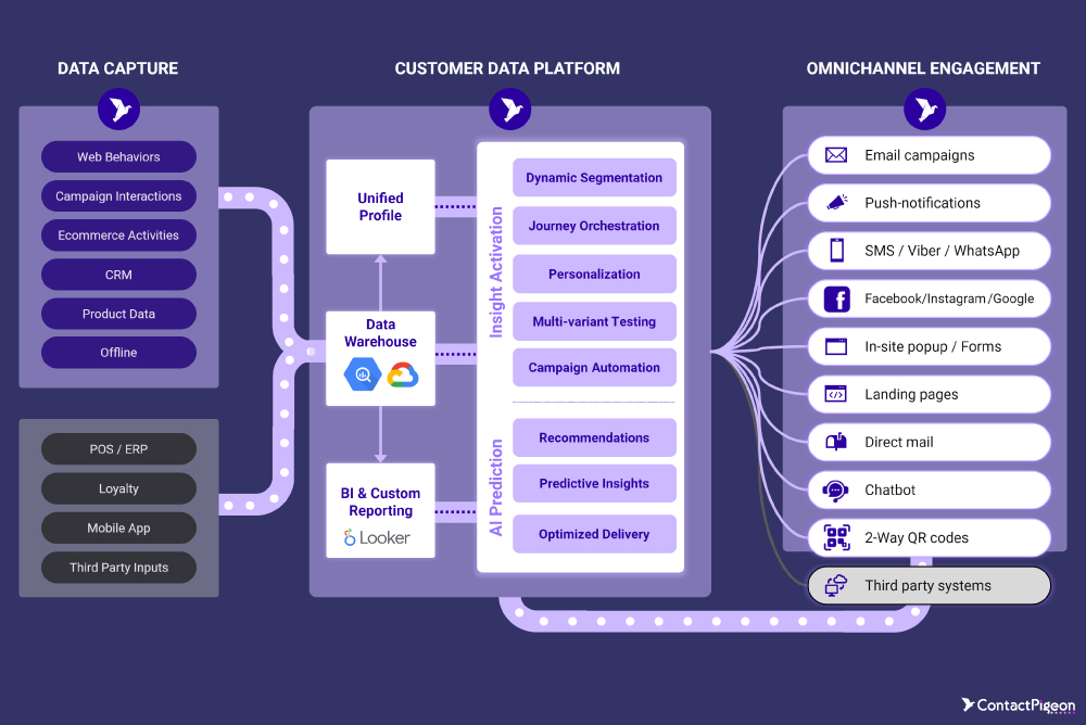
How to optimize a home page using a CDP

- Personalized content blocks: Use data from the CDP to dynamically display personalized content on the homepage, such as product recommendations, tailored offers, or content that aligns with individual customer preferences and browsing history. For instance, a returning customer interested in athletic wear might see promotions for new sports collections.
- Segment-specific promotions: Utilize customer segments within the CDP to create homepage banners and promotions tailored to different customer groups. For example, display special discounts for high-value customers or loyalty members, while showcasing entry-level offers to new visitors, thus increasing relevance and engagement.
- Localized experiences: Leverage geographic and demographic data to adapt the homepage content based on a visitor’s location. A CDP can enable you to promote region-specific deals, localized store information, or even language customization to make the homepage experience more relevant to each visitor’s context.
- Behavioral triggers for Calls-to-Action: Use customer behavior data from the CDP to tailor the calls-to-action (CTAs) on the homepage. For example, if the CDP identifies that a customer has abandoned their cart, the homepage could display a reminder with a direct link to complete their purchase or an exclusive discount as an incentive.
- Dynamic content testing and optimization: Implement real-time A/B testing for homepage elements using CDP data to identify the content that resonates best with specific customer segments. For instance, test different hero images or promotional messages for various audience segments and optimize based on conversion and engagement metrics.
Create your very best home page
In summary, the key elements that make an eCommerce homepage successful include personalized content, strategic CTAs, high-quality visuals, mobile optimization, and clear navigation. As you move into the execution and experimentation phase, consider applying these strategies and leveraging customer data to create a top-performing homepage that keeps your brand ahead of the competition.


