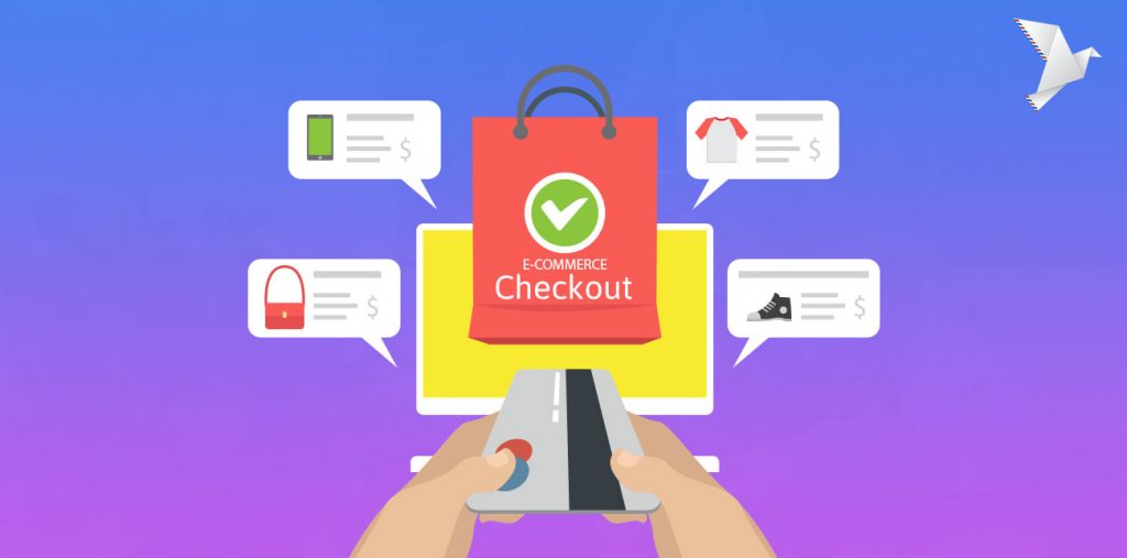
Attaining the best eCommerce checkout is not a one and done deal. Achieving the best checkout pages requires testing and optimization to hit your desired conversion rates and ensure your customers complete their transactions. Some eCommerce businesses excel at check out pages while others overlook the functionality of this all-importance page.
Many e-shops focus instead on the front-end by creating an attractive and functional interface with engaging site experience. But if you can’t close the deal, all that design work is for naught. Competition for eCommerce is increasingly global, and if you’re not constantly testing and refining the checkout pages, your web conversion rates will likely suffer.
Invest on Checkout Page, with Mobile in mind
Focusing on the design for the best checkout pages is time and money well spent. Recent eCommerce benchmarks from Smart Insights reveal that while desktop checkout conversions remain king, smartphone checkouts are growing. Most recently, it’s tablets that now drive mobile device checkouts. Data from Moz shows that more than half of shoppers browse on mobile devices, but the majority seal the deal on their desktops. With device-based shopping on the rise, it mandates stronger mobile checkout design.
Surveying the eCommerce landscape and learning from those eStores that have mastered checkout optimization is critical. Differentiating yourself from others in the sphere is wise in some capacities, but for checkout process design and mobile checkout design, emulating market leaders that have invested in, and are succeeding at, checkout optimization is shrewd.
The Best Checkout Pages for 2023
No matter the niche of your e-shop, ensuring great checkout process is the best way to drive conversions. Here are some of the top-performing checkout pages for 2022 and insights on why they’re thriving in an increasingly competitive marketplace.
1. Monki.com
H&M subsidiary brand Monki and sister site MonkiGlobal excel at transforming online browsers to buyers, even in the tougher to convert the mobile market. Their mobile design effectively reflects the feel of their stores that blend cool Scandinavian and Asian street styles. Their awesome mobile user experience makes them an eCommerce force. With a target market of hip young urbanites chained to their digital devices, Monki’s mastery of mobile checkout form design makes them one to watch.
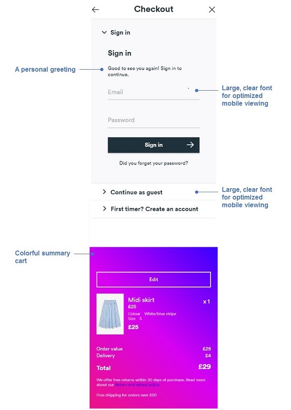
Best Checkout Pages example 1: Monki Mobile Checkout
2. VictoriasSecret.com
The iconic lingerie shop derives 20% of its $8 billion+ annual revenues from eCommerce. Victoria’s Secret was an early adopter of online sales and has two decades of experience designing the best checkout pages. For desktop and mobile sales conversion, the clean and intuitive design is key with clear CTA to close the sale. The checkout and chat buttons move on the top bar to facilitate a conversion. Furthermore, by breaking apart of the checkout process in 3 stages – Addresses, Delivery, Offer & Payments – allows for smaller input forms without overwhelming customers at one go (especially great for mobile users).
Plus, VS utilizes clever and compelling abandoned cart emails to re-engage customers.
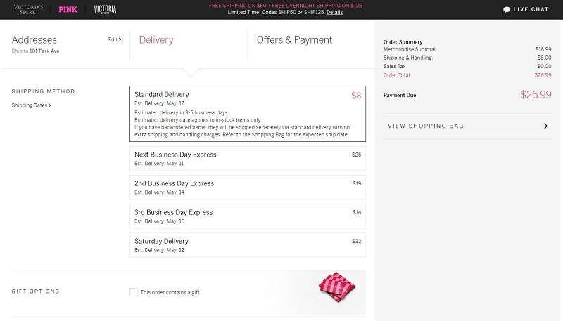
Best Checkout Pages example 2: Victoria’s Secrets
3. CrateAndBarrel.com
Crate and Barrel is committed to retaining its brick and mortar presence while growing its online market share and focuses on omnichannel capabilities because their leadership believes their online and offline sales feed each other. C&B has done well, and its best checkout pages design features multiple shipping options. More importantly, Crate and Barrel embrace digital payment services including MasterPass, AMEX Express checkout, VISA checkout, and PayPal to drive conversions.
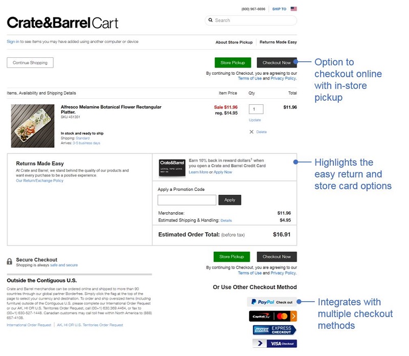
Best Checkout Pages example 3: Crate and Barrel

4. Bratleboro.com
Online watch shop Bratleboro is headquartered in Spain but is constantly expanding its global reach through its Shopify store. Its products are stylish and affordable and now available in the US via ASOS. On its own eCommerce shop and ASOS, Bratleboro is savvy in its checkout design because the first thing they do is collect your email address. The best checkout pages should include functionality targeted at abandoned cart activity to revive potentially lost sales and snagging email addresses is critical.
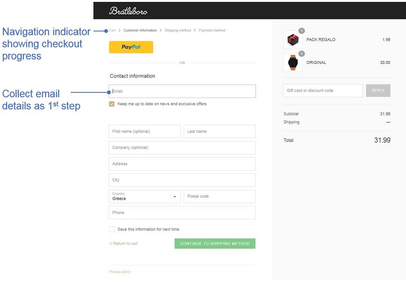
Best Checkout Pages example 4: Bratleboro
5. Burton.com
The outdoor gear and clothing store founded by pro snowboarding pioneer Jake Burton Carpenter has drastically evolved since its late 70s founding. Burton’s desktop and mobile shopping sites are rich with a diverse and powerful tech stack. Burton excels as one of the best checkout pages because of its options. You can transact as a guest, Burton.com log-in, PayPal, or Amazon Pay. This way visitors don’t need a dedicated sign-in for their shop to buy. Lots of options can outwit cart abandonment and increase conversions.
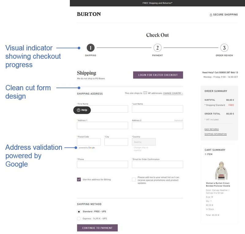
Best Checkout Pages example 5: Burton
6. BaubleBar.com
Fast-fashion jewelry retailer BaubleBar specializes in moving catwalk-inspired designs onto their site as fast as possible. With weekly product launches, their appeal to and knowledge of their core customers is incisive. Their desktop and mobile sites are agile and highly navigable with clear CTA buttons for easy cart-loading. What’s striking is their prominent display of “secure checkout” with trust marks and safety assurances, which are critical in an atmosphere of rampant retailer data breaches.
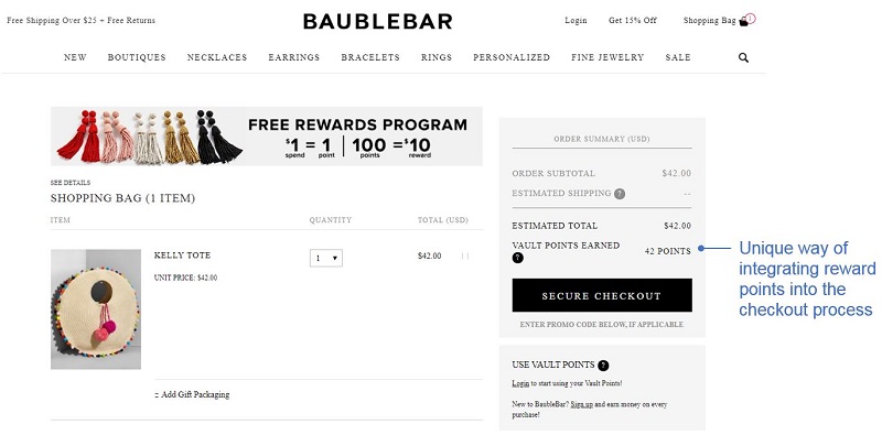
7. BHPhotoVideo.com
Another of the best checkout pages we’ve seen is B&H Photo and Video. With neighborhood camera shops gone the way of payphones, B&H’s NYC superstore remains iconic, but its online presence is what drives $100 million+ annual sales. Their shopping cart and checkout is clear and streamlined with large CTA buttons, social-driven and guest checkouts, more shipping options than almost any online retailer, and a streamlined payment interface to transact quickly before buyer’s remorse takes hold.
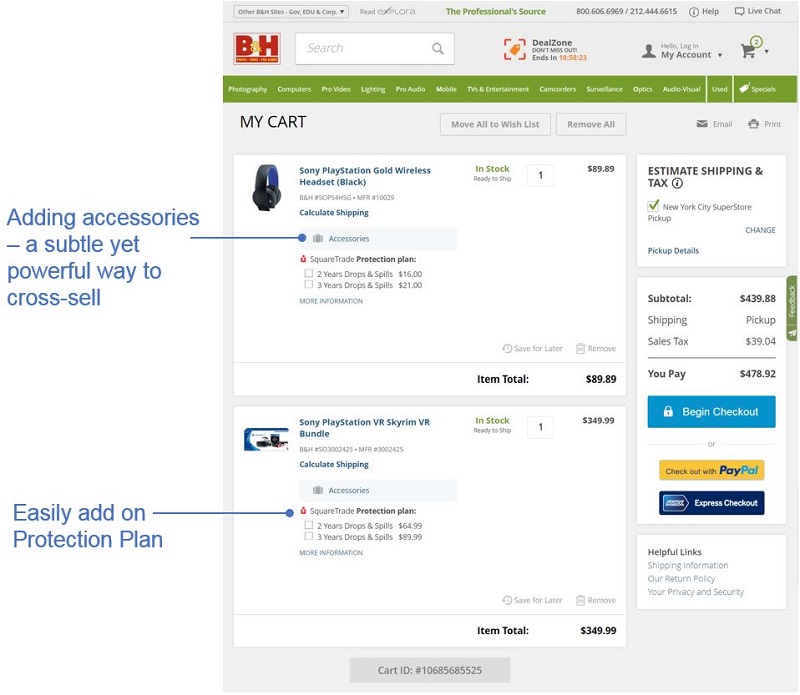
eCommerce Optimization Never Stops
If your eShop has a lower than average sales rate, or excessive cart abandonment, it’s time to explore checkout optimization. If your eCommerce sales stats are hitting industry benchmarks, there’s still room for improvement to realize the best checkout page design.
Even the most streamlined process faces abandonment and other challenges as the online market grows globally intensifying competition.

Let’s Help You Scale Up
Spending time on Linkedin? Follow us and get notified of our thought-leadership content:


