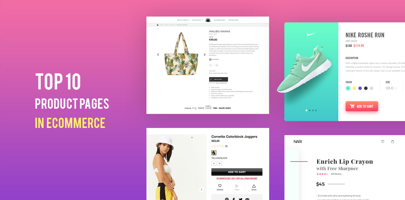
Your company’s landing page is its first impression. It determines what potential customers see first, whether they click around to see more and possibly make a purchase, maybe even whether they sign up to your email list to receive regular updates. For eCommerce businesses. the first impression visitors have of your brand is often the product pages. Like all first impressions, it’s vital that your landing page makes a good one, especially in today’s crowded eCommerce marketplace. What exactly goes into some of the best product pages on the web? So although there are some great eCommerce resources and articles about optimizing a product page, we will focus on the best product page examples we’ve seen from global brands, in 2023.
What is a product page?
A product page is simply the most important asset of an eCommerce site. It’s the landing page where a product is displayed to the website visitors and actually, it is where 40-60% of your total site’s traffic takes place and the very start of the cart and checkout functionalities. It usually consists of:
- the product name,
- the product image
- the product description
- an “Add to cart” button to order it
What are some examples of products?
Depending on the retailer/eCommerce site the product may be a physical one (eg shoes) or a digital one (eg ebook). Some more product examples are:
- zappos.com –> shoes
- hawkers.com –> sunglasses
- halfords.com –> bikes
- bathstore.com –> bathroom products
- waterstones.com–> books
- amazon.com –> anything actually!
What makes the best product pages?
So how can you make your product page stand out?
We combed through the web checking out product pages from household names and companies you might not have heard of to analyze their landing pages to find out exactly that.
We used the following criteria to make our choices since we believe that they play a greater impact on the overall eCommerce conversion rate of an e-shop:
- Aesthetic appeal: What kind of images and copy do they use? Do they fit well? Are they appealing to the eye?
- UI/UX: How easy is the page to use on desktop and mobile browsers?
- Page Load Speed: How quickly does the website and accompanying graphic or video content load? We tested this using GTmetrix.com.
- Innovation: Are there any new and interesting tools this website uses to present the product in an interesting and engaging way?

The 10+1 Best of the Best Product Pages of 2021
☕ So, grab some coffee, make yourself comfortable, and prepare to do some shopping: here’s our list of the ten (plus one!) best product pages of 2021.
-
Best Product Page #1: Bellroy
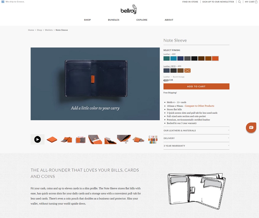
Product page: Bellroy
Aesthetics: With plenty of white space offset by clean images of their product and simple fonts. This retailer of bags and wallets uses video, photography, and sketch art to give both a modern and whimsical feel to their page.
UI/UX: The best-in-class product page for 2021. Once the page is loaded a video featuring the product begins. Super innovative, super effective. Usability feels intuitive, and they’ve got a nice large photograph of their product at the top of the page with their tagline (“Considered carry goods to enhance your every day”) just above a link to their shop. It’s the first thing the customer sees.
Innovation: Video and animations keep customers on the page longer. This one was a no-brainer for our best product pages list, and also has some of the best product detail pages we saw.
Speed: GTmetrix score: B (81%) on page speed, ranked above the average score. Page size: 1.27MB.
-
Best Product Page #2: Sun of a Beach
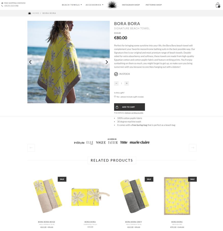
Product page: Sun of a Beach
Aesthetics: The very top of the page catches attention with a looping video of a Grecian beach, with the company’s colorful towels laid out in a pleasing display. The ‘as seen in’ layer right after the fold adds a degree of prestige to the company name, establishing them as a trustworthy eCommerce company in the prospective customer’s mind.
UI/UX: The website is laid out in Instagram-friendly fashion, with hover text on images letting customers know product names, pattern names, and how they can ‘shop this look.’
Innovation: Sun of a beach also uses ContactPigeon’s all-in-one eCommerce marketing automation suite to help them reach their customers. The suite lets companies use for entering/exit popups, behavior-driven product recommendations, and more.
Speed: GTmetrix score E (57%). Page size: 3.3MB.
-
Best Product Page #3: Forever 21
Product page: F21
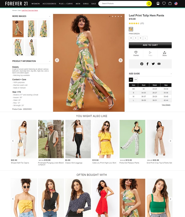
Aesthetics: Super bold colors and text let the customer know about sales and deals right away. Below the fold, motion graphics and more of the same bold colors and fonts draw the eye from one thing to the next, with links to popular products and coupons.
UI/UX: Forever 21’s UI is designed to help shoppers browse and shop faster. Categories are laid out in a clear, linear way by clothing type. Additional filtering options by size, color, and price range are great time savers for visitors to narrow down to the items from the wide selection of inventory. Shoppers can mouse over a product to see the product in various angles without having to enter the product page. Within the product page, all the key information from product images thru descriptions are laid within a single page view, without much need of scrolling.
Innovation: Given the range of product offerings F21 provides, the website makes great use of product recommendations based items a shopper may like based on browsing history, and matching products often purchased together.
Speed: GTmetrix score C (77%). Page size: 5.4MB.
-
Best Product Page #4: Beatific
Product page: Beatific co.
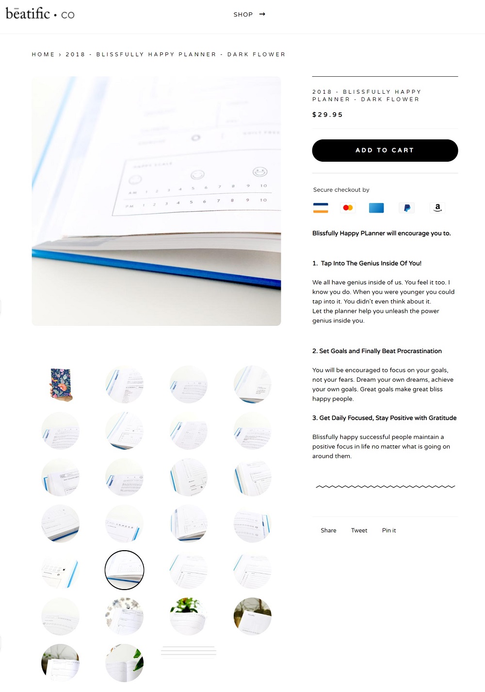
Aesthetics: Beatific sells funky, styled planners and journals with an inspirational bent. Their site is simple and clean, making strategic use of white space and clean font design. An animated banner at the top of the page makes use of beautiful photography and provides a link to the store and a little icon at the top right links to the Shopify cart.
UI/UX: The interface follows the design of simplicity without overwhelming options and choices. It helps to focus the attention on the product itself with the goal of communicating a sense of purpose.
Innovation: They have an entry popup promoting their email newsletter and a nice big link at the bottom for you to sign up as well.
Speed: GTmetrix score C (73%). Page size: 2.47MB.
-
Best Product Page #5: Johnny Cupcakes
Product page: Johnny Cupcakes
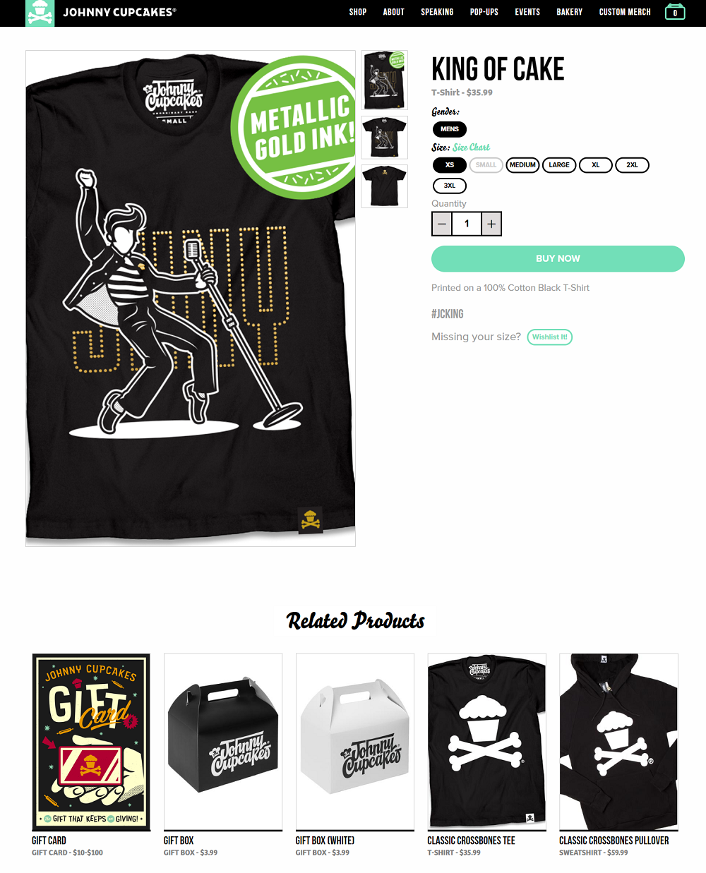
Aesthetics: This page hits you with a video, product declaration, and endorsement all at the same time, in the top banner. The video looks to be taken at a store opening, with a guy running along a line of excited customers. Bold lettering in the middle of the banner says, “World’s first t-shirt bakery,” and below that is a quote from the Boston Globe calling the company a “top innovator” in the world of eCommerce.
UI/UX: The site’s design is consistent and easily navigable and plays up the company’s unique “bakery” aesthetic.
Innovation: We love the fact that this page loading animation is a guy chasing after a cupcake, which is a fun touch.
Speed: GTmetrix score D (61%). Page size: 16.5MB.
-
Best Product Page #6: Luxy
Product page: Luxy
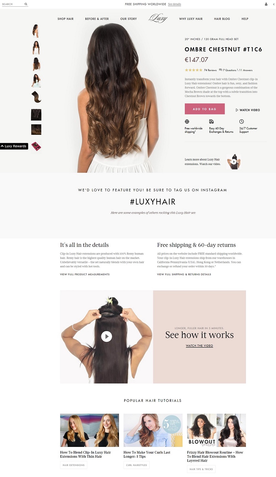
Aesthetics: A light color palette and lots of white give this luxury hair extension site an airy feel, and the fonts they chose to use support that. The look of the site, its aesthetic, and even the company’s name are meant to give the consumer a high-end image. Before and after images, testimonials, and manufacturing info round out the page.
UI/UX: The UX of Luxy’s product page is designed for better content awareness. With the inclusion of videos, reviews, FAQ, hair tutorials are all geared towards educating the shoppers on quality and use of its products. Navigating the different sections on the product page is pretty straightforward. There’s a site search bar in the top left corner and Shopify cart link in the right, easy to find and use. The sales pitch is right under the video: “In just minutes, you can get your dream hair.” A large professional photograph of a model wearing their product, plus a video of her, show the customer how it looks in pictures and in motion.
Innovation: Use of tutorial content and videos within the page enhances user awareness, as well as increase the on page duration.
Speed: GTmetrix score: F (47%). Page size: 8.52MB.
-
Best Product Page #7: Insta360
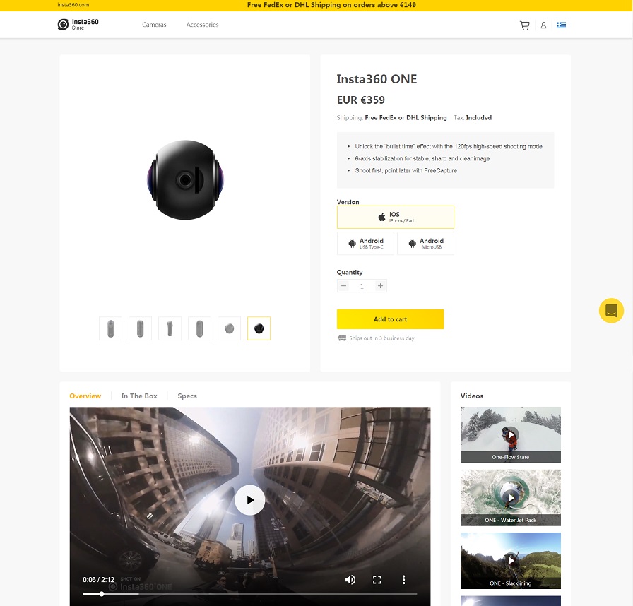
Product page: Insta360
Aesthetics: This site keeps it simple, with Amazon-like product listings and large images. The white background and yellow highlights serve as a visually popping contrast to the black products and text. Overall design offers a sleek and clean appeal.
UI/UX: The top navigation menu drops down into consumer and pro categories for their line of 360-degree cameras. Banner images are action-oriented, marketing to athletes and adrenaline junkies to film their adventures.
Innovation: This site also makes use of the ContactPigeon eCommerce suite for marketing automation, tracks usage stats with Inspectlet, and uses Google’s Viewport Meta for mobile usage stats.
Speed: GTmetrix score F (41%). Page size: 5.2MB.
-
Best Product Page #8: SuzyQ Donuts
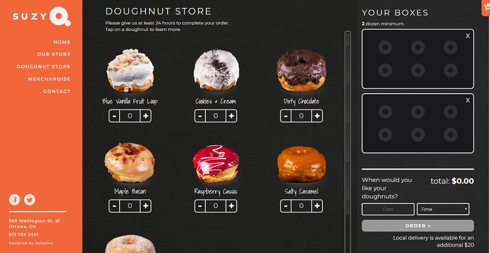
Product page: SuzyQ
Aesthetics: This website looks delicious.
UI/UX: Large photographs of its tasty products, a prominent “order now” button, and sidebar navigation menu all make this page pleasing to the eye and let the user know exactly what it is that SuzyQ sells right away. The best part is the elimination of the typical e-shop cart with a visual representation of a donut box as you fill up the order. This would probably win our award for best product page design.
Innovation: The visual of the donut box replacing the typical eCommerce cart serves as a clever and fun way to resemble a brick & mortar concept. At the same time, a real-time display of total cost provides fool-proof transparency in the checkout process.
Speed: GTmetriz score: A (92%). Page size: 3.21MB.
-
Best Product Page #9: Tesla Motors
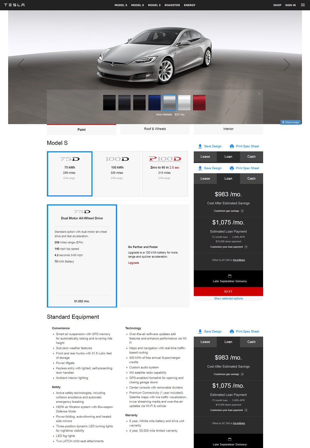
Product page: Tesla
Aesthetics: From the jump, this page captures attention with large, dynamic photographs of Tesla’s products. Each section of the easily-scrollable page is dedicated to a separate Tesla vehicle, with the last slice reserved for Tesla’s Powerwall products.
UI/UX: The navigation menu, including an option to sign up for the newsletter, is right at the top of the page, the font used is futuristic and fits the image of the company as a technological trailblazer, and there’s one line of copy to describe each thing: ‘Model 3: The car of the future.’
Innovation: The ability to visualize the final product as shoppers customize to their hearts content is a great way to increase the product appeal.
Speed: GTmetrix score: D (67%), below average. Page size: 2.47MB.
-
Best Product Page #10: MADE
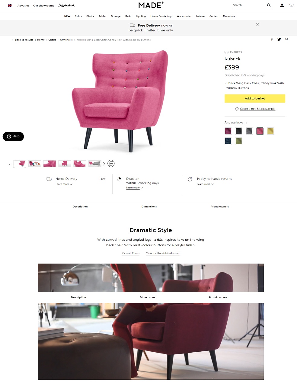
Product page: Made
Aesthetics: From the start, Made’s simple yet modern page visuals blend perfectly with the product design. They also added context-related pictures and videos for visitors to immerse themselves in the product.
UI/UX: The page navigation is seamless with clear CTAs and stunning visuals. Further down the page, the retailer listed full details on the product dimensions as well as comparative visuals of the product relative to a standing person.
Innovation: Create use of 360 product views that allows shoppers to fully see the product digitally across all angles.
Speed: GTmetrix score: F (33%), below average. Page size:6.36MB.
-
BONUS: Best Product Page #11. BRATLEBORO
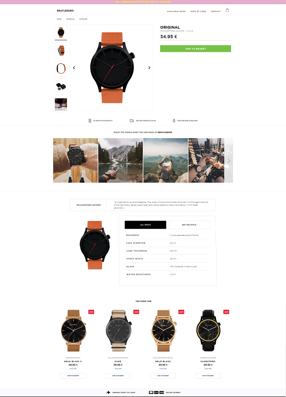
Bratleboro’s product page
Aesthetics: Hawker’s little brother, Bratleboro, offers one of the best Shopify product pages we’ve seen so far (Tesla is on Shopify too!). Its product page maintains brand’s minimalistic design approach, giving great focus on displaying multiple high-quality product images.
UI/UX: Although we believe that the color palette Bratleboro uses is not so coherent, overall they are masters of User Experience, since they usually use a smartbar on the top of the page as an attention grabber. The product has nice stunning photos (+packaging & real-life photos) and right under the CTA button, they display shopping incentives (Warranty, Return Policy, Security). Then they focus on “creating” heavily emotional user experience for the visitor, displaying lots of everyday photos of their watches, due to the Instagram shop integration. Once the user is hooked they are ready to move on to the text details and logical part of the purchase (description, characteristics etc).
Of course all the above happen flawlessly on almost any mobile device since they have one of the best mobile product pages we’ve seen.
Innovation: Their Instagram integration allows the user to “Shop” the products tagged on every post, something that works really well since the customer feels much better when viewing a branded Instagram photo, rather than when viewing an ordinary product photo. Thus, it converts really well. So lesson learned: Instagram Photo > Product Photo
Speed: GTmetrix score: C (76%), above average. Page size:2.81MB.
The Best of the Best Mobile Product Pages we spotted in 2021
Since Mobile>Desktop. below you will find the best Mobile Product pages we found out there which could inspire you for your store’s product page’s design as well:
-
Best Mobile Product Page #1: CLARKS
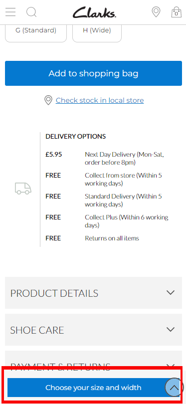
Product page: Clarks
Aesthetics: Clarks uses plenty of white space, neat design and calm color pallet, in order to offer a smooth User Experience. Being classy, they nailed the principles of Branding and they’ve built, by far, one of the best product pages in the world right now.
UI/UX: The (multiple) product images are top-notch, the core CTA button has a clear blue color that is eye-catching, yet not disturbing and the content is hidden in tabs in order to offer the optimal mobile experience to the visitor. What makes Clark’s product pages even better is their helpful customer reviews that give great insights about product performance and boost organic performance as well.
Innovation: Since they know that the user must choose Size and Width, they use a 2nd sticky CTA button as you scroll down the product page, which motivates you to take the 1st step of the funnel. Brilliant, relevant and useful approach!
Speed: GTmetrix score: E (57%) on page speed, which is not good enough. Page size: 2.10MB.
-
Best Mobile Product Page #2: MOTHERCARE
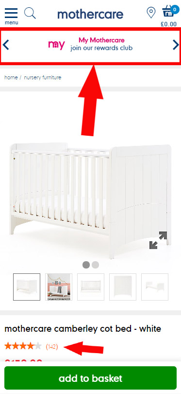
Product Page: mothercare
Aesthetics: MotherCare has a consistent aesthetic presence and feel across their website and their product pages. White color prevails here as well, being followed by navy blue. We weren’t thrilled but it is simple and it works well.
UI/UX: The overall mobile UX is really good, the site is really easy to use. It also displays some really useful tips which help you discover more product categories and do some upselling effectively.
Innovation: mothercare has a special layer, just beneath the top navigation bar, which outlines and rotates the 4 incentives, in order to contribute to conversions. Clever thought and implementation, we’d just use bigger font size because in mobile you barely can read them.
Speed: GTmetrix score: E (50%) on page speed, ranked below the average score. Page size: 2.52MB.
-
Best Mobile Product Page #3: MATALAN
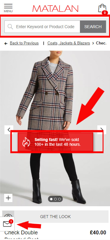
Product page: Matalan
Aesthetics: The feeling and the aesthetics of Matalan is a little bit outdated but this is not worrying the brand, since it is one of the TOP 50 retailers in Europe, according to Emarsys.
UI/UX: The overall mobile UX is flawless, easy and fast while it makes it super easy for the user to find anything, thanks to the big search bar at the top bar. The product page optimization is at really high standards with lots of incentives put near the red, eye-catching, “Add to Bag” button.
Innovation: Matalan has an awesome live notification system that notifies the user about the number of users currently seeing the same product and also labels as hot those products that are selling hard during the last few hours. A super effective way to create scarcity and validation. Kudos to their eCommerce team!
Speed: GTmetrix score: E (56%) on page speed, ranked below the average score. Page size: 2.22MB.
Wrap Up
There you have it, our ten best product pages of 2021. All of these sites blend smooth eCommerce functionality, design best practices, as well as landing page best practices and good UI/UX, for a winning product page. Every entrepreneur should be thinking about this when designing their own site. You can have all the right pieces: a Shopify cart, a newsletter link, a picture or two, but if it isn’t presented in a way that pulls the customer in, you’re only doing half the work of creating a good product page.

Let’s Help You Scale Up
Spending time on Linkedin? Follow us and get notified of our thought-leadership content:


