In the competitive world of eCommerce, capturing and maintaining customer interest is paramount. One critical challenge that retailers face is browse abandonment—when visitors leave an online store without making a purchase. Statistics reveal that a staggering 97% of first-time visitors leave an eCommerce site without purchasing anything. Furthermore, nearly half of all online store visitors are merely browsing, with no immediate intent to buy. Thus, understanding and mitigating browse abandonment is essential for turning these casual visitors into loyal customers, and boosting conversions. In this article, we delve into the best browse abandonment examples from leading retailers, providing key insights and strategies to help your business thrive.
Retailers with top browse abandonment campaigns
Browse abandonment emails are a powerful tool for re-engaging customers who have shown interest in products but didn’t add them to their cart. These emails can be subtle reminders or enticing offers that bring shoppers back to your site.
To better understand how leading brands tackle browse abandonment, let’s explore some of the most effective strategies implemented by famous retailers. These top retailers tailor their browse abandonment emails to resonate with customers, leveraging urgency, empathy, and incentives. By personalizing messages and offering support, retailers can significantly improve re-engagement and conversion rates.
Browse abandonment example #1: Cole Haan – Subtle urgency with personalization

Cole Haan’s approach to browsing abandonment emails is subtle yet effective. The design is minimalistic, with a straightforward message encouraging the recipient to “bag this one before it’s gone,” creating a sense of urgency without being pushy. They also use a “check availability” CTA, sparking curiosity and driving engagement.
- Subject line: “Open to see the styles curated for you”
- Highlights: Personalized product recommendations, clear CTA, urgency without pressure.
- Lesson: Subtlety and personalization can encourage customers to revisit their initial interests.
Browse abandonment example #2: Lego: Engaging visuals and incentives
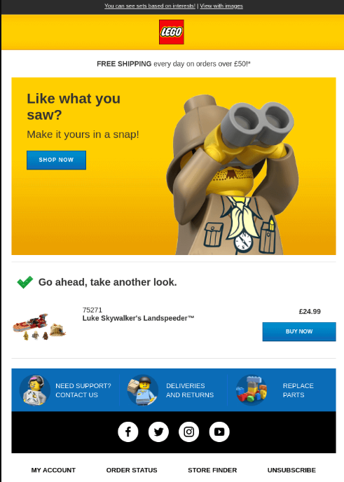
Lego’s emails are vibrant and focus on a single product, utilizing captivating visuals. They understand the power of incentives, offering “free shipping” to entice the customer.
- Subject line: “You’ve looked at some great LEGO sets!”
- Highlights: Single product focus, clear CTAs, free shipping offer.
- Lesson: Use engaging visuals and simple incentives to draw customers back.
Browse abandonment example #3: Adidas – Empathy, humor, and social proof
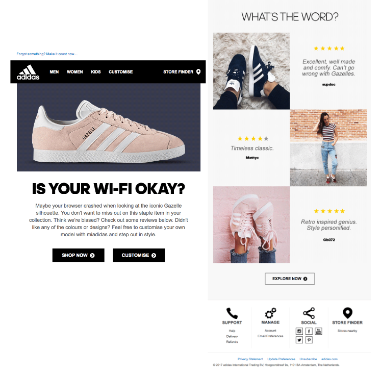
Adidas takes a customer-centric approach, expressing concern for any potential browsing issues. They subtly incorporate FOMO (Fear of Missing Out) and include customer reviews to build trust.
- Subject line: “Sorry to hear about your Wi-Fi…”
- Highlights: Empathy, customer reviews, multiple precise CTAs.
- Lesson: Showing empathy and using social proof can effectively encourage customers to return.

Browse abandonment example #4: Nomad – Building trust and reassurance
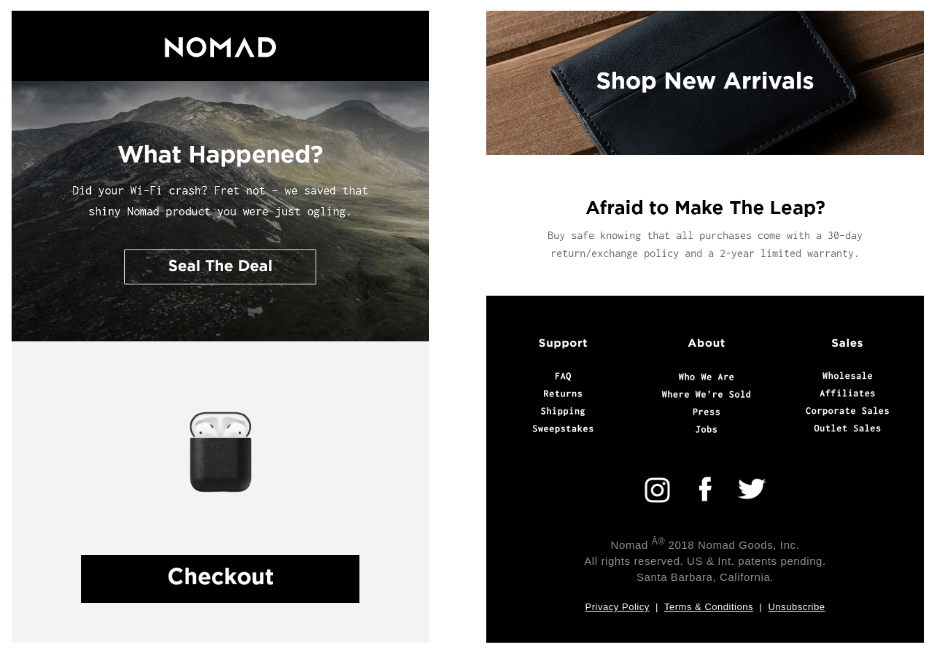
Nomad’s email asks why the customer left without purchasing, using a unique “seal the deal” CTA. They emphasize their return policy and warranty, reassuring hesitant buyers.
- Subject line: “Nomad Gear is Selling Out Quick”
- Highlights: Unique CTA, reassurance with return policy and warranty.
- Lesson: Address customer concerns directly to build trust.
Browse abandonment example #5: Haoma – Offering support and personalization
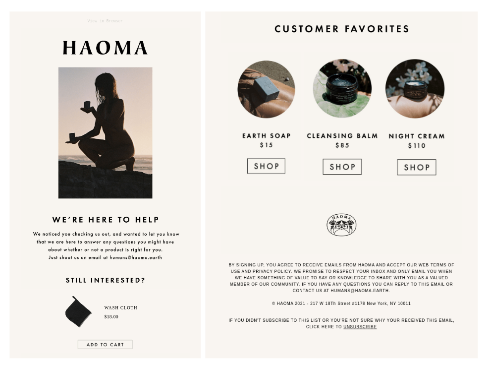
Haoma’s emails focus on assisting the customer with any questions, showcasing a specific product, and offering additional customer favorites.
- Subject line: An open-ended question to engage the customer.
- Highlights: Direct communication, personalized product display, support offer.
- Lesson: Proactively offer assistance and personalization to regain customer interest.
Browse abandonment example #6: The Dollar Shave Club – Bold branding and humor

Known for its bold branding, The Dollar Shave Club combines humor with a strong product focus. The email highlights the benefits of shopping with them, accompanied by a high-quality image of the product.
- Subject line: “Where did you go?”
- Highlights: Bold branding, humor, clear CTA emphasis.
- Lesson: Utilize brand voice and humor to create memorable browse abandonment emails.
Browse abandonment example #7: Samsung – FOMO and cross-selling

Samsung’s email strategy includes creating a sense of urgency by highlighting product demand and offering free shipping. Browse abandonment examples that suggest similar products, enhance cross-selling opportunities, and AOV, hitting two birds with one stone.
- Subject line: Free shipping reminder and reference to the products viewed
- Highlights: Urgency, free shipping, cross-selling.
- Lesson: Use FOMO and cross-sell products to increase sales.
Browse abandonment example #8: On – Sleek design and curiosity

On combines a sleek design with a simple “still available?” subject line, triggering curiosity. They emphasize free shipping and present various product categories.
- Subject line: Simple, yet immediate and effective
- Highlights: Clean design, curiosity-driven subject line, free shipping offer.
- Lesson: A sleek, uncluttered design and curiosity can effectively engage customers.
Browse abandonment example #9: National Mattress Outlet – Urgency and savings

This retailer uses a catchy color scheme and emphasizes “express delivery.” They hint at limited availability and offer coupons for additional savings.
- Subject line: Nudging the customer to take action
- Highlights: Urgency, discounts, product variety.
- Lesson: Highlighting scarcity and savings can drive conversions.
Browse abandonment example #10: Pulp & Press – Excitement and cross-selling
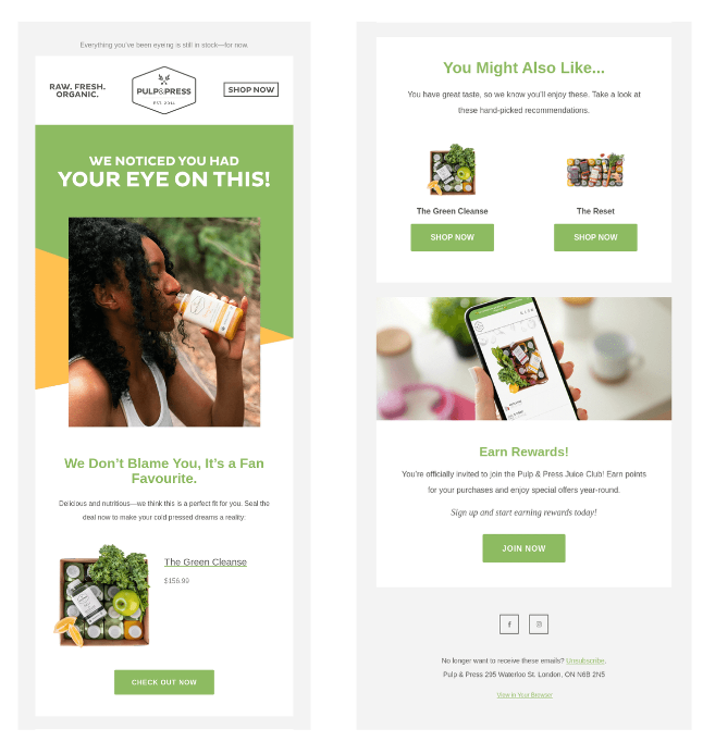
Pulp & Press’s email conveys excitement and encourages customers to act quickly. Browse abandonment examples that capitalize on cross-selling opportunities by suggesting complementary products is one of the top eCommerce best practices in 2024 and the brand hit a bull’s eye.
- Subject line: Funny and direct
- Highlights: Exciting tone, clear CTAs, cross-selling.
- Lesson: An enthusiastic tone can effectively engage and motivate customers.
Browse abandonment example #11: American Giant – Simplicity and clarity
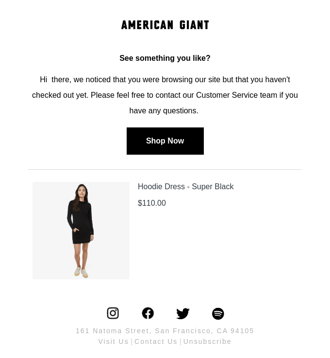
American Giant’s email features plain text and a single product focus, with a clear “Shop Now” button. The simplicity and direct approach are its strengths.
- Subject line: Simple yet engaging
- Highlights: Clear CTA, single product focus, straightforward messaging.
- Lesson: Simple, direct emails can be surprisingly effective.
Browse abandonment example #12: Timberland – Personalized product recommendations

Timberland’s email uses product recommendations to complement the initially viewed product, demonstrating an understanding of the customer’s preferences.
- Subject line: Product recommendation focus
- Highlights: Personalization, relevant product suggestions.
- Lesson: Personalization can significantly enhance customer engagement.
Browse abandonment example #13: PacSun – Straightforward simplicity

PacSun’s email starts with “Still Interested?” and showcases multiple products, making it easy for customers to find what they were browsing.
- Subject line: “Still Interested?”
- Highlights: Multiple product options, straightforward messaging.
- Lesson: Simplicity and clarity can help customers quickly find their interests.
Browse abandonment example #14. Converse: Discount and complementary recommendations

Converse has one of the most interesting browse abandonment examples pairing a promotional discount with a relevant message. Listing browsed products and offering additional recommendations is a sure shot when it comes to conversions.
- Subject line: Pricing-focused titles to incentivize consumers
- Highlights: Promotional discount, complementary product suggestions.
- Lesson: Combining discounts with recommendations can boost conversion rates.
Discover more Browse Abandonment resources for retailers
- Omnichannel Cart Abandonment Strategy: 360 Guide
- 50 Cart Abandonment Stats Every Retail Executive Should Know (2024)
- 3 Proven Ways to Reduce Category Browse Abandonment
How ContactPigeon’s CDP optimizes browse abandonment to retrieve lost opportunities

ContactPigeon’s advanced Customer Data Platform (CDP) is designed to tackle browse abandonment head-on, transforming lost opportunities into conversions.
Key Features:
- Data integration: Collect and analyze data from various customer touchpoints, including browsing history, interaction patterns, and purchase behavior.
- Personalization engine: Deliver hyper-personalized emails and notifications based on individual customer preferences and behaviors.
- Automated campaigns: Set up automated workflows that trigger targeted communications to re-engage browsers at the right time.
- Omnichannel approach: Utilize multiple channels such as email, SMS, push notifications, and social media to reach customers wherever they are.
- Advanced analytics: Gain insights into the effectiveness of browse abandonment strategies with detailed reporting and analytics.
Implementation tips:
- Segmentation: Divide your audience into segments based on browsing behavior and tailor your communications accordingly.
- A/B testing: Experiment with different messaging, offers, and timing to find the most effective strategies for re-engagement.
- Continuous optimization: Regularly review performance metrics and adjust your strategies to continuously improve results.
From abandonment to increased revenue
Browse abandonment represents a significant challenge but also an incredible opportunity for eCommerce retailers. By studying the best browse abandonment examples from top brands and leveraging advanced tools like ContactPigeon’s CDP, you can effectively re-engage lost visitors and drive them toward making a purchase. Implementing these strategies not only recovers lost revenue but also enhances the overall customer experience, fostering loyalty and long-term success. Embrace the power of data-driven personalization and omnichannel engagement to transform abandonment into increased revenue for your business.
Let’s Help You Scale Up


