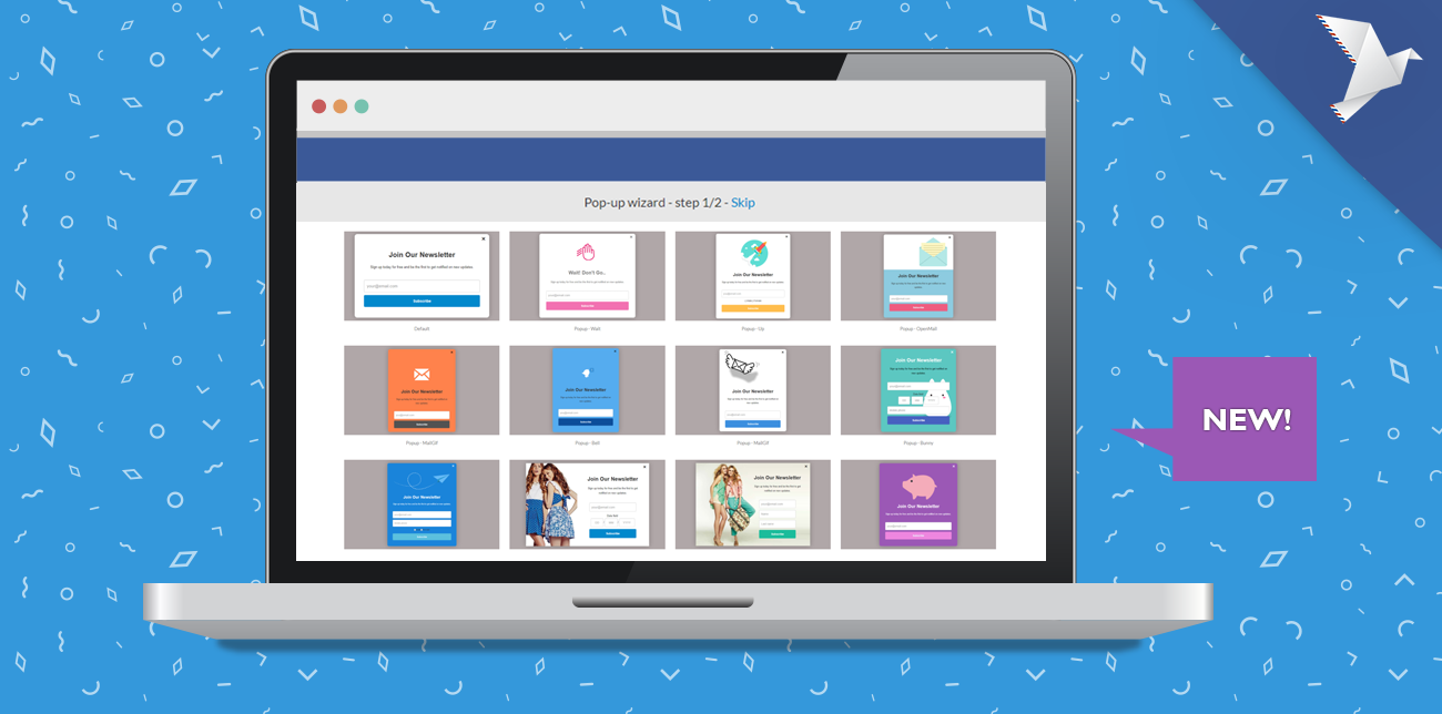
While summer is long gone in most part of the world, here at ContactPigeon we are still on fire. ? Following our recent introduction of E-commerce Insight Dashboard, we are excited to introduce a few new enhancements to ContactPigeon’s Dynamic Popup Editor.
We redesigned the Dynamic Popup Editor with the goal of delivering a new experience that’s super intuitive for a first-time user. At the same time, we introduced a score of mobile responsive design-ready templates that you can easily customize for your use, or simply activate. This way you spend less time on tweaking the pop-ups, but rather focus on getting new leads faster.
Ready to use Dynamic Popup designs
To access the Popup templates, simply begin with a new dynamic popup. We have created 25+ ready to activate designs inspired by a variety of industry verticals from fashion to blogs. All templates are designed to be mobile responsive, so rest assured that they will be visually appealing for visitors accessing your site with either desktop or mobile devices. The designs even include seasonal promotions such as the upcoming Black Friday sale.
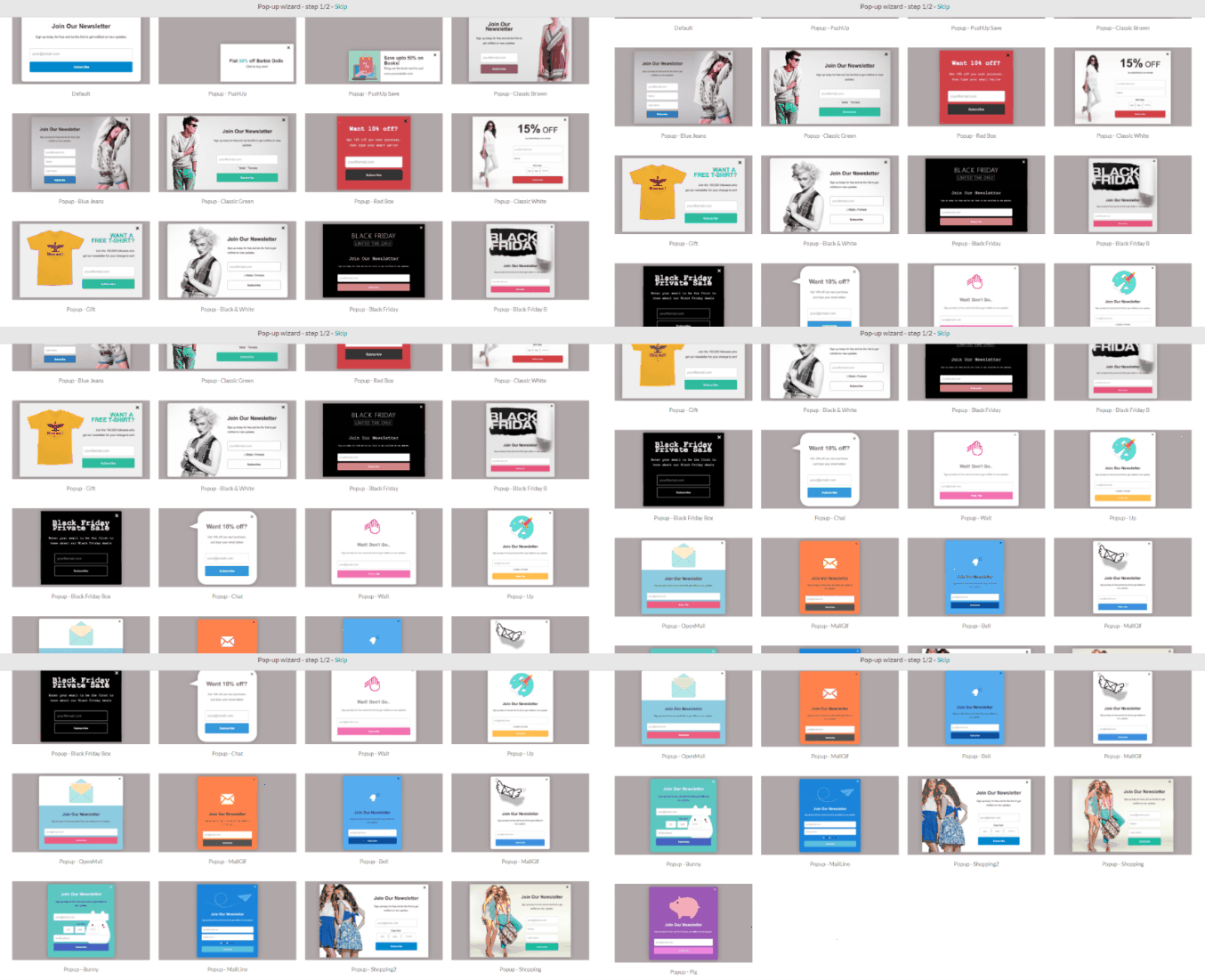
25+ dynamic popup templates
With more designs coming your way, we hope these will serve as great inspirations for your lead generation efforts.
Enhance User Interface
In the effort to simplify the flow of the dynamic pop-up, we introduced a menu selection upfront where you can pick and choose the condition which the pop-up will appear to your site visitors. There are 4 key conditional triggers based on whether if the pop-up will appear on load vs. on exit, and if the visitor is either known or unknown to your site. P.S., known visitors are those who have signed up previous, regardless of sign-in status. You can choose the frequency and additional condition of the pop-up reappearing directly on this screen as well.
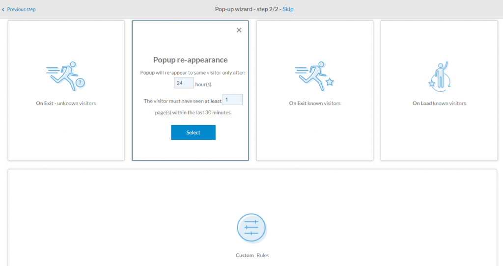
Dynamic pop-up conditions
Similarly, we have given the pop-up editor itself a facelift. You’ll see that we haven’t changed most of the functionality, everything is still where you left it. The improved design will enable the steps you take to create a pop-up flow more seamlessly. That mean’s less back and forth between the tabs, and more intuitive user experience.
For example, take a look at the sliding before and after view of the “Subscribe” tab.
[image-comparator left=”1705″ left_alt=”Previous dynamic popup editor” right=”1706″ right_alt=”Current dynamic popup editor” classes=”hover”][/image-comparator]
Did We Mention Mobile Responsive?
Of course, we did! it’s one of our proud design features. This time we even added a nifty feature for you to preview the pop-up in the mobile format directly on as you design it. Just click on “Mobile Preview” as you work in the editor.
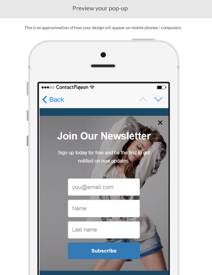
Preview popup design in mobile
Stay Tuned
We hope you find our latest introductions helpful. For step by step guide on setting up a dynamic pop-up for your account, please check out the relevant guide in our knowledge base. If you have any metrics or ideas on what we can add next, please give us a shout!
Stay tuned for new features we’re launching over the next few months that will improve the way you reach your web visitors! Be the first to know and subscribe to the blog — you’ll get updates on feature releases, as well as our latest content, right in your inbox.


