While many other brick-and-mortar high-street brands have crumbled throughout the decades, luxury cosmetic giants, Sephora have gained a stronghold in the competitive cosmetics retail landscape. Survival has been, in part, a result of Sephora’s omnichannel strategy, which ultimately redefined the cosmetics shopping experience.
From its humble beginnings as a small perfumery in the French town of Limoges, Sephora is firmly in the retail spotlight as one of the leading brands of personal care and luxury beauty products. Like Fartech (which we covered in this case study), Sephora’s business model is geared towards a diverse range of customer segments.
In this case study, we take a deep-dive into Sephora’s omnichannel marketing strategy and examine how the blend of in-store experiences with digital platforms has transformed the customer journeys and sustained Sephora’s growth strategy.
Table of Contents
- The History of Sephora
- The key success factors that drive Sephora’s growth strategy
- Authentic Customer Experience-focused mentality
- Exceptional Omnichannel Strategy
- Omni-Channel Company Culture
- Turning Data into Growth
- Data-driven Mobile strategy
- “Augmented” Retail Strategy
- Solid Business Continuity & Crisis Management Strategy
- How Sephora’s omnichannel strategy redefined customer experience in cosmetics retail?
- Example #1: Sephora’s Visual Artist feature
- Example #2: Multi-Purpose & content-rich Mobile app
- Example #3: Building a stellar community
- Sephora’s eCommerce website
- Analyzing Sephora’s Home Page
- Analyzing Sephora’s Category Page
- Analyzing Sephora’s Product Page
- Analyzing Sephora’s Checkout Process
- Interesting eCommerce tools that Sephora uses
- Impressive Sephora stats you may not know
- Go omnichannel or go home (probably)
The History of Sephora
Sephora has always been an innovative brand. When Dominique Mandonnaud opened his first store in Limoges, France (known then as Shop 8), products were grouped by type rather than brand. This allowed customers to try more products they were drawn to.
The company’s first Paris store opened in 1970, and by 1998, Sephora was among the industry-leading champions for diversity, inclusivity, and empowerment. The business quickly spread its presence across Europe and the United States. Today, the Sephora at Champs Élysées attracts over six million people a year.
Owned by LVMH Moët Hennessy Louis Vuitton, the world’s leading luxury goods group, Sephora stores feature a variety of beauty products from more than 300 brands. No wonder Sephora’s new tagline and manifesto is, “We Belong to Something Beautiful”!

Awards Sephora has won to date
Given Sephora’s rise to retail prominence, it’s no surprise to see they have picked up numerous awards on their journey. To date, the company has garnered 19 awards, but we expect there are more to follow.
- Women’s Wear Daily “Specialty Retailer of the Year” (2010)
- Beauty 2.0 Awards “Best Pinterest” (2013)
- Beauty 2.0 Awards “Best e-Commerce Website” (2013)
- Beauty 2.0 Awards “Best Blog by Beauty Brand” (2013)
- World Retail Congress Retailer of the Year Award (2018)
- Glossy Awards Innovation Team of the Year award (2018)
- Glossy Awards Best Campaign by a Traditional Beauty Brand (2018)
- SHEFinds’ “Best New Beauty Products” (2019)
- HelloGiggles “Beauty Crush Awards” (2019)
- Cosmopolitan’s “The Cosmo Makeup Awards” (2019)
- 2 x Women’s Health “Beauty Awards” (2019)
- The Knot “Beauty Awards” (2019)
- Cosmopolitan’s “Skincare Awards” (2019)
- Parents “Beauty Awards” (2019)
- Cosmopolitan’s “Holy Grail Beauty Awards” (2020)
- ESSENCE’s “Best in Black Beauty” (2020)
- SheFinds “Best New Beauty Awards” (2020)
- Parents “Beauty Award” (2020)
- Allure Best Of Beauty (2020)
Sephora has also featured in numerous indexes, “best in class” lists, and honors.

The key success factors that drive Sephora’s growth strategy
In their own words, Sephora is “a leader of prestige omni-retail.” The company’s goal is to create a shopping experience that enables beauty and cosmetic customers to purchase products confidently.
Sephora’s marketing team has taken retail to the next level since they have mastered the art of bringing both the offline and the online customer journey into a holistic shopping experience.
Between 2017 and 2019, Sephora consistently reached revenues of $6 billion, a near 50% increase from just five years prior when the personal care giant was only registering $4 billion.
Sephora’s retail strategy can be honed down to 7 key strategies.
Key success factor #1: Authentic customer experience
The Sephora business strategy centers around the customer shopping experience. Their in-store set-up is a digital playground for beauty enthusiasts. Utilizing various mobile technologies, screens, and customer-focused sales tactics, Sephora’s takes advantage of new-generation digital technologies such as augmented reality. Store assistants use iPads to showcase the multitude of shades and colors so customers can try before they buy.
Key success factor #2: Exceptional omnichannel strategy
Sephora was among the early adopters of an omnichannel strategy as part of their digital marketing efforts. Central to the Sephora marketing strategy is a mobile app that provides customers with a central hub where they can access all things related to beauty, cosmetics, and skincare.
With a bevy of new products, video tutorials, celebrity news, and fashion trends directly within the mobile app that consistently encourages customers to return, Sephora’s digital marketing strategy keeps its audience informed, up-to-date, and hungry for more.
Moreover, Sephora has nailed loyalty marketing as well. By nurturing customers who spend 15x more than the average customer, Sephora has built a seamless, unified, and personalized customer experience by launching groundbreaking technologies like ColorIQ, ‘Smell O Vision,’ and famous Sephora Visual Artist.

Key success factor #3: Omni-Channel company culture
Sephora’s retail strategy uses data and technology to bring the shopping experience to life. But the “secret sauce” behind its omnichannel success is simple yet far too difficult to copy. In 2018, the company went one step further by merging its digital and physical retail teams and developed a world-class omnichannel approach.
By creating one team, Sephora focused on overall sales rather than prioritizing its eCommerce strategy. This purely omnichannel approach enables marketers to track the entire customer journey from online browsing to in-store interactions with sales representatives and over-the-counter sales. Sephora is one of the very few retailers globally which turned omnichannel business thinking into action.
Key success factor #4: Turning data into growth
Sephora recognized a large percentage of shoppers use personal smartphones to search for online reviews, recommendations and compare the price of products with their competitors.
Rather than treating personal devices as a threat, Sephora developed a retail strategy to take advantage of mobile technologies. With the help of Google Analytics 360 Suite, their analytics team was able to identify which online advertising was driving in-store purchases. The Sephora marketing strategy was born from this data, and sales from digital ads soared by 3x.
Key success factor #5: Data-driven mobile strategy
Given that most online searches take place on a mobile phone, Sephora saw the advantage of incorporating a mobile app to enhance their retail strategy.
The app is designed to provide its customers with valuable information such as reviews and emulate a sales associate to provide relevant product recommendations.
Being always data-driven, Sephora has foreseen the rise of mobile during the early 2010s by heavily investing in mobile technologies.
For example, Sephora was among the first brands launched in Apple’s Passbook in 2012, getting more than 87k app downloads per week. But was that a result of luck? Certainly not. Sephora knew that approximately 70% of its mobile users came from iOS devices, which is why it was quick to invest in Apple’s digital wallet.
Key success factor #6: “Augmented” retail strategy
Beauty and cosmetic shoppers consume video content across multiple devices. Sephora takes advantage by including tutorials and evocative images in their retail strategy by using brand ambassadors and micro-influencers on social networks and YouTube.
Sephora’s customer engagement strategy provides customers with access to valuable content. “Groups” and “Conversations” enabled Sephora to build a vibrant community of beauty aficionados. In-store digital components such as welcome screens, menus, and sales assistants armed with mobile devices help customers find the right product.
The amount of earned media Sephora from user-generated content (UGC) every month has no match in the cosmetics industry.
Key success factor #7: Solid business continuity & crisis management strategy
When stores were forced to close during the global pandemic, Sephora’s eCommerce strategy shifted to expand its online efforts to make it easier for customers to search for products from the comfort of their homes.
To enhance operational efficiency, Sephora tweaked its supply chain strategy across warehouse locations, inventory management, and automation. Sephora also took steps to align inventory with projected sales, thereby minimizing ‘out-of-stock’ products.
These business reflexes highlight bold business continuity skills that help the company overcome the tide.
How Sephora’s omnichannel strategy redefined customer experience in cosmetics retail?
Example #1: Sephora’s Visual Artist feature
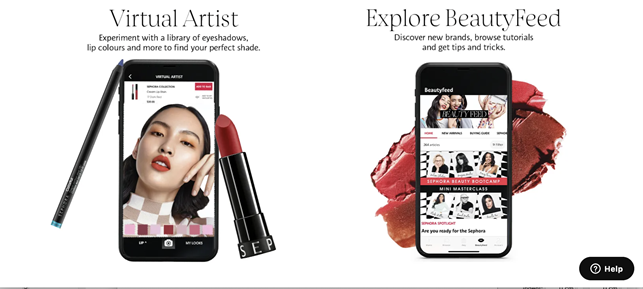
With hundreds of products in each category, shopping for beauty products can be overwhelming. To help customers find the right products, Sephora incorporates augmented reality technology and ‘Color IQ,’ enabling customers to virtually ‘try before they buy.’
Sephora’s mobile app includes a Virtual Artist feature that scans the user’s face and matches their skin tone with a complimentary color. The technology incorporates artificial intelligence (AI) and uses facial recognition software that reveals how a particular product will look when applied by the customer.
Once customers decide on a particular product, they are directed to the relevant page to purchase the product online or locate the product in a store.
Example #2: Multi-Purpose & content-rich mobile app
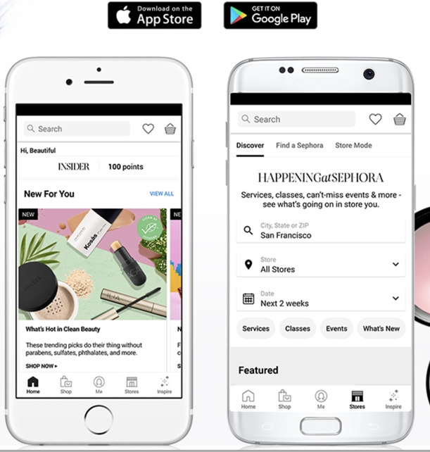
Sephora gathers data through its mobile app, a source of customers’ in-store and online habits. Such data helps Sephora to make relevant product suggestions, which influences future purchasing decisions.
For example, Sephora sends notifications to individual customers that have searched for a specific item. The notification may inform customers when new products are in store, offers gifts on their birthday, and announces upcoming events. It also notifies when live events that
are happening when a customer is close by geographically.
Not only does Sephora’s augmented reality feature provide an innovative in-store experience, but its mobile app also enhances in-store experiences by using bar codes that provide product information, reviews, and personal purchase history upon scanning.
Example #3: Building a stellar community

The Sephora business model focuses on enhancing the customer experience. An effective way of achieving this is to encourage its growing community of followers to share their experiences, knowledge, and tips.
On its website, the retail giants have created a Beauty Insider Community where users can gravitate to engage in friendly discussion, ask and answer questions, share photos, recommend products and connect with like-minded shoppers.
Sephora’s eCommerce website
Sephora is undoubtedly one of the most digital-savvy retailers around. To figure out what makes their online strategy masterful, we’ve analyzed 4-page templates to determine what’s hot and not.
A. Analyzing Sephora’s Home Page
Sometimes, the simple approach is the most effective. When you have an overwhelming choice of products like Sephora, a minimalistic web design is a way to go.
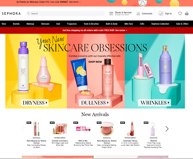
What we liked:
- Easy to navigate: Today’s shoppers do not have the patience to search for products. Sephora makes finding the most popular product categories instantaneous by linking to skincare, makeup, and fragrances directly from the Hero space. It’s the first thing shoppers see. The rest of the home page provides a list of Sephoras other products built into the company’s merchandise strategy.
- Engaging visuals: Sephora has opted for a simple white background overlaid with high-definition images of their product range. Without conflicting colors obscuring the PNGs, the images ping from the screen and are easy to recognize.
- Slick UX: The homepage uses pagination arrows, allowing visitors to view more products in the same category without leaving the homepage.
- Great use of top/smart bars: Sephora showcases its coupon-based promotions right at the top of the website, an excellent placement that’s highly visible yet non-intrusive to the rest of the browsing experience.
- Easy access to social media: Visitors can reach Sephora’s social media accounts with a single click. Placed within the website footer, the social media icons are easy to find.
What we didn’t like:
- Overwhelming: We’re nit-picking a little here, but the homepage showcases too many products. This may subtract from the shoppers’ overall exploring experience, as too many choices from the homepage can be overwhelming for users that are new to the site.
B. Analyzing Sephora’s Category Page
Ecommerce websites with massive product categories can sometimes be difficult for visitors to navigate. Sephora’s web designers have done a great job at neatly organizing the category pages’ structure and making it easy for shoppers to locate products.
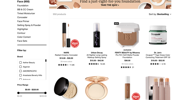
What we liked:
- Well Organised Navigation Menu: Finding products when there are thousands to choose from could be a complete mind-bender for online shoppers. Yet, Sephora did a great job organizing categories across the upper bar menu and listing each sub-category in a sidebar menu on the category pages. Sephora adopts a nested structure by listing categories inside the category pages and numerous products under each category.
- Quick Look functionality: With one click, shoppers can look behind product images and discover the essential information about a particular item. Sephora has included a color palette and helpfully highlights which tones and shades are not in stock by marking it with an X.
- Personalized Suggestions: Simple but effective; a list of “holiday gifts” and products under $25 provide customers with shopping inspirations that ultimately lead to purchase conversions.
- Filter Options: To make it easier for their customers to explore the multitude of products, Sephora offers a useful filter function on the left-hand menu. It helps customers significantly narrow their purchasing options by quickly navigating to the preferred brands within the desired price range.
What we didn’t:
- Too “old school”: Despite Sephora being a rather innovative brand, the overall design of its eCommerce site and the UX seems to stick to the basics. The same goes for its product listing, which follows the typical design flow. While safe, it doesn’t provide anything surprising for the user to experience.
- Partial Visuals: Sephora’s website is not the most visually appealing despite its best efforts to include high-quality product images. The tips offered at the bottom of the category page – while useful for SEO – probably go unnoticed by customers only because it appears like a chunk of text. The placement doesn’t invite visitors to pay any attention to it despite offering some great tips. This section would be more enticing and aesthetically pleasing if there’s more emphasis on the visual and organization, like the example below.

C. Analyzing Sephora’s Product Page
Sephora’s product pages are intuitive, focuses on the products, and provide loads of detailed information. The attention it has paid listening to and answering consumer questions is remarkable – one of the best we have encountered.
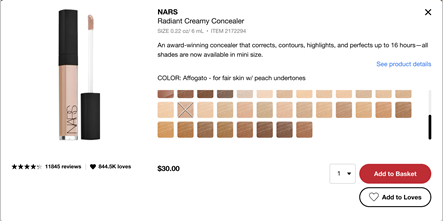
What we liked:
- Product Videos: We noticed product videos before the page fold for numerous products. This is an excellent tactic to skyrocket the customer experience, increase average session duration, and reduce the bounce rate.
- Explore this Product: This is an excellent section that enhances user engagements and “injects” tons of social proof on the product pages by featuring user-generated content from customers and influencers.
- Shipping Selection: Customers can reserve and collect items from their nearest store or pay for shipping. Sephora also informs shoppers how much more they need to spend to qualify for free shipping, a nice touch that can further boost shopper spending per order.
- Exceptional Product Info: Sephora has made a concerted effort to provide as much relevant information as possible to beauty connoisseurs. Tips include how to use products and ingredients. This section helps to build customers’ confidence through product education.

- Customer Reviews: The thousands of authentic customer reviews with star ratings for each product is by itself a key driver for sales. Furthermore, Sephora asks reviewers to provide details of their eye color, hair color, and skin tone, so buyers are more informed on the purchase decision.

What we didn’t:
- CTA button: There is only one “add to basket” button at the top of the page but a lot of scrolling for shoppers to learn about the product. It would be more convenient for customers if the add to basket CTA is stickier, either appearing at specific intervals within a page or remaining visible as shoppers scroll down the page.
D. Analyzing Sephora’s Checkout Process
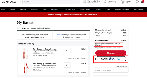
What we liked:
- Guest option: Not all online shoppers are comfortable with registering accounts with eCommerce brands. Sephora recognizes this and conveniently allow buyers to “check out as guest.” Nice touch.
- Reserve and collect: Sephora offers its customers the option to reserve a product and collect it from a store. This hybrid eCommerce model is ideal for customers that do not want to hand over sensitive information such as email and payment details or wait for the shipping to arrive.
- Credible payment options: Both Paypal & Klarna are trustworthy payment solutions that certainly reassure consumers to convert easier.
- Nice, minimal design: The checkout process offers clear, distinct steps with friendly color coding. The absence of a top menu and footer creates a neater user experience geared towards conversions.
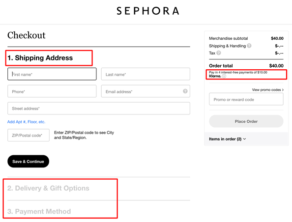
What we didn’t:
- Lack of Safety Badges: None trust badges, icons, or copywriting optimization like “Pay securely via…” was spotted, despite transaction safety is among the most crucial checkout best practices in eCommerce.
- Restrictive Shipping: Shipping options outside the US, Canada, or Japan is impossible. There is no UK or EU website, for example, and addresses in Europe are not available options. While this may be part of Sephora’s expansion strategy, we consider this as a missed opportunity for the millions of international visitors who may come across Sephora’s brand.
Interesting eCommerce tools that Sephora uses
Using BuiltWith, we scanned Sephora’s US website to highlight some of the eCommerce technologies Sephora uses among its arsenal.
- Klarna: The UK retail startup which revolutionizes the shopping experience adding great payment flexibilities to both customers and retailers.
- Signal: Offers deep analytical insights and real-time customer connections so brands can build profiles of high-value customers.
- Certona: This resonance personalization tool tracks consumer behavior and provides personalized recommendations based on real-time interactions.
- Olapic: A leading visual commerce software that strengthens product pages by showcasing user-generated content from the company’s social media accounts.
Some other interesting eCommerce tools that are worth mentioning, are the ones used by ASDA and the John Lewis brand, UK’s top homeware retailer, like Omniture SiteCatalyst, Bazaarvoice, and Hotjar.
Impressive Sephora stats you may not know
- Sephora is an empire: 2,600 stores in 36 countries worldwide!
- The company currently employs more than 30,000 employees
- Sephora has been twice recognized by Forbes as one of America’s Best Employers in 2018 and 2019
- Sephora’s website receives almost 60m visitors a month
Breaking Sephora news not to miss
- Sephora will open mini shops inside 850 Kohl’s stores by 2023, as retailer bets big on beauty – CNBC
- Sephora Shows How Inclusivity Is Good For Business – Forbes
Go omnichannel or go home (probably)
Throughout its history, Sephora’s expansion strategy has been admirable. The pivot to digital platforms has been highly impressive, triumphantly succeeding where so many other established high street brands failed miserably.
In short, Sephora’s success is not by accident. The company has built a solid foundation based on a customer-centric business model and marketing strategy from in-depth research to understand its audience’s needs and behaviors. Moreover, Sephora has successfully extended its strategic advantage across both online and physical channels it serves – an exceptionally well-executed omnichannel offering.
As the digital landscape continues to evolve and consumers hanker after convenience and personalization, eCommerce businesses face challenges to improve and adapt their business strategies. Omnichannel is not the future any longer. It’s here in our present age, and the sooner retailers prioritize their business strategy and goals, growth and results will follow.
ContactPigeon, one of the leading customer engagement and marketing automation solutions for retailers in Europe, has numerous capabilities to help any retail brand take the next step towards business transformation.

Let’s Help You Scale Up
Spending time on Linkedin? Follow us and get notified of our thought-leadership content:

