


ASDA is one of the largest and most famous retailers in the UK. Currently, it serves more than 18 million customers every week across its 600 stores. The British empire leverages machine learning, an omnichannel approach to retail, and now-iconic lines to meet emerging needs. In other words, the ASDA marketing strategy includes many cool tricks that can make a company stand out and get a competitive edge.
Resuming our favorite case studies and brand stories, the purpose of this detailed analysis is to benefit other retail businesses with both inspirational and instructive marketing gems. So without further ado, let’s take a deep dive into ASDA’s marketing secrets.
No time to spare? Listen on the go!
ASDA’s history through the years
ASDA’s history shows innovation at every turn. The Asquith brothers founded it in 1949, drawing on their experience as food entrepreneurs: butchers, grocers, and cafe owners. ASDA evolved quickly and achieved major success by being at the forefront of everything from food discounting to the eCommerce experience. The company has changed the way that the British shop more than once. It pioneered both supermarket shopping and box-store business.
At the beginning of the century, ASDA joined Walmart and became the exemplary crown jewel of the Walmart collection. The UK chain turned into an international icon of success. The retailer has responded to changing nutritional values. It’s won multiple Quality Food Awards, including retailer of the year multiple times. That’s particularly impressive when you consider that they also have been crowned the lowest-priced supermarket 23 years in a row.
Its most recent chapter revolves around ASDA’s strong response to the COVID-19 crisis and the business’s acquisition by a new set of brothers, the Issa brothers, in a partnership with TDR Capital. This move made it possible for ASDA to take full advantage of in-progress strategic initiatives and new opportunities.
Build smarter customer journeys and activate AI-driven personalization for repeat purchases.
The key marketing strategies ASDA used to scale
The brand has led the way in the integration of channels and diverse product lines since the beginning. Its current position results from innovative initiatives and the readiness to readjust the digital ASDA marketing strategy when new challenges arise.
Key Strategy #1: Omnichannel Approach
The ASDA marketing strategy models omnichannel best practices. Customers get to choose their shopping experience from a constellation of integrated options. ASDA enables them to move between physical and virtual locations, connecting them through in-store social, digital check-outs, Click & Collect services, and a mobile app designed to help with meal planning and budgeting.
The brand’s communication strategy has turned the retailer into a multi-media giant. It connects with customers through a print magazine, in-store radio, and an omnipresent social footprint.
ASDA’s latest push toward an omnichannel total experience pairs it with the digital supply chain management platform Blue Yonder. With Blue Yonder, ASDA sets itself up to integrate the management of its supply chain, order fulfillment, in-store workforce, and demand projection.
Key Strategy #2: Market Segmentation
ASDA isn’t just about food. George, its line of fashion and home goods, has long been an iconic British retail brand — possibly a little too long. Younger shoppers were using ASDA as a grocery store, bypassing its other offerings.
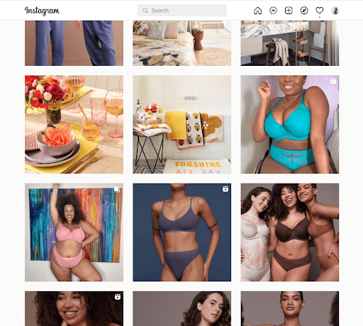
In the past two years, ASDA marketing segmentation has undergone a revolution that has brought George to a younger market with innovations in style, supply, and social. Instead of selling off the asset, the Issa brothers entered into new partnerships with young and home-grown British designers to design collections for George. They’ve also begun to develop influencer partnerships with campaigns on platforms such as Instagram.
The messaging has also gotten a facelift. ASDA retargets George to younger clientele with socially progressive messaging such as an inclusive lingerie campaign on its Instagram channel. Additionally, social campaigns often focus on ethical sourcing and body inclusivity, highlighting the radical change even more.
Key Strategy #3: Strong Crisis Management
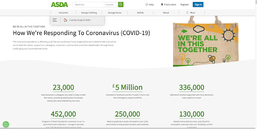
COVID-19 challenged businesses around the world, but it also led to pandemic-inspired marketing innovations. ASDA was poised to ride that wave as ethics intersected with profits during this crisis.
Always at the forefront of grocery eCommerce, ASDA responded to the pandemic with an efficient rollout of measures designed to protect vulnerable citizens. It increased delivery capacity, introduced a volunteer card designed for people shopping on behalf of others, and allocated exclusive store hours for NHS and care workers. The company also took care of its own with paid leave for vulnerable employees.
ASDA has donated millions of pounds worth of food to help food-insecure residents during the pandemic. As the pandemic has moved through different chapters, affordable options rose to the top of its commitments in stores and on digital platforms.

Key Strategy #4: Product and Format Diversification
Like its competitors Tesco and Sainsbury’s, ASDA has built its brand on the promise of providing an increasing number of products at low prices and with ultimate convenience.
ASDA’s product categories include:
- Groceries
- George Clothing
- George Home
- Mobile Products and Services
- Petrol
- Optician Products and Services
- Insurance
- Baby’s and Children’s Lines
They continue to find opportunities for cross-promotion and integration. One of their latest projects is the introduction of On the Move convenience stores that sell ASDA products and groceries at ASDA petrol filling stations.
Analyzing ASDA’s eCommerce website
We’ve analyzed four pages of the ASDA website and identified both its strengths and the mistakes you should avoid.
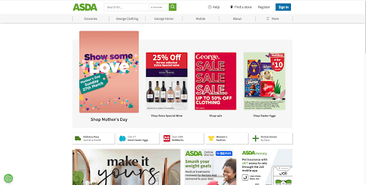
Analyzing ASDA’s Home Page
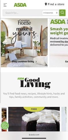
We’ll be honest. For all that we admire the ASDA marketing strategy, which relies on state-of-the-art digital tools and integrations, the home page fails to impress by betraying some basic design principles. Following eCommerce Home Page best practices is the best course of action in situations like that.
What we liked:
- Sticky search and navigation bar: No matter where you are on the website, you can easily find your way home — or to any of the other pages in the menu. Navigation material stays at the top of the frame.
- Integration of the lifestyle blog: The cleanest section of the home page is the block showcasing recent blog entries. By spotlighting ASDA Good Living, the company brands itself as a family resource dedicated to your holistic well-being.
- CTA for feedback: At the very bottom of the page, there’s a call to action (CTA) asking for feedback on recent store experiences. The company offers the chance to win £1000 in exchange for survey participation. While the promotion isn’t uncommon, putting it on the home page makes customers more likely to participate and underscores the message that ASDA cares about customer experience.
- Limited color palette: The primary colors are the trademark ASDA green, a darker green, and an eye-easy blue. By limiting themselves to green and blue, the designers add some much-needed cohesion.
What we didn’t:
- Lack of visual hierarchy: When you first arrive at the ASDA home page, your eye starts scrambling around the screen. Yes, you can find anything — if you already know what you’re looking for. The website does not provide a journey of its own. The page floods the viewer with promotional offers instead of focusing on one or two. Some of the page’s problems could be solved by changing one of its first two blocks to a carousel.
- Awkward main menu: The main menu is hard to navigate. It doesn’t show subpages in the directory, which would allow visitors to hone in on the precise area of the website they need.
- Too many buttons: ASDA may sell just about everything, but does it need a button for everything? We think not. Some of these topics should be subordinated to subpages and submenus.
- Messy featured graphics: The featured graphics are all promotions that have been compressed into the space rather than designed for it. This leads to difficult-to-read text and busy images.
- Gestalt failure: Gestalt theory asserts that people group similar things together and/or understand parts with respect to a unified whole. The visual relationships on the home page don’t make sense. Why are buttons for a virtual doctor’s visit and an Easter-egg promotion given the same format and put on the same line — along with buttons for “Women’s Fashion,” “Over 1.000 RollBacks,” and “Delivery Pass for just £6 a month”? The page provokes several similar questions.
- Poor mobile performance: The site is technically mobile responsive. Its layout translates to a more vertical-friendly one as you move from desktop to device. But some of these features — such as rows of buttons — don’t translate well. In addition, while the site now transitions some blocks to carousels, those carousels aren’t designed for one-image-per-screen scrolling. Instead, you see several promotions that are only partially in the frame.
Analyzing ASDA’s Category Page
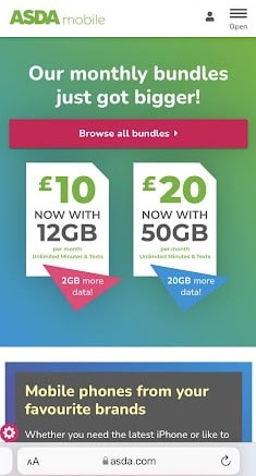
The category pages are substantially stronger than the home page. While the Groceries Page is busy, its elements hang together, and the design evokes the experience of in-store shopping with a coupon booklet, which is sure to appeal to an older clientele. Its Mobile Page is particularly strong. It’s full of valuable and logically organized content.
What we liked:
- Sticky cart functionality: As soon as you move into the catalog of phones, a small cart icon appears next to the menu icon. The site automatically updates your cart as you add things, and allows you to access it at all times.
- Strong menu: Unlike the home page, the category page menu is easy to navigate with an easy-to-digest number of subpages listed when you hover over the name of the page.
- Customer reviews: ASDA presents social proof for its plans, letting the viewer scroll through a carousel of customer reviews.
- Clean design: A limited number of blocks work well with the bold color scheme. The layout makes sense, and scrolling takes the viewer through a logical customer journey that relates to the sales funnel.
- Better mobile performance: The web design still isn’t ideal, but the page elements are better mapped for easy reading on a device.
- Clear CTAs: A more limited number of CTAs draw the eye with their bright pink color and appear at logical intervals.
What we didn’t:
- Poor filtered navigation: Across category pages, filtered navigation should be easier. There are few filters, and using them is awkward.
- Text-heavy: The Mobile Page has a lot of text. It’s well-chosen but still too much. The site would benefit from more visuals and stricter editing.
- Lack of cohesion between pages: Each category page has a fundamentally different layout and color scheme. It’s good to differentiate areas of the business, but there should be a greater sense of continuity between them.
Analyzing ASDA’s Product Page

As we continue to move through the funnel, ASDA promotes individual products with customer ratings and comprehensive information.
What we liked:
- Customer reviews: On grocery, fashion, and home-goods listings, ASDA follows all product reviews best practices. It advertises rating and number of reviews at the top and gives you access to everything customers thought, good or bad.
- Clear protocols for delivery and time windows: Whether it’s an emergency phone replacement or a pint of half-and-half, timing matters. ASDA’s delivery schedule makes sense. Even better, it’s transparent, allowing users to decide they’d rather run to the corner store if necessary.
- Playful spirit: At the side of the product details for phones, ASDA provides a text box titled “The nerdy stuff.” It allows you to find all the specifications you want or to scroll past with a smile.
What we didn’t:
- Timid CTA buttons: The “Buy Now” buttons for phone products are vivid pink, but it would be better if they were larger instead of the same width as other buttons. For grocery products, “Add” is the same color and width as “Add to List” and “Favourite,” just filled instead of outlined. “Add” is also a shorter word and thus a smaller button.
- Text-heavy: The product pages have too much text by a lot. Viewers need to be able to opt in to further information rather than having it overwhelm them upfront.
- Limited, small images: Graphics are relatively small in size and few in number. A better balance would be preferable.
Analyzing ASDA’s Checkout Process
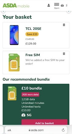
ASDA’s many repeat customers have made it one of the top online grocers in the UK, and good checkout flow provides a user experience that keeps them coming back.
What we liked:
- Clear and focused product recommendations: ASDA upsells with purpose. It limits its suggestions to additions that make sense based on previous behavior.
- Easy input fields: Information is easy to read and input for both mobile and desktop users.
What we didn’t:
- No guest checkout: To checkout, you have to register for an account. While this makes future checkout experiences easier, it might unnerve people who prefer not to save their information on websites.
- Few privacy assurances: ASDA could do more to assure customers that it’s taking all possible measures to secure customer information.
How ASDA could further improve its omnichannel customer experience
An omnichannel chat like ContactPigeon’s Samaritan would boost both the ASDA marketing strategy and its revenue by supplying current deficits in its website. A chatbot would provide customers with greater direction and support, lacking on the messy home page. Moreover, a coherent design and centralized platform for all communication would help tie different aspects of the business together.
A handful of retail technologies used by ASDA
Using BuiltWith, we scanned the UK website and highlighted the most impressive technologies that complement the ASDA marketing strategy:
- Omniture SiteCatalyst: A marketing automation tool that is the most popular in its class among the top 100,000 websites.
- Hotjar: An audience measurement tool with an impressive roster of clients including sports-gear titans Wilton and Puma.
Latest ASDA news
Stay up to date with the latest brand stories that highlight top-tier developments:
- The Grocer: “Asda to appoint 150 new ‘greengrocer’ roles nationwide.”
- Retail Gazette: “Asda trials digital ID at self-checkout.”
- Retail Week: “Asda makes budget ranges promises after anti-poverty campaigner complaints.”
- Retail Week: “Asda poaches Tesco and Nisa executives as it rebuilds leadership team.”
Impressive ASDA-related stats you may have missed
Need more proof that the ASDA marketing strategy has resulted in exceptional growth? Take a look at these numbers.
- ASDA has 145,000 employers that serve over 18 million employees. (ASDA Corporate)
- As of January 2022, ASDA commanded 14.4% of the market share. (Statista)
- To supply more than 600 stores across the UK, ASDA has 21 food depots, three clothing centers, and two website fulfillment centers. (QuerySprout)
- Stores range in size from the largest supercentre at more than 100,000 feet (Milton Keynes) to the smallest supermarket at 3,000 feet (Meanwood, Leeds). (ASDA Corporate)
- ASDA has more than two million Facebook fans and more than 500,000 followers on both Twitter and Instagram. Lifestyle brand George beats its Instagram performance with over 700,000 followers. (Facebook: ASDA, Twitter: @asda, Instagram: @asda, Instagram: @georgeatasda)
- ASDA is committed to local sourcing with more than 600 local suppliers that supply over 6,000 total products. (QuerySprout)
Discover more resources about FMCG retailers
- Sainsbury’s Marketing Strategy: Becoming the Second-Largest Supermarket Chain in the UK
- Tesco Case Study: How an Online Grocery Goliath Was Born
- The Marks and Spencer eCommerce Case Study: 3 Growth Lessons for Retailers
- The Ocado marketing strategy: How it reached the UK TOP50 retailers list
- ALDI’s marketing strategy: The key growth ingredients of the FMCG titan
- Walmart Marketing Strategy: Decoding the Success of the US Multinational Retailer
- Analyzing Lidl’s Marketing Strategy: How the Discount Supermarket Leader Scaled
- FMCG Marketing Strategies to Increase YOY Revenue
ASDA went omnichannel, did you?
The retailer may be due for a website facelift, but it’s led the way in eCommerce. The ASDA marketing strategy was able to adapt to the pandemic crisis so quickly because it already had a multichannel infrastructure in place. For the last two years, it has continued to innovate at breakneck speed, improving every facet of its omnichannel platform.
Take inspiration from the company’s passion and exceptional execution. The pandemic has created a new reality and demands more seamless integration between online channels and between in-store and online shopping experiences. Book your free consultation on customer engagement and eCommerce today. Let Contact Pigeon help your retail business adapt and thrive in the emerging climate.

Let’s Help You Scale Up
Spending time on Linkedin? Follow us and get notified of our thought-leadership content: