

Would you open a supermarket without any cash registers? Absolutely not; that would be ridiculous. And you shouldn’t neglect the online checkout experience with your business, either. Customers need a place to finalize their purchases that’s intuitive, easy to use, and hassle-free. By utilizing a few best practices, a little research, and good design, your eCommerce checkout flow can be exactly that.
Table of Content
The Importance of Checkout Flow
Your eCommerce checkout flow is one of the most important parts of the entire business website. You’ve brought the customer there with clever ads, drawn them through your site with persuasive design, and convinced them to make a purchase. The hard part is done, right? Not necessarily. You could still lose them with poor checkout flow design.
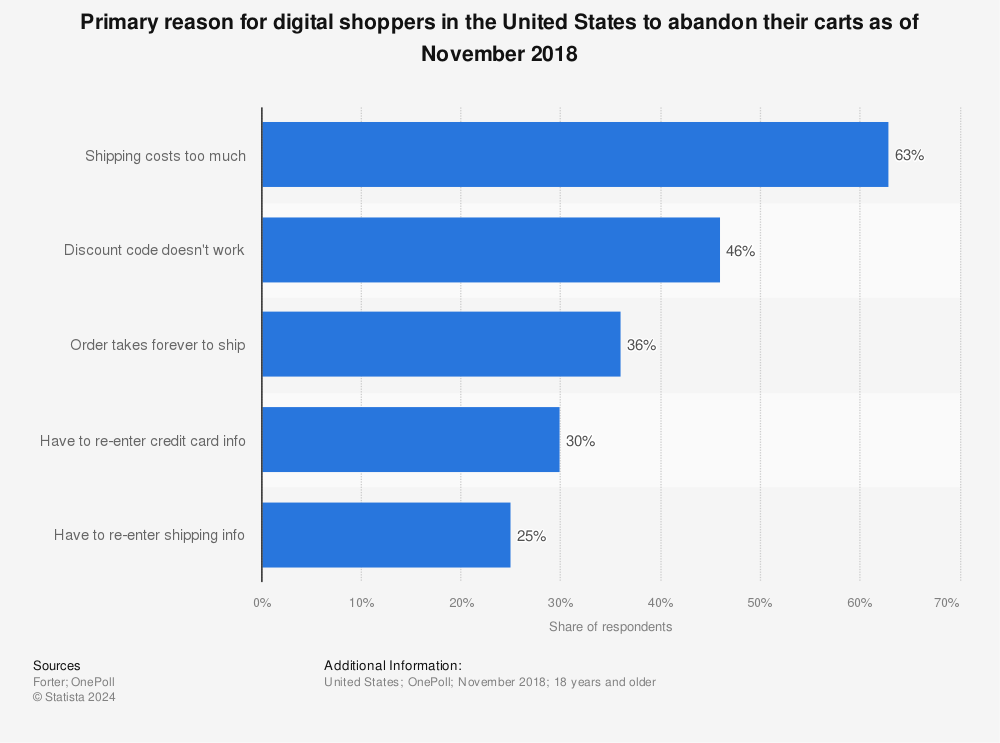
According to recent data from Statista, 63% of people abandon their purchase before they buy. Some studies put that figure as high as 75%.
You’ve done all that work to get them there, only to lose them at the final precipice. It’s called “cart abandonment,” and it’s one symptom of the poor checkout flow. Data entry pages with too many fields, unclear product information, and repetitive checkout pages can also lose the customer just as they were ready to buy.
In this post, we’ll define just what checkout flow is, and how you can optimize its design to make the user experience more seamless.
eCommerce Checkout Flow FAQ
What is Checkout Flow?
So what is checkout flow, and what does it have to do with your eCommerce website? Checkout flow can be defined as the customer’s experience during checkout on your site. How well can they move from the beginning of the process to the end purchase? The ease with which they move from one step to the next should be so simple that it flows.
What Makes Good eCommerce Checkout Pages?
Good eCommerce checkout pages should be easy to navigate, have clear instructions, and not take too long to complete.
Why Should I Care About Optimizing My Checkout?
Optimizing your checkout experience will put money back into your pocket and help turn traffic to your page into actual revenue. According to another Statista report, eCommerce was responsible for over two trillion dollars of sales in 2017 alone and is projected to top four trillion in 2020. Imagine how much higher that number could’ve been with less cart abandonment!
How Can I Improve My Store’s Checkout Experience?
By building a smooth, intuitive checkout page for your customers. Avoid anything that will make the checkout experience slow or overly burdensome. Being upfront about any fees, like shipping, isn’t a bad idea either. In general, no matter which type of website you own nowadays, optimizing it is a necessary and never-ending story.
The High Conversion Checkout Design Flow Checklist
Now that we’re beginning to understand the value of an optimized checkout design, let us show you how to make it a reality in your online store. We’ve gathered some key insights from conversion stats from our client base to form a checklist of high converting checkout designs. This list will take you through each stage of the checkout process in the same order as the customer, detailing how to tweak each one for optimal flow.
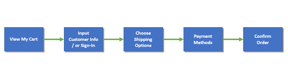
Chart showing the general checkout flow of an eCommerce business.
The General Checkout Process
Having the following items as part of your overall eCommerce checkout flow design will do a lot to make buying a seamless experience for the customer.
- Minimize the steps in the process. Use only the form fields that you need, and try to use as little as possible so the customer isn’t spending too much time typing in their information. Utilizing autofill can help with this.
- Avoid having the customer re-enter too many things, especially shipping and payment information that they’ve already entered on a previous page. Having an option to make the shipping address the same as the billing address, for example, could help here.
- Display a progress bar at the top of the screen, easily visible, to let the customer know where they are in the process and navigate backward should they need to. Again be sure there aren’t any unnecessary steps in the checkout process.
- Display trust seals to let people know their sensitive data is protected. Customers less worried about their payment information or address being leaked are more likely to convert. Displaying these at multiple points during the checkout experience, as well as an SSL certificate, will reinforce that security.
- Include customer reviews throughout the checkout process, with the exception of the payment page.
- Include a call to action (CTA) button only for options that bring the customer closer to the final “Thank You” page.
- Offer a guest checkout option.
- Offer gift wrapping, and be clear if that includes an extra charge.
- Show options for express delivery if they’re available.
- Provide multiple payment options so you can include as many buyers as possible. That means Google Pay, Apple Pay, PayPal, and others in addition to the standard debit and credit card providers. Some of these providers have a very loyal customer base, and it would be smart to draw those people in.
- Include “checkout” buttons at both the top and bottom of the screen.
- Show shipping fees clearly and early in the checkout process to avoid unpleasant surprises for the customer. Consider leaving the payment page for last; the customer may be more likely to complete the purchase if they’ve already entered other information.
- Provide a clear link to your policies and make sure users can contact customer support from anywhere in the checkout flow. Make sure customers know how returns are handled and are aware of any guarantees pertaining to your company and product.
In addition to the tips above, research your competition. If there’s a more successful company than yours in the same arena, take a look at what they’re doing and see how you can incorporate it into your own checkout flow model. Do they have a beautiful checkout design? Or do they go for efficiency, more like an Amazon checkout design? Which of those would work for you?
Design your flow using wireframes so you can easily follow the path you’d like the customer to take. Try using analytics to gather data on their path through your checkout flow. See if you can figure out where they’re getting stuck, and why.
Doing so can help you refine your page design. Maybe there’s an extra page or a few extra form fields you don’t need, a delay throwing the customer off. Always be revisiting your checkout flow, as well as the rest of your site, to see how it can be better.

Step 1: Shopping Cart Page Checklist
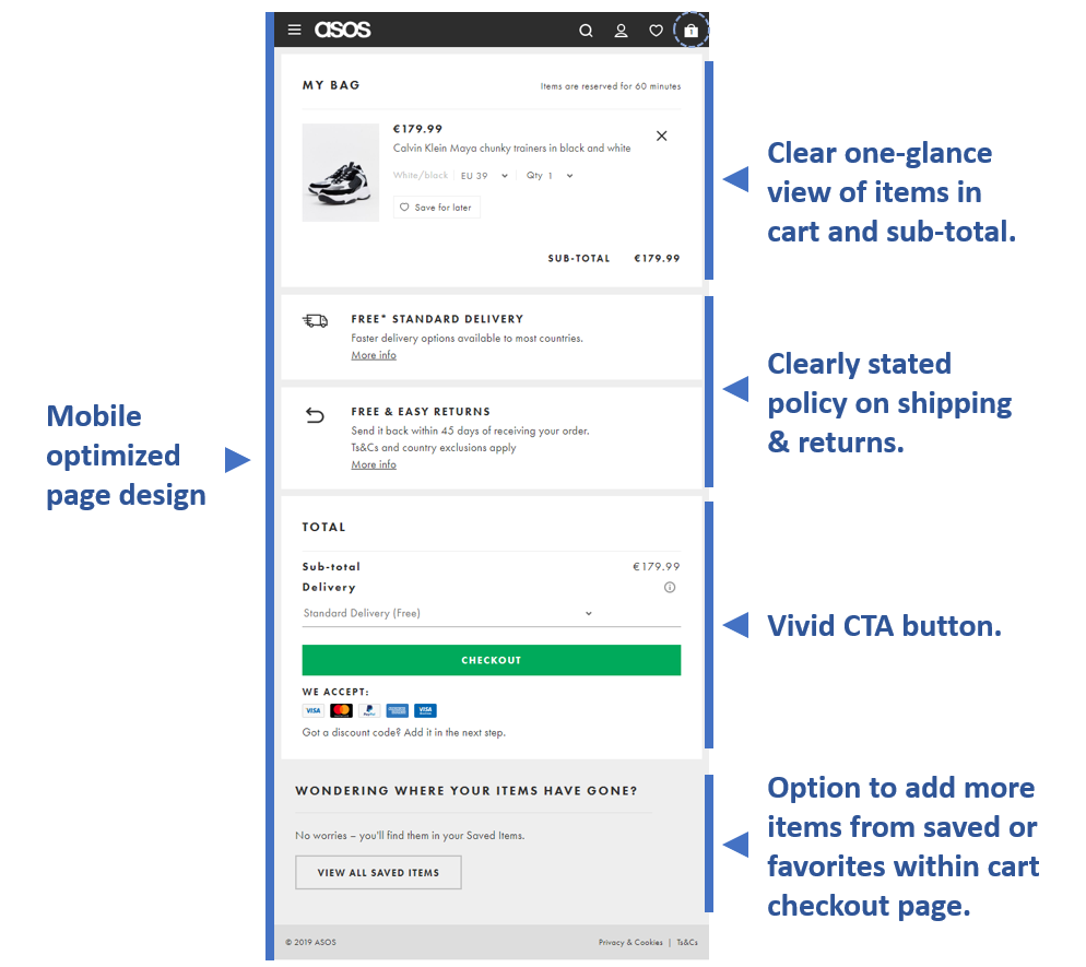
Example of cart checkout page from ASOS.
Here are some ideas for your shopping cart page that can help ensure an optimal checkout experience.
- Make the “checkout” CTA button nice and vivid, with no other buttons distracting from it.
- Provide a clear view of items in the cart. Either let the user add their item and remain on the product page with an “add to cart” option, OR take the user to a separate shopping cart page when they add an item to their cart.
- Give the customer clear confirmation when they’ve added something to their cart, like a little cart icon with a number next to it showing how many items are waiting to be bought.
- Have the cart confirmation icon or box stay open until the customer clicks somewhere else so they definitely see it.
- Consider a mini cart animation if you’re opting to let your customers stay on the product page when they add an item to the cart. Having something come in from the side of the screen showing what they’ve added, then stay until they close it or click away, is a great way to make sure they’re notified of what’s in their cart.
- Display all the relevant information regarding the products in the customer’s cart, so they can double-check before they buy. This includes an image, product name, and product specs.
- Use a unified color scheme and design that fits the rest of your site and makes it easy for users to find elements like CTA buttons. Use color to highlight information like CTA text.
- Keep it simple; avoid conflicting information or an abundance of CTAs that will distract the user from moving forward through the checkout process or cause them to abandon their cart altogether.
- Clearly stated policies on shipping, returns, etc.
Step 2: Customer Information Input Checklist
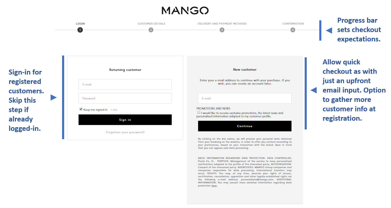
Example of customer sign-in and data input pages from Mango.
Make it easy for the customer to provide their information.
- Minimize the number of forms they need to fill.
- Add a “same as billing address” checkbox for the shipping address.
- Auto-populate fields.
- A/B test pages with differing numbers of forms to see which works best.
- Ask for payment information last.
- Consider a one-step (one page) checkout design.
- Have a guest checkout option.
- Make sure you get their email for follow-ups and cart abandonment reminders.
Step 3: Shipping Method Choices Checklist
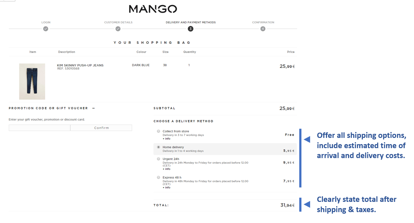
Example of shipping method selection from Mango.
Once the user is ready to choose a shipping option, make that as easy for them as possible.
- Make it easy for them to choose a shipping method, and outline clearly how much each one costs.
- Give a clear estimation of the delivery date to the customer, not the shipping company. You could provide a range of dates, and it’s better to err on the side of caution. Be conservative with shipping estimates.
- Name the shipping company you use.
- Offer same-day/express delivery.
- Offer an option for receipt of the invoice.
- Let the customer know if you accept payments in installments.
- Link to your FAQ on shipping/returns for more information.
In the example provided, Mango concisely combined shipping detail, delivery methods, and payment options into one page. This is a great way to minimize the number of clicks a customer has to go thru in order to complete the checkout process.
Step 4: Payment Method Checklist
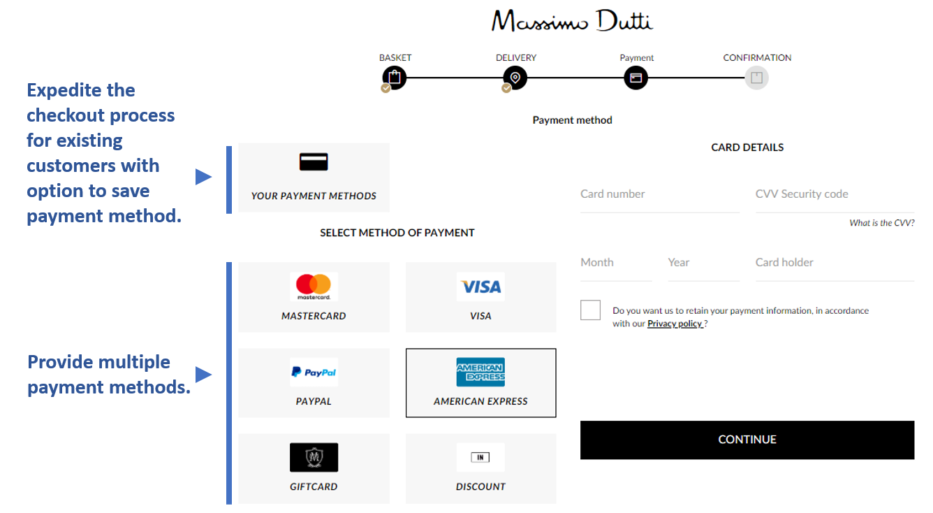
Example of payment method selection from Massimo Dutti.
Now that you’ve gotten the customer to the final step, make sure they commit.
- Remind customers that their payments are secure.
- Add at least three safety-related trust marks (anti-fraud, SSL, encryption).
- State clearly which payment methods are accepted, and if additional fees apply to any of them.
- Let the customer know if they’ll be redirected when paying with a card.
- Use autofill for information like their name and shield sensitive info like the credit card number.
- Make sure your payment page is optimized for mobile as well as desktop.
Offer multiple forms of payment. In addition to the standard credit card carriers, digital wallets like Apple Pay and Google Pay will bring in more customers. The more options they have to pay, the more likely they are to buy. They’ll also remember that you offered their option if it’s an unusual one, and come back.
Step 5: ‘Thank You’ Page Checklist
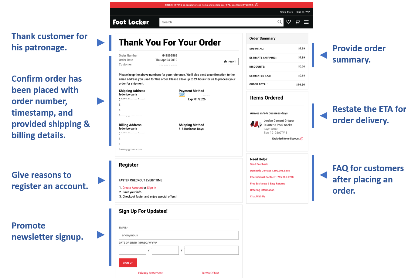
Example of Thank You page after checkout from FootLocker.
They’ve committed to the purchase, but there’s still a little bit more you can do before your customer leaves.
- Confirm that the order was submitted.
- Inform if you’ll be sending a confirmation email.
- Include upselling and cross-selling widgets.
- Offer the chance to leave feedback/reviews on the shopping process.
- Promote any relevant events or products coming up.
- Add a link to your blog so interested customers can see it and subscribe.
- Restate the delivery estimate (your order should arrive between X and Y dates).
Bonus: How To Stop Cart Abandonment With Personalized Dynamic Exit Intent Pop-ups
No business is going to have 0% cart abandonment, but you can do your best to reduce yours. One way to reduce the number of people that leave your site is with dynamic exit-intent pop-ups. You can simplify the process of creating them with a reliable tool. We’ll use the eCommerce marketing automation tool ContactPigeon (CP) as an example here. They offer a lot of great options combined into one, including the ability to make personalized exit-intent pop-ups.
Here’s how to use ContactPigeon to make a pop-up.
Step 1: Create a Pop-up or select from an existing template

Then, choose pop-up triggers.
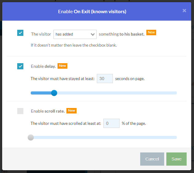
Step 2: Select how you would like the pop-up to be triggered
For example, you can trigger the pop-up on exit by an unknown visitor only.
You can also set a number of other parameters, such as:
- Minimum number of pages a visitor should have seen within the last 30 minutes
- Minimum duration visitor stayed on a page
- Percentage of a page viewed
- Whether if a visitor has made any “add to cart” action

In the case of abandoned cart exit-intent, you’d want to make sure to pick “On-Exit Known Visitors” to trigger the following settings.
Step 3: Enable “add to cart” option under the trigger options
Make sure the visitor “has added” something to his basket. You can also set additional criteria such as time spent on-page to ensure the visit has been meaningful.
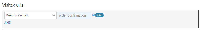
Lastly, to make sure that the popup is only delivered to that visitor who has not completed an order checkout, you would need to filter out any visitors who has already reached the order confirmation page. Similar to the example from the screenshot example below, you need to add the unique URL name of the confirmation page from your business.
That’s all. Now, all you need to do is to set the pop-up live and see the conversion grow!
What’s Next? Read more great eCommerce Checkout resources:
- Best Checkout Pages in eCommerce [2019 Edition]
- 27 Top eCommerce Checkout Tips for 2019
- The eCommerce Checkout Best Practices Infographic
- Mastering The Abandoned Cart Recovery Process
- 10+1 High Converting Abandoned Cart Email Examples For Inspiration
Putting It All Together
Now that you know the best practices for checkout flow optimization, and how to implement them in each step of the process, it’s time to get to work. If you haven’t built your checkout page yet, use these steps as a guideline to create a high converting eCommerce checkout flow in the industry. If you’re retooling your current website, go through step by step and see what you can change. It may seem insignificant, but you’ll no doubt be surprised at the benefit you get from putting a little extra effort into your checkout flow. And, your customers will thank you.

Let’s Help You Scale Up