

An eCommerce dashboard is essential for retail brands looking to optimize their operations and make data-driven decisions. By providing an in-depth view of decisive metrics and KPIs, the dashboard helps businesses stay ahead of the curve and make informed decisions about their eCommerce strategy.
A well-designed eCommerce dashboard as a part of CDP and should be both intuitive and comprehensive. Read on to see the must-have KPIs and metrics you must include in your dashboard and the guiding principles for optimal dashboard layout.
Table of Contents
One-minute FAQ to fully understand an eCommerce dashboard
What is an eCommerce dashboard?
An eCommerce dashboard is a visual representation of decisive metrics and retail KPIs (Key Performance Indicators) related to the performance of an e-shop. It overviews essential data points, such as sales, traffic, conversion rates, and customer behavior, in a visually appealing and easy-to-understand format.
Why is it so important for eCommerce and retail businesses?
The primary aim of an eCommerce dashboard is to provide business owners and managers with a quick and straightforward way to monitor the health of their online store and make data-driven decisions. By aggregating and displaying significant metrics in real-time, eCommerce dashboards can help organizations identify trends, opportunities, and potential challenges and respond to changes in the market.
What should an eCommerce dashboard contain?

While there are multiple types of eCommerce dashboards for the retail industry, a standard one should include data metrics about product sales, web traffic, marketing performance, customer behaviors, and the operational health of the business. They can also be integrated with other tools, such as analytics platforms and payment gateways, to provide a holistic view of the eCommerce ecosystem.
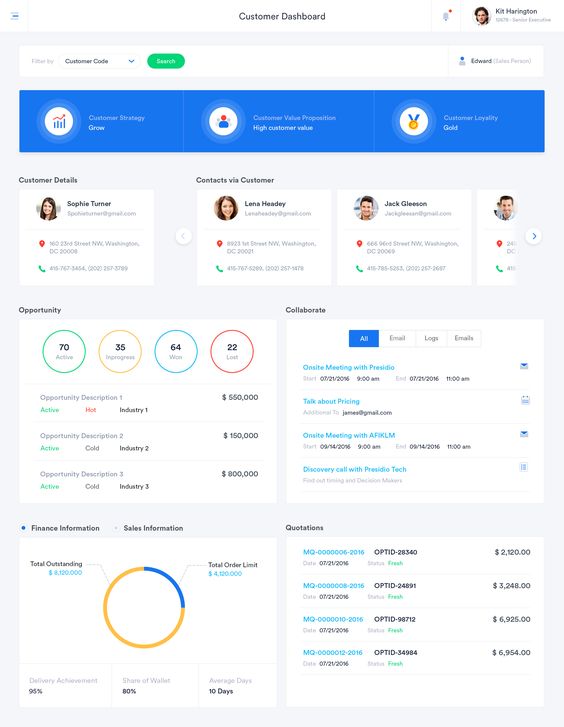
Creating an insightful eCommerce dashboard for retail
Key components of a 360° eCommerce dashboard
Seven core key components make up an eCommerce dashboard, but the specific metrics and data displayed can vary based on the needs of the business.
Component 1: Sales & financial metrics

A key goal for the eCommerce dashboard is to provide viewers insights on sales performance, revenue growth trends, and other key financial metrics such as gross margins. Incorporating the right metrics and visuals here would enable the dashboard viewer to gauge the success of the eCommerce business quickly.
Component 2: Website and user experience
A core component of any online business revolves around site traffic. Hence, any data that informs the viewer about visitor trends should be incorporated here. Incorporation includes website traffic, conversion rates, page views, and other metrics that indicate the effectiveness of the user experience.
Component 3: Marketing performance
The eCommerce dashboard should also help viewers evaluate the effectiveness of marketing campaigns and channels, such as email, social media, organic growth, and paid advertising. Metrics here should identify the key channels and campaigns that bring in visitors and sales, highlighting the areas that may need more attention.
Component 4: Customer insights
This component should include data and visuals that help viewers understand customer behaviors, such as customer acquisition, retention, and lifetime value.
Component 5: Product info

Understanding how products move is a significant part of the retail business. The eCommerce dashboard would only be complete with monitoring the product performance, including product popularity, average order value, and inventory levels.
Component 6: Shipping & Logistics
The dashboard should monitor shipping and delivery times, shipping costs, and other metrics related to order fulfillment and logistics. On-point monitoring is even more important during peak seasons, such as holidays or seasonal sales events, where logistic delays may lead to a backlash of issues.
Component 7: Operational metrics
Lastly, it’s important not to lose sight of the key operational metrics, such as order processing times, return policies, and customer support response times. These metrics help eCommerce managers understand how efficiently the business operates and spot any potential hiccups that impact customer satisfaction.

Must-have KPIs and metrics
Revenue KPIs & metrics
Revenue metrics measure the performance of an eCommerce business and track its growth over time.
- Total sales: The total amount of revenue generated from sales.
- Gross margin: The difference between the cost of goods sold and the revenue generated from sales. Expressed as a percentage or actual numeric amount.
- Average order value (AOV): The average amount spent per order.
- Sales by product/category: The sales performance of individual products or product categories. Similarly, gross margin by product or category is helpful in understanding which product group is most profitable versus loss-making.
- Sales by channel: The sales performance of different channels, such as organic, paid marketing, social media, or through a mobile app.
- Sales by geography: Provide insights into how sales vary in different geographical locations, such as regions, countries, or cities. This metric is particularly useful for retailers with a physical presence, as it can pinpoint potential locations for physical stores.
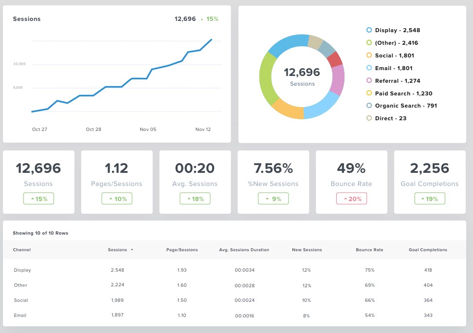
Website behavioral KPIs & metrics
Web behavior metrics provide insights into how users interact with the eCommerce site, helping businesses optimize the user experience and improve conversions.
- Sessions: It is the total number of sessions made during a predefined period.
- Average session duration: Amount of time a visitor was on the website, often used to measure engagement.
- eCommerce conversion rate: The percentage of website visitors who completed a purchase.
- Unique visitors: Number of distinct individuals visiting the e-shop.
- New visitors: This metric is about the percentage of visitors that came to the website for the first time.
- Bounce rate: The rate of visitors who leave a website after viewing a single page. The bounce rate is an indicator of the quality of the landing page (e.g., user-friendliness, load time, trustworthiness, etc.) and whether the content matches the visitor’s expectations with search or paid results.
- Exit rate: The percentage of visitors who leaves the website from a specific page.
- Scroll depth: Amount of a page a user has scrolled through, often used to measure engagement.
Marketing KPIs & metrics
There are numerous KPIs for measuring marketing success, so let’s break them down by channel type.
A. PPC / Paid campaign metrics
- Total impressions: Total number of instances someone has seen (or potentially seen) a link to the campaign ad, whether it’s a paid link or visual ad.
- Average click-through-rate (CTR): The ratio of clicks to impressions to the paid ad.
- Total spend: Total cost of the ad campaign.
- Total conversions: Total sales generated from orders made by visitors sourced through the campaign.
- Cost per conversion: Calculates the total cost incurred to acquire a customer purchase.
- Return on ad spend (ROAS): The revenue earned for every dollar spent on the campaign. This metric shows the profitability achieved for each campaign effort.
B. Search engine optimization (SEO) metrics
- Total organic traffic: Total number of visitors coming through organic search results.
- Total organic impressions: Total number of instances someone has seen a link to the website.
- Average organic CTR: The ratio of clicks to impressions to the website’s search listing.
- Average position: Tracking of the position of the website’s keyword in the search engine results.
- Backlinks (referring domains): The number of backlinks pointing to your website from other sites.
C. Messaging Marketing (Email / SMS / Push Notifications) metrics
- Total Sent: Total number of campaign messages sent to your recipients.
- Total Delivered: Total number of campaigns reached the intended medium (inbox, mobile, or pc devices). These metrics can be different from the total sent because of bounced messages, caused by a variety of reasons, including wrong contact info or a full inbox.
- Opens: Total number of messages opened or viewed. Note that this metric is only trackable on specific mediums such as email, Viber / WhatsApp, or push notifications.
- Open rate: Ratio of opens to total delivered.
- Clicks: The number of clicks to a URL link within each messaging campaign. In ContactPigeon, we consider a click unique to the recipient and URL for a specific message. This is a good indicator of campaign engagement.
- Click-thru rate: The ratio of recipients who clicked to the number of messages delivered.
- Conversion rate: This is the number of recipients who made a purchase order over the number of messages delivered.
- Unsubscribes: Total number of recipients who choose to unsubscribe from future communication or specific mailing lists. This is a great indicator of the quality of the campaign message.
- Top campaigns by open, conversions, and revenue: Having a tabular view of campaigns by open rate, conversion rate, and total revenue generated is a good way to quickly understand the performance of the campaign at a comparable level.
D. Social media metrics
- Reach: Measures the potential unique viewers a post or campaign has.
- Engagement: Rate of interactions between your content and your audience on social media. This is often measured by interactions such as “likes”, clicks, comments, and shares.
- Clicks: The number of clicks to a URL link within an ad or social post.
- Purchases (Conversions): Number of order purchases resulting from the social channel.
- Spending: Total costs from social ads.
- Average cost/purchase: The cost incurred to reach a purchase.
- Average cost per click (CPC): The average spending over the number of clicks.
E. Referral marketing metrics
- Top referrals by revenue: A breakdown of revenue generated by referral source.
- Top referrals by sessions: A breakdown of total sessions generated by referral source.
- Acquisition costs by referral: Average spend to bring in one customer by referral source. This key metric helps to highlight the profitability of your referral channel.
Customer insight KPIs & metrics
The following metrics help shed light on the purchasing behavior, as well as the cost and value of acquiring and retaining customers. It is most effective to track such metrics at the segment level to understand how specific groups of customers are characterized.
- Customer lifetime value: The total revenue expected from a typical customer as long as that person remains a client. It’s best to look at the total average revenue and the average profit by customer.
- Customer acquisition cost: Total cost incurred to acquire a new customer. This includes the cost of marketing and sales required to reach the first purchase.
- Customer retention cost: Total cost incurred to keep a customer buying from your business as long as possible over a specific period of time. This often includes marketing campaigns, offers, and sales costs associated with existing customers.
- Customer churn rate: The ratio of customers lost over the total of customers at the start of the period.
- Repeat purchase rate: The percentage of customers who make second or more purchases.
- Customer satisfaction score: Measure of customer satisfaction. Often, this metric is collected and calculated from customer satisfaction surveys, and supplemented by social tools that measure consumer sentiments.
- New customer: Period-over-period comparison of the number of new customers acquired.
- RFM analysis: These analyses include measuring the recency, frequency, and monetary value of purchases incurred within a specified period of time at the customer or customer segment level.
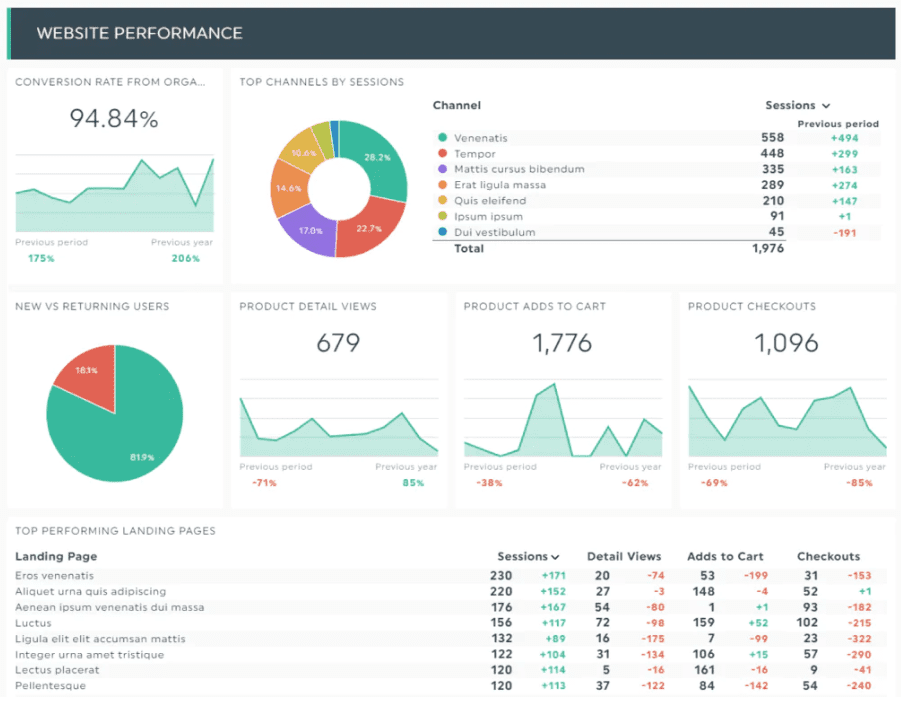
Product info KPIs & metrics
Product metrics provide insights into how well the products are selling, their profitability, as well as the inventory level. The metrics should be kept on product grouping or category level, with the ability to drill down into specific products.
- Revenue by product category: The total sales generated by each product or product category.
- Gross margins by product category: The total gross margin generated by product or product category. This metric, along with the revenue by product, helps viewers understand the product or product groups that are generating the most sales and profitability for the business.
- Quantity sold: Total number of quantities sold by product or product category. This helps to understand the popularity of the product by volume.
- Inventory turnover: Measure of how efficiently the business can sell the entire in-stock inventory relative to the cost of goods sold within a given period.
- Inventory to sales ratio: A measure of inventory in stock relative to the number of fulfilled sales. Given that inventory is often a company’s biggest expense, retailers that can keep the inventory-to-sales ratio low, save money overall.
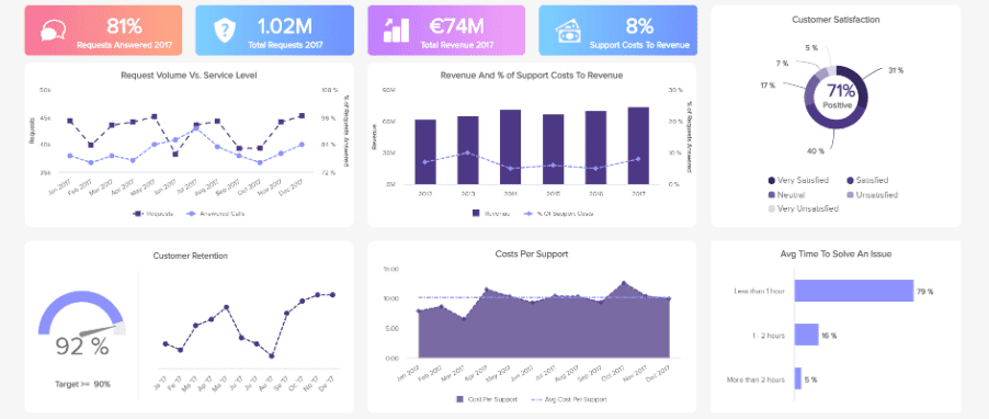
Fulfillment, shipping & operational metrics
These metrics allow viewers to grasp the health of their operation and highlight areas that may potentially cause bottlenecks in the process.
- Average order processing time: The time between when an order is placed by a customer and when the order is fulfilled by the business. Orders that require shipping are considered fulfilled when the business sends the package to the shipping courier service.
- Average shipping time: The length of time it takes for companies to ship an order on or before the requested date. This metric is vital to customer satisfaction.
- Rate of returns: Measures how frequently product returns take place. This is the number of orders returned over the total order volume.
- The number of customer requests/inquiries: The number of customer inquiries via all support channels, including call center, email, online chat, social channels, and even written requests. Monitoring the trends in customer inquiries provides a good view of customer satisfaction.
- Average resolution time: The amount of time it takes a customer service representative to solve a ticket once it’s been created.
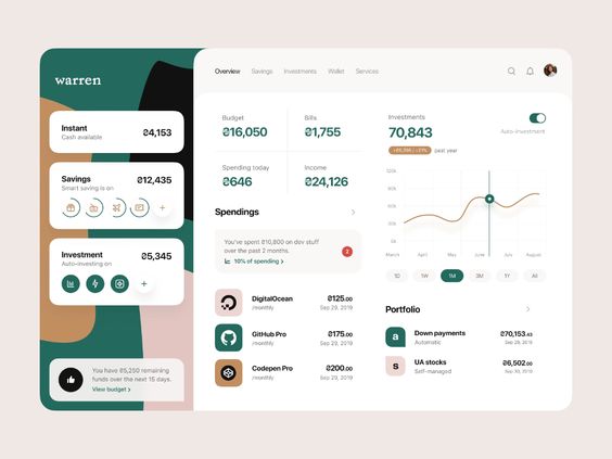
eCommerce dashboard best practices and examples
Given the extensive array of data metrics available to eCommerce managers and marketers, the challenge is always around filtering down those metrics and data points without overwhelming the viewer with a massive report. Great eCommerce dashboards are clear, interactive, and user-friendly. They need to communicate the information at a glance through efficient data visualization that allows viewers to extract actionable insights, identify trends and patterns, and locate potential areas for improvement.
Here are the guiding principles to manage your dashboard-building process.
1. Keep your audience in mind

The audience is one of the most important factors to take into account when it comes to designing your eCommerce dashboard or dashboards. You’ll need to know who will use this dashboard and for what purpose to choose the relevant KPIs and define the best views for them. Consequently, there is no one-size-fits-all dashboard for all viewers, so you may want to tailor the dashboard or create different dashboards with a specific audience in mind.
A typical eCommerce report may have several audiences, each of whom has different goals in mind.
- Managerial / executive / financial users: This type of user often looks for the big picture. They want answers to questions such as how my business is doing relative to our quarterly or annual goals, or the key trends and patterns that may impact where the business or industry is going. The executive user often uses a dashboard to monitor long-term company strategies and benchmark a wide range of trend-based information. Some key metrics include sales, customer insights, and high-level product trends. Comparison to similar periods (last quarter, last year) are particularly important here, and are part of CDP strategies.
- Marketing managers or analysts: Marketing users rely on the dashboard to track the performances of recent marketing campaigns, understand customer behaviors and help formulate future marketing strategies. For this type of user, it’s helpful to provide the ability to filter and drill down data, where they can track comparisons across various channels and campaigns. Key metrics for marketing audiences are web traffic, marketing performances, and product info.
- Operational managers or analysts: The operational managers or analysts seek information to monitor and manage the health of the eCommerce business. They are using the dashboard to highlight areas for potential disruptions. You may want to include detailed and data-rich views with shorter time-frequency (by hour, day, or week). Metrics include web traffic behaviors, product details, fulfillment, and operational metrics.
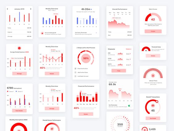
2. Telling a story with data visualizations
Simply put, dashboard storytelling is a process that presents data visually that will depict the whole narrative of the data analysis to understand business goals and performances efficiently. In addition, it’s a way to enlighten users for which the data analysis process may not be available or accessible.
Dashboard visualization falls under four general categories: relationship, distribution, composition, and comparison. Determining which visualization to use depends on the goal of the metrics you’re trying to present. Here is a flow chart that will help you choose the optimal chart type based on your needs.
- Line charts: Ideal for displaying patterns across a continuum (e.g., time). At the same time, multiple lines can help you compare different series. Line charts have a common format and are hence familiar to most people, so they can easily understand the information at a glance.
- Bar charts: Great for quickly comparing items within the same category, for example, visitor signup by source. Bar charts come in various flavors and include column charts, area charts, and stacked bar charts.
- Pie charts: These charts show percentages of a whole. This function allows viewers to quickly understand the breakdown by categories and compare them based on the sizes of the slices.
- Funnel charts: Funnels are exceptional for showing data in sequential stages (e.g., customer conversion flows, and sales process).
- Bubble charts: Primarily used to depict and show relationships between numeric variables, such as comparing costs, values, and risks. The bubbles’ size and position allow visualization data on a 3-point axis.
- Scatter charts: Use a scatter plot when two variables may have a positive or negative relationship. For instance, sales of ice cream versus the temperature or grouping of visitors with marketing spend.
- Gauge charts: Gauges often show key business indicators, such as sales volume or the number of customers. They use various color indicators to represent different values of the same metric scale and have a needle pointer to indicate current standing.
- Tables: Although tables are not precisely data visualization, the trusted old-fashioned table is still the best way to present data in an organized and sequential manner. Tables are helpful when you want to enable viewers to look up specific information.
3. Plan your layout
Once you have defined the key metrics and visuals you want to include in the dashboard, how they are placed on the dashboard also impacts how easily viewers can find and understand the analysis. A well-planned layout helps viewers efficiently locate important information and grasp key takeaways without spending much time trying to understand what they are seeing.
A general rule of thumb is to present the most critical information at the top of the view and start from the top left side, where the reader’s eyes typically begin reading. Major trends should be visible at a glance before proceeding to detailed charts. Always try to group metrics of similar themes or keep them close by so viewers need not switch mental gears when moving from one chart to the next.
Best tools for accurate and productive eCommerce reporting
A major headache for most users when designing an eCommerce dashboard for the retail industry is building integrated sources for a comprehensive report. Often the data from eCommerce performance sits within the eCommerce platform (CMS), email marketing data within a separate email tool, traffic sources within Google Analytics, and performance marketing yet within another system. These facts present a challenge as disparate data sources don’t blend well to perform any calculation or aggregation analyses.
The best tools for eCommerce reporting are those that support the integration of data across multiple sources, can run various models or scenarios, and produce great-looking visuals in the final dashboard outputs. Here are some recommendations:
ContactPigeon + Looker

One of the core capabilities of ContactPigeon is the 360° view of customer profiles. The platform by intent is designed to pick up visitors’ live web behaviors such as acquisition source, page views, time on page, clicks, and conversions. When combined with eCommerce actions (e.g., product viewed, add-to-cart actions, and checkout) and campaign interactions – email, mobile marketing, push notifications, pop-ups, and omnichannel chat, ContactPigeon provides you with a comprehensive view of customer engagements across the entirety of your online touchpoints. This function helps minimize your data integration effort by miles, as ContactPigeon combines the power of Google Analytics with your eCommerce CMS and outbound marketing solutions.
By default, ContactPigeon offers multiple dashboard views of eCommerce and marketing performance, ranging from sales overview to detailed campaign results.
For enterprise users, ContactPigeon has recently integrated with Looker, a powerful business intelligence and analytics software that helps users to analyze and share insights for decision-making. Users can use this BI tool to explore the massive data set within ContactPigeon and build data models that help to answer crucial questions and make predictions.
Questions such as:
- How much should I spend on acquiring new customers versus upselling to existing ones?
- Are my marketing messages resonating with my target audience?
- What’s the optimal number of touchpoints to get a return purchase?
ContactPigeon + Looker key features
- Unique insights into eCommerce, marketing, and customer insights without heavy integration efforts
- Deep understanding of customer journeys and what it takes to convert a customer
- Ability to drill down, pivot, and model data on demand
- Forecasting and prediction for the future of your brand
- Automated eCommerce reports to be delivered periodically
ERP + Tableau / Power BI
More likely than not, your retail organization already uses an internal ERP system that manages product inventory, logistics, financing, and many other functions. ERP is a good starting point to amass the majority of your eCommerce data, such as product pricing, shipping info, customer inquiries, and perhaps order status – assuming the eCommerce activities integrate here. You may need to develop integration with solutions that capture visitor behaviors, such as Google Analytics and other marketing tools used for outreach campaigns (e.g., email marketing). After that, you will need to load these data sources to a BI tool to define your metrics and build the correct views of your eCommerce dashboard.
Tableau and Power BI are well-built data visualization tools that allow users to connect easily to various data sources and create interactive dashboards. However, there are a few things to consider when choosing which BI tool to implement, as each has its strength and weaknesses.
For instance, Power BI by Microsoft is generally considered more user-friendly, intuitive, and affordable. It integrates well with other Microsoft products, such as Excel and SharePoint, making it a popular choice for businesses that subscribes to these products. On the other hand, Tableau is known for its advanced visualization and wide range of customization options. It also offers a well-built ability to integrate with multiple data sources, including ERP systems and cloud services. The downside, however, is the steep learning curve for its users and the steep price tag.
Never stop evolving
eCommerce dashboards are vital tools for businesses looking to maximize online sales and stay ahead of the competition. By providing real-time insights and analytics, dashboards help eCommerce operators make informed decisions, track performances and identify areas for improvement. They also offer interfaces that are accessible, making it easier for business owners and managers to monitor, manage, and share insights on their eCommerce operations.
In an ever-evolving digital landscape, keeping an eCommerce dashboard is essential for success, because it ensures that businesses have the information they need to stay ahead of the curve and grow their online presence. Are you interested in learning how ContactPigeon can help you define your brand strategy with insight-driven decisions? Book a free 30-min consultation and chat with our growth experts today!

Let’s Help You Scale Up
Spending time on Linkedin? Follow us and get notified of our thought-leadership content: