Are you ready to dive deep and explore the top abandoned cart email examples from the most successful eCommerce brands of 2020? If you are an eCommerce manager looking to grow your brand in 2021, you should be. (Actually it is highly recommended to update and optimize every aspect of your eCommerce email marketing strategy, on a quarter basis.)
The truth is that addressing abandoned carts is key to unlocking trillions of unspent dollars – as much as $4 trillion, to be exact based on 2017 data. Whether shoppers are browsing to buy later, seeking a better deal on shipping, or getting side-tracked, the statistics for eCommerce cart abandonment are staggering — with an average cart abandonment rate as high as of 70%.
The good news is that marketers can recover some of this loss — as much as 63%! All you need is the latest cutting edge platform for eCommerce marketing automation and an abandoned cart email strategy. In this post, we’ll take a closer look at the abandoned cart, why you should care about it, and what you can do to nail your own abandoned cart emails. Read on for everything you need to know.
What is an Abandoned Cart?
The eCommerce term, “abandoned cart” describes a scenario in which a visitor on a site places products in their shopping cart, but leaves the page before completing the call to action, or purchase. Now you know what abandoned cart means, so what can you do about it?
Why your business needs Abandoned Cart Email Automation
Not all is lost when a potential customer abandons their cart on your site. In fact, nearly 75% of consumers who abandon their shopping carts plan on returning to complete their purchases. That’s where abandoned cart email automation comes into play, winning you back sales and boosting your ROI. Email is the perfect channel to use to remind consumers — in a non-intrusive way — and to continue to engage with them about their pending purchase. Over 10% of abandoned cart recovery emails are clicked and of those, 30% lead to an order back on site. What’s more, consumers prefer to get notified via email, with 49% of consumers saying that they would like to receive promotional emails from their favorite brands on a weekly basis.
10+1 Abandoned Cart Email examples that nailed it
We’ve touched all the basics — from what abandoned cart means for eCommerce to why marketers should care and how abandoned cart emails can boost your ROI.
Moving on, we’re sharing with you our top picks for the 10+1 best-abandoned cart email examples that nailed it, and giving you a break down of why:
1. Asics Abandoned Cart Email
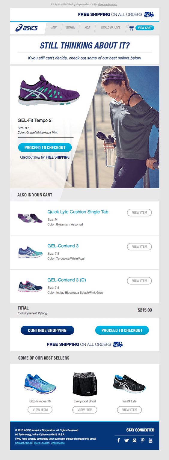
- Subject line: “Still thinking about it?” makes the customer click through to see if they still might be considering a purchase. Abandoned cart email subject lines are key to grabbing the reader’s attention, as we highlight in our selected abandoned cart email series examples.
- Motivation for purchase: At the top of the abandoned cart email, it is clearly displayed that there is free shipping for all orders. Free shipping, as we have said, is a huge motivator for purchase.
- Clear image: Asics displays all of the items in the cart and has a view button on the right-hand side so customers can see additional details.
- Stand out CTA: Asics places a bright CTA next to the image with clear action intent.
- Additional motivation: Located under the CTA is another reminder that this item ships free.
- Additional CTAs: At the end of the order Asics gives customers the option to check out or continue shopping with two different CTAs (and again reminds of free shipping).
- Recommending products/Showcasing best sellers: Showcasing some of the best sellers from their site, at the bottom of the message, Asics recommends their products and has a clear click-through option to view more details about each product.
2. J. Crew Factory Abandoned Cart Email
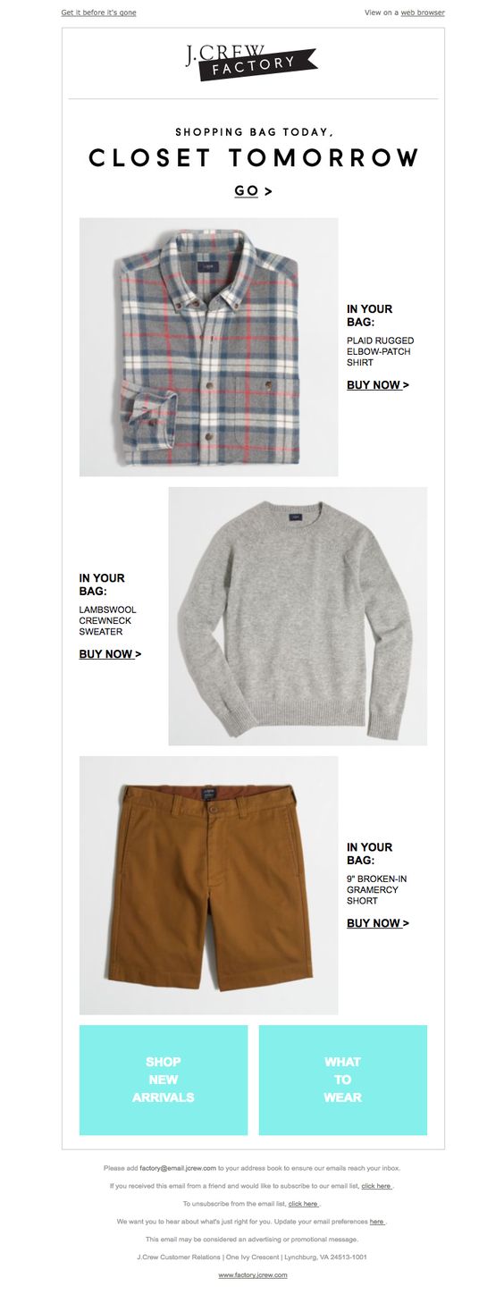
- Subject line: In this abandoned cart email example, J. Crew Factory uses clever copy to get their customer’s attention: “Shopping bag today. Closet tomorrow”.
- Preview text: In the upper left-hand corner we see the text: “Get it before it’s gone” helping to motivate shoppers to complete their transaction, or risk missing out.
- Branding: J. Crew Factory puts their brand front-top and center for the customer to see — this is a must for brands wanting to create successful abandoned cart emails.
- Motivating CTA: Located in the center of the message is the CTA, clearly marked and calling to action…to “go”…and buy these clothes that were abandoned in cart. Simple and to-the-point.
- Clear image: A clear image accompanied by a clever copy, reminding customers of what item(s) could be hanging in their closet — brilliant!
- Images combined with clever copy: Showing customers images of what products they have left behind help remind them of their interests and what they left “in their bag”. Displaying additional CTAs next to each individual item such as J.Crew Factory’s “Buy Now” is another way to boost abandoned cart email conversion rate.
- Easy to find opt-in/opt-out and email preferences: Located at the bottom center of the message and easy to find, customers can change their email preferences or unsubscribe. The more relevant the emails, the more value for the customers, and the fewer unsubscribes.
3. PacSun Abandoned Cart Email
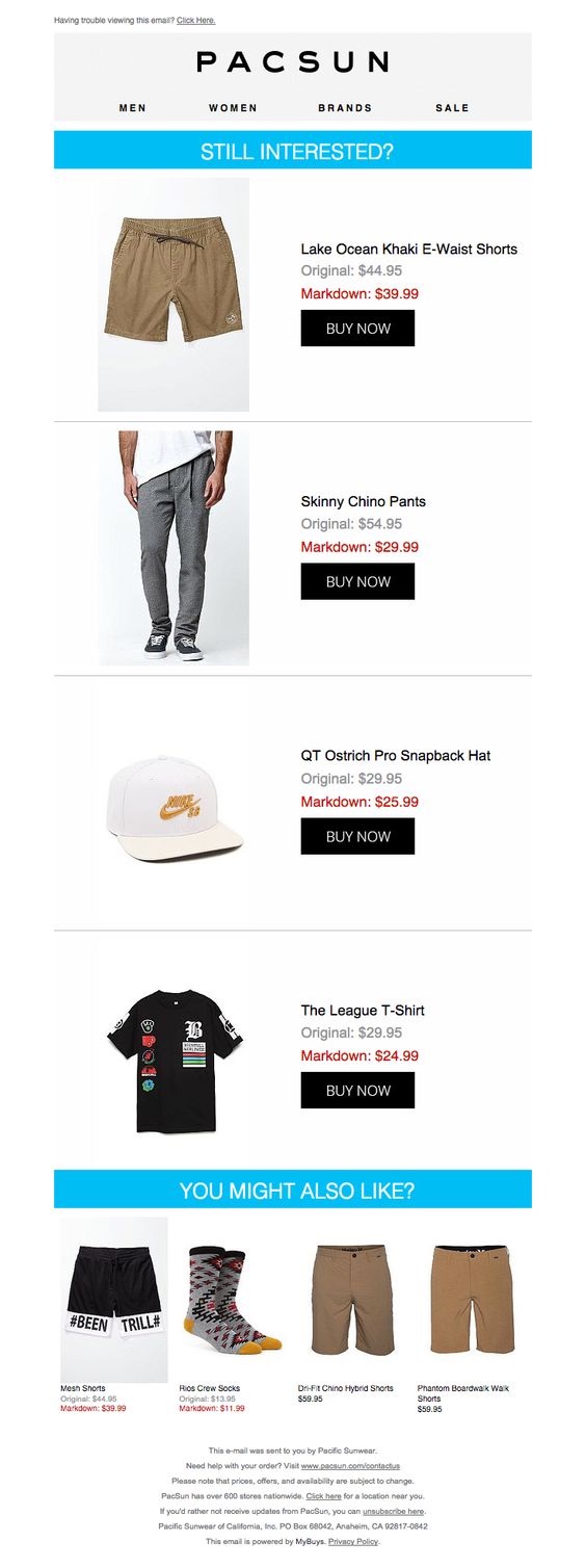
- Branding: Pacific Sunwear (PacSun) starts off the email with their branding, shows off their different departments, such as men, women, etc. The customer knows right away who the email is from.
- Smart Copy: Clearly marked with bright blue at the top of the message, “Still interested?” grabs the attention of the reader.
- Simple and clear images: Simply scrolling down allows shoppers to view all the items they left behind in their cart. It’s clear and easy to navigate with no fuss.
- Clear CTAs: This abandoned cart email example is awesome. Next to each item is a black CTA that stands out from the page, making it easy for customers to click through at multiple points of interaction with the email.
- Offering recommendations: At the bottom of the email is the same bright blue banner as at the top, only this time, with the helpful message: “You might also like?” showing some similar items for the shopper to compare and consider for purchase.
4. Whiskey Loot Abandoned Cart Email
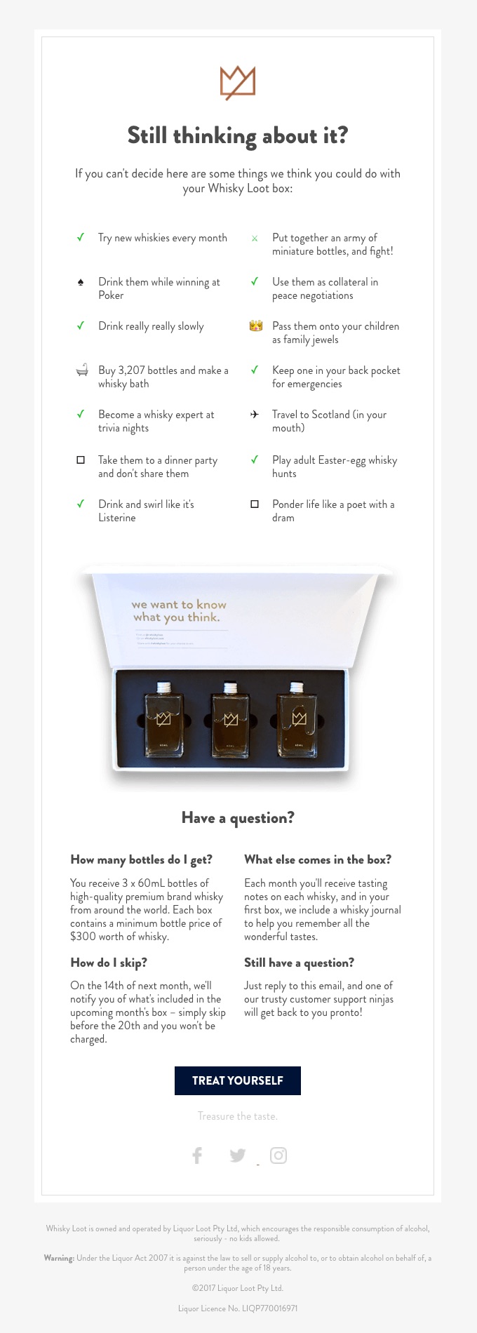
- Subject line: The subject line from Whiskey Lot is humorous and sets the tone for the entire Abandoned Cart Email: “Your cart is sobering up”. This is an awesome abandoned cart recovery email example.
- Useful information: Whiskey Loot starts off their abandoned cart emails with everything you need to know — front and center — with 14 humorous ideas on why the customer should complete their purchase.
- Specific product and brand information: Clearly stated under the bottom section “Have a question?” is further information about how Whisky Loot box works and what customers can expect to receive with their ongoing subscription.
- FAQ: In the same section, there are other relevant FAQs that are most likely commonly asked for the Whiskey Loot program and might be related to the reasons that visitors have abandoned cart on the site.
- Clearly marked contact options: In the same helpful bottom section, Whiskey Loot makes it super easy for customers who are still in limbo regarding their purchase to reach out and ask further questions by something as simple as contacting customer service by simply replying to the Abandoned Cart Email itself.
- Clear CTA: At the bottom, in the center of the page is the simple CTA: “Treat Yourself”.
5. Sephora Abandoned Cart Email

- Email subject line: “Don’t miss out on this” creates a FOMO or, fear of missing out that makes customers want to open your email to see what they could possibly miss out on.
- Preview text: In the upper center portion of the email. We see the unintrusive question: “Um, excuse me. Should this be yours?” — a little question with a lot of punch.
- Motivation to purchase with further savings or free gift: The top banner clearly displays a motivational message — receiving a gift with a purchase of $25 or more and a clear, catchy coupon code (ex. free shipping, free returns etc).
- Big clear and smart copywriting: A beauty mantra is perfect for grabbing the attention of shoppers. And, no woman wants to have “beauty regrets!” so they will certainly check out the rest of the email. It’s a really clever example of everything responsive abandoned cart emails should detail.
- Clear image: Sephora placed the abandoned cart product right in the center of the message — you can’t miss it.
- Include customer reviews: Reviews matter. 85% of millennials say reviews influence their purchasing habits. Here, Sephora includes the reviews right below with the featured product so the customer is sure to see.
- Recommend products: Consider that nearly half of US consumers alone say they are more likely to make purchases with companies that personalize experiences and 48% of consumers increase their spending as a result of personalization. That’s why Sephora showcases 4 recommended products right below the features product.
- Insight via interaction: Ask your customers to take a quick quiz with related/relevant information. At the bottom of the email, Sephora entices customers to further ensure that they have no “beauty regrets”. This also helps you further personalize future communications and makes customers feel valued and listened to.
Tip: We released a 3k words-long case study about Sephora’s omnichannel strategy. Don’t miss it!
6. La Redoute Abandoned Cart Email
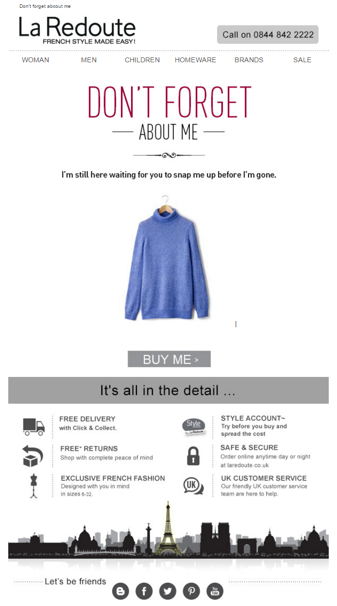
- Email subject line: In the upper left-hand side we see a catchy subject line such as ”Don’t forget about me”. It captures customers’ attention in a cute, sassy way.
- Contact options: A clearly marked, easy to locate telephone number is on the upper right-hand side. This is a stellar example of how to overcome any questions/obstacles (from browser errors to product related) that might be standing in the way of customers completing their purchases.
- Big clear and smart copywriting: La Redoute keeps to their brand image by using a clear, clean font and copywriting that is short and to the point.
- Clear image: Providing a clear image of the item(s) that have been left behind, waiting for purchase right in the middle of the email brings it to be the focal point. After all, this is a second chance at selling your product.
- CTA button(s): Located right under the clearly marked call-to-action buttons make it effortless for consumers to complete their sale.
- Motivation to purchase with further store info: As the reader ends the email, located at the bottom but still clearly standing out as relevant information, we find: “It’s all in the detail…” — never a more true statement. Consider that 66% of shoppers buy products from one retailer in preference to another because the delivery services offered were more appealing. Yes, stating clear shipping options is that important. That’s why this email ranks as one of our top abandoned cart email examples.
- Size: Size is important when it comes to sending cart abandonment emails. Usually, the shorter, and more quickly you get to the point, the better. It doesn’t feel as pushy. Instead, it’s just a little friendly reminder.
7. Moment Abandoned Cart Email
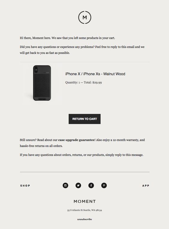
- Clear copy: From the start, Moment lets customers know that they have left something behind in their cart and they are there to help.
- Offering assistance: By asking if customers had questions or experienced issues in placing the order, customers feel taken care of. Offering an easy way to get assistance such as replying to an email is very helpful and quick for customers. This unique and sincere tone is why we chose this as one of the top abandoned cart email examples to share.
- Clear image: In the center of the message is a clear image of the product and other relevant information such as price, quantity, etc.
- Motivate with useful info: Below the image is copy and links for customers to learn more about guarantees and warranties.
- Reiterate convenience: In the last line of the email, Moment reminds customers that all they need to do is reply to the email to get personalized assistance.
8. Bonobos Abandoned Cart Email
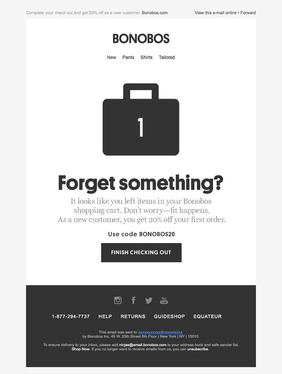
- Subject line: Straight and to the point — Asking if the customer “forgot something”.
- Preview Text: In the upper left hand corner we see inviting preview text with a motivating message — “complete your checkout and get 20% off as a new customer”. Clear, catchy and clever copy: “Don’t worry — Fit happens”. Using humor and candor go a long way in reaching customers that have abandoned items in their cart. Front and center the copy is clear and concise.
- Motivation to complete the sale: Clearly re-stating in the copy in the center of the message that there is a new customer perk of getting 20% off of the first order is a great incentive, plus offering the coupon code under the copy is a great attention getter.
- Clear CTA: Directly under the creative persuasive copy is a clear CTA — simply encouraging customers to finish checking out. The colors of the email contrast, making the CTA button pop out, and call to the customer.
- Clearly display contact and other relevant info: Bonobos places a box at the bottom of the email includes information about shipping, and a telephone number to reach customer service. These are just some of the reasons we chose this as one of our top abandoned cart email examples.
9. Dote Abandoned Cart Email
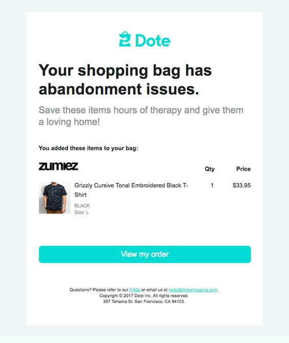
- Subject line: “Your shopping bag has abandonment issues” — is a fun way to communicate with customers and remind them of the products they have abandoned. It also sets the tone for the entire email.
- Branding: Dote puts their brand up-front and center in their email.
- Clever and to-the-point copy: Dote uses fun and light-heart copy to grab the attention of the reader.
- Clear images: Not only does Dote show what items are in the shopping bag, but they also give the entire breakdown of the order to help remind customers of specific relevant details.
- Clear and large CTA: Spanning the whole page is the CTA that is clear, brightly colored and lets customers easily and quickly return to their order and proceed to checkout. This is a great feature and is why we chose this as one of our favorite abandoned cart email examples.
- FAQs and useful info: Dote also use bright colors to draw customers attention to the bottom of the message where they have easy access to additional helpful information.
10. Adidas Abandoned Cart Email

- Subject line: “Is your wi-fi ok?” is clever and catchy — which is why we chose this email as one of our favorite abandoned cart email examples.
- Clever copy: Adidas nails it with preview text not only recommending their product in a funny and clever way but also by encouraging the reader to scroll down and read the reviews they supplied.
- Clear CTAs: Under the copy is are clear CTAs, not only to shop but also to customize your shoes.
- Reviews help sell: Customers love reading other customer reviews about products. Adidas shows off top reviews with trendy images of the product in question.
- Easy to find useful info: At the bottom of the message, Adidas clearly marks everything from support to managing preferences and finding a store.
Bonus Example 11 (abandoned cart via push messages): Urban Treats
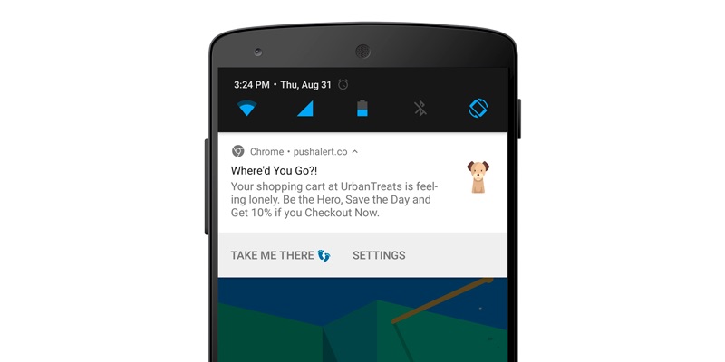
- Subject line for abandoned cart via push messages: Wrapping up our abandoned cart email examples is Urban Treats. “Where’d you go?” along with the cute dog emoji tugs at the heartstrings.
- Persuasive copy: Urban Treats copy is clever, clear and persuasive.
- Motivate purchase: If the persuasive copy doesn’t sell you, the 10% off might.
- CTA: Not only does Urban Treats try to persuade you to checkout now at the end of the copy with a sweet deal of 10% off, they also have a clear CTA on the lower left hand side of their push notification: “Take me there”.
- Clear settings options: By allowing customers to easily control settings on push notifications, you send more convenient and relevant messages.
- Tools you need to create a responsive Segmented Abandoned Cart Strategy: An advanced abandoned cart tool is essential. Use a sophisticated platform like ContactPigeon, which offers you the ability to create different abandoned cart PER CUSTOMER SEGMENT to skyrocket conversion. For example, for men/women, for your top 3 product categories and so on.
Build an omnichannel Abandoned Cart Strategy
In 2021, every eCommerce brand must have an omnichannel marketing strategy in order to build a responsive abandoned cart strategy. This means creating a seamless user experience across all channels relevant to the buyer’s journey to drive purchases across various points of sale on different devices. Here are some helpful tips to get started:
- Content is king. Without great content, your not going to capture the attention of your audience. You need to be sure you are providing relevant information to customers, every time. That’s where a fully automated platform comes in handy.
- Compile data and insights to identify your customers. You need to understand who your customers are, where they come from, what drives them to purchases and their challenges or obstacles along the way. Examples of automated tools that help you capture this information are landing pages, surveys and more.
- Segment, target, send. Once you have a clearer idea as to who your customers are and their web behaviors, use a dynamic segmentation tool to help you segment those customers into groups. This is where you will be able to identify their path to purchase and how you can best target them with personalized, relevant content.
The benefits of an omnichannel Abandoned Cart Strategy
Once you have the data needed to set up an omnichannel marketing strategy, you can focus on applying it towards building a responsive abandoned cart strategy. We broke down some of the key channels you can utilize to grow your business and combat the dreaded abandoned cart below:
Automated emails:
Email is still king when it comes to communicating with potential clients — even those who have abandoned items in their cart. That’s because this channel has the best ROI in eCommerce. One major advantage in using an automated email campaign is that over 2.6 billion people have an email account and since email stays in viewers’ mailboxes, it is more accessible. Also, it’s really simple to set a successful campaign into motion. All you need is a marketing automated platform to provide you with simple to use tools and features to go beyond mass email marketing and instead send unique, personalized, responsive emails.
Using push notifications for abandoned carts:
What sets automated website push notifications apart from email is that they can be delivered to a device, mobile or desktop, even when the user is not online. Abandoned cart reminders help you reduce cart abandonment since the automatic push notifications are triggered by customer behavior and are sent when shoppers leave items in their cart. This is a vital part of any successful omnichannel marketing strategy. The good news is that by using marketing automation platforms such as ContactPigeon, it’s really easy for marketers to create automated push campaigns by selecting from ready-made eCommerce automation scenarios.
On-site pop-ups with abandoned cart trigger:
On-site pop-ups for abandonment reminders help you boost conversions by engaging customers with popping messages. They are triggered to “pop-up” as visitors are leaving the site with items in the cart. Here at ContactPigeon, we built an abandoned cart trigger into our pop-up feature. What’s more, pop-ups with abandoned cart trigger are easy to set up. All you need is access to responsive pre-made abandoned cart email templates and simply customize the pop-up to show off your brand. Your automated marketing platform takes care of the abandoned cart email timing to ensure you send the right message at the optimal time.
Remarketing:
Remarketing campaigns are the perfect opportunity for marketers to target visitors after they leave your site with strategically placed off-site ads on other platforms. Even though the most common type of remarketing is display Ads, you can also create remarketing campaigns deliverable via email, push notifications, social media and other types of messaging channels. It’s simple to do using automated platforms that gather relevant content based on your visitor’s previous web behaviors.
Facebook remarketing is a prime example. Remember, as we said earlier, content is king. By creating short and direct messaging to capture the attention of your target personas, you can increase your brand awareness, re-engage customers to return to your site, and persuade them to take action. The results? Facebook posts under 40 characters receive 86% higher engagement than other posts, so keep it short and sweet.
No matter which your eCommerce platform is custom, Magento, Shopify, Bigcommerce, Woocommerce, Lemonstand, Presta or whatever, you ought to do the proper research to find tools that integrate with your email marketing automation platform to get your abandonment strategy up and running. Just keep in mind that in a medium online shop with 1000 visitors per day, ~40 abandoned carts can easily occur on a daily basis. This tactic can help you recover 2-4 baskets with a low to medium conversion rate performance.
Ready. Set. Convert!
Now you know everything you need to nail your abandoned cart strategy and drive your conversions to new heights in 2021. We’ve shared with you some great tips on how you can start designing your omnichannel marketing strategy for abandoned carts, and our top picks for truly inspiring high converting abandoned cart email examples. What are you waiting for? Get started designing and setting up your abandoned cart email automations today.


