A giant in the UK’s grocery industry, ALDI prides itself in selling the most economical quality items. Over the past decade, ALDI’s marketing strategy has aimed at aggressive growth globally, trying to ensure everyone has nearby ALDI stores or a nearby ALDI supermarket. This mindset has helped the company become the third-largest grocery brand in Australia and has placed it on track to become the third-largest in the U.S. by the end of 2022.
This ALDI case study will dive into ALDI’s marketing strategy and analyze its eCommerce page to help other companies learn about marketing strategies for supermarkets and see the kind of growth that the brand has been enjoying.
In a hurry? Listen to our article on the go:
ALDI through the years: how the retail titan was created
Once a small German grocery store that two brothers took over for their mother in 1945, ALDI’s brand positioning of selling quality low-cost products grew out of its environment. Since World War II had just ended, Germany’s economy was weak and many citizens couldn’t spare much money for groceries.
To reclaim money from other market leaders at the time, customers had to collect rebate stamps to send to their local co-operative at regular intervals. ALDI, then called Albrecht, thrived by subtracting the legal maximum rebate of 3% before all sales, eliminating the process to entice customers. To save costs further, the store didn’t spend on any advertising, and items that didn’t sell would promptly come off the shelves to conserve space for only what people wanted.
By 1960, the brothers jointly owned 300 shops, leaving no one wondering why ALDI is the best.
ALDI then began expanding internationally, building its first American store in Iowa. Today, just in America, the chain has grown to over 2,000 stores across 35 states, managing more than 25,000 employees. The company has received over 1,200 product awards and recognitions since 2017, including BrandSpark American Trust Study’s most trusted Discount Grocery Store Chain.
Build smarter customer journeys and activate AI-driven personalization for repeat purchases.
The ALDI marketing strategies that unlocked its growth.
ALDI’s growth clearly came from 9 key factors. We’ve spotted and analyzed them below, so feel free to try the same strategies for your business.
Key Strategy #1: Omnichannel transformation
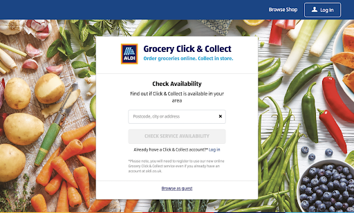
A strong, consistent omnichannel presence reduces friction along the customer journey, building and strengthening brand associations quickly. ALDI’s omnichannel strategy has been to meld its online and offline channels, investing in services like click-and-collect, letting a customer shop online and pick up their order from the store.
As a part of this effort, ALDI partnered with delivery services like Deliveroo and Instacart, which let shoppers who live far from its stores buy items as though they were physically present. Some of these services also let people access features such as click-and-collect, so they can customize their experience to best fit their needs and wants.
Key Strategy #2: Choosing the optimum target market
The grocery giant positions itself as the most cost-effective retail store to target the middle-income group worldwide. ALDI’s pricing strategy of maintaining the lowest possible prices and no-frills discounts encourages men and women in low and mid-level income groups and economical shoppers around the world to become regular customers.
To better cater to this market, ALDI continuously finds ways to reduce operational costs. For instance, it introduced a cart rental system. Shoppers would pay a quarter to unlock a cart from a corral at the front of the store, and they would get it back once they returned their cart. This added no charge to the customer but allowed ALDI to avoid hiring employees just to manage the carts.
Key Strategy #3: Creating an “As Is” map of the supply chain
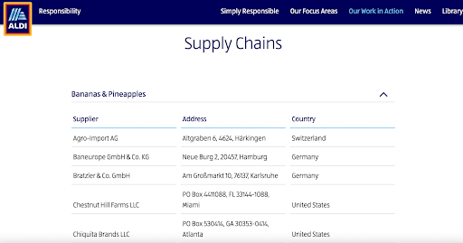
ALDI maintains an “as is” map of its supply chain for some of its products to accurately pinpoint areas for expansion, as well as potential process breakdowns and risks. It also makes this information public on its website, letting its customers hold it accountable, which helps position ALDI as a transparent, trustworthy brand that values ethical product sourcing.

Key Strategy #4: Differentiation: The ‘Good Different’ new brand positioning
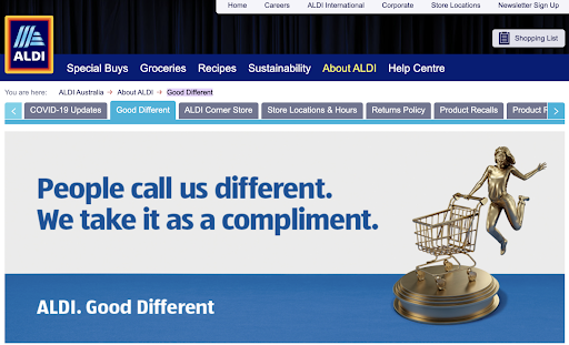
ALDI’s low prices make it stand out against all other major retailers. To raise consumer awareness about its uniqueness, ALDI’s marketing strategy in Australia incorporated new brand positioning, “Good Different,” which reinforced that the company’s low prices are a result of conscientious business practices — for instance, it sources products ethically and treats staff and suppliers with respect.
The “Good Different” campaign told customers that ALDI’s prices are better because the company is better, quelling any concerns over why it can charge so little.
Key Strategy #5: Social responsibility
ALDI understands the brand expectations that millennial and Gen-Z shoppers hold. They want a brand they support to take interest in its impact on the world. As a result, ALDI focuses on and constantly discusses its CSR efforts, such as sourcing all of its ALDI-exclusive chocolate bars and confectionery sustainably.
This focus also helps the brand build earned media, which is more influential than either paid or owned media. For instance, the EPA has ranked ALDI 15th on its Green Power Partnership’s “National Top 100 List” for its record-breaking green efforts. This ranking will attract more customers than ALDI Tweeting about its environmental awareness.
Key Strategy #6: Simple, cost-effective distribution
ALDI was able to open roughly one store every week in Britain, largely because its product distribution is uncomplicated. It purchases items in bulk and stores them in local warehouses, minimizing transit time and waste disposal while transporting goods.
Key Strategy #7: Ads promote USP
Though there is no ALDI marketing department in Germany, ALDI’s promotion strategy in the U.S., UK, and Australia, makes significant use of print, electronic, and display media to promote its stores. In these countries, it runs copies like “Swap and save” and “Like brands, only cheaper” to entice customers to switch from competitors’ brands to their own and build trust in its products.
Key Strategy #8: Simplified in-store layout
ALDI keeps its layout as simple as possible to drive down operational costs. Customers can generally find and pick out products on their own, reducing the number of employees necessary to assist them. ALDI’s marketing strategy also includes keeping only a limited amount of high-quality, name-brand products, so customers don’t have many options to confuse them, reducing their selection time.
Key Strategy #9: Engaging with followers

By engaging with its followers, ALDI can build brand loyalty. For instance, it has run a “Fan-Favorite Survey” since 2019, where fans can enroll in a lottery for up to $1,000 in ALDI gift cards by voting for their favorite ALDI product. This loyalty helps the brand activate its following, turning its fans into marketers by encouraging people to use its hashtags for its products, which helps it access people its efforts hadn’t reached previously.
Social media lets a brand reach a far wider pool of potential customers than any other tool. ALDI maintains a strong social media presence — boasting 2.8 million Facebook followers, 830,000 Instagram followers, and 106,000 Twitter followers at the time of writing — to get its brand in front of the internet-savvy section of its target audience.
ALDI’s eCommerce website
ALDI is undoubtedly one of the most highly evaluated retail brands out there. To achieve this, they mastered the art of eCommerce conversions. Or not? We’ve analyzed four-page templates of their site to identify eCommerce best practices and mistakes you should avoid.
A. Analyzing ALDI’s Home Page
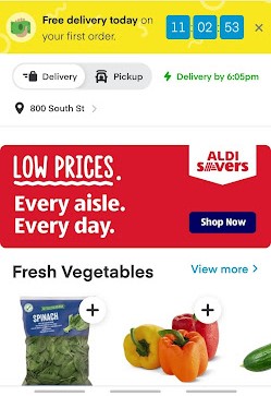
What we liked:
- Noninvasive offers: Pop-ups still boast an average conversion rate of 3.9%, and the main barrier preventing retailers and CRMs from using pop-up ads is their invasiveness. Because the offer appears on a bright banner that feels native to the page, it still catches a visitor’s eye but doesn’t irritate them, which can help increase conversions.
- Attractive deals: ALDI’s website reinforces the brand positioning by placing copy about ALDI’s low prices against a bold, eye-catching red background. Even if the customer doesn’t consciously register it, this reinforces the brand image in their mind.
- UX design: The page focuses strongly on user intent, letting customers start adding items to their cart directly from the home page. This removes friction between arriving at the home page and making a purchase, speeding customers along in the sales funnel.
- Search bar: A search bar is available on every page, letting the customer redirect their journey at any point if they decide they want a different item. The ubiquity of search bars reduces friction points, too. A customer can start searching for items quickly from the home page.
What we didn’t:
- Slow to load: Because it uses dynamic elements, the page loads slowly. As the user scrolls down, sections load in, freezing the page for seconds. The sidebar also sometimes fails to open when clicked. This increases the site’s bounce rate, since the probability of bounce increases by 32% if a page load time goes just from one to three seconds and by 90% if it reaches five seconds.
- Non-unique design: Though effective, the website interface is identical to Instacart’s. Visitors who have used Instacart before will automatically expect similar functionality, which may exacerbate frustration with the loading times. A website design is also an opportunity to build and reinforce brand associations and maintain consistency across platforms, which enhances the omnichannel experience.
B. Analyzing ALDI’s Category Page
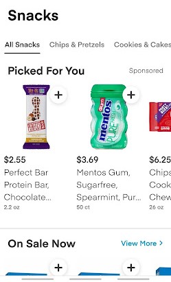
What we liked:
- Sticky cart: The options to add an item to the cart and view the cart are conveniently available no matter where the customer scrolls on the page, empowering users to add items to their cart even if they’re unsure about buying them. A/B testing shows that sticky carts increase orders from the product page by 7.9% and all add-to-carts by 8.6%.
- Sorting options: Letting the user customize their search helps them find the items they want more quickly, reducing churn.
- Useful information on display: By displaying deals available for items on sale and small text for other information, like if a product is gluten-free, this page enhances the customer experience, increasing retention and CLV.
What we didn’t:
- No filters: Like sorting options, filters help a user customize their search to find items more easily. This category page permits the user to reduce their options to smaller subcategories, but there is no ability to filter items based on features like brand, price, and common dietary restrictions. Adding this would reduce customer choice overload, which otherwise leads to cart abandonment.
C. Analyzing ALDI’s Product Page

What we liked:
- Minimalist presentation: The above-the-fold information is minimal, stopping at the “Favorite” button. However, its design and arrangement make the page still look complete, enhancing the customer experience while reducing extra noise that could complicate their decision-making process.
- Item suggestions: Customers can look through similar products if the current one doesn’t fit their needs, so they can immediately find a better option instead of abandoning their cart. They can also check items that other users frequently buy with the current product, making it easier to pair products while expanding their final cart, increasing ALDI’s revenue.
- Add item to Favorites: The option to add an item to a “Favorites” list boosts CLV by promoting repeated use while adding value to the customer, who can find the item more easily in the future.
- Simple content copy: The product details are simple, laying out the benefits for the customer clearly and without confusing data that might distract or confuse the customer.
What we didn’t:
- Nutrition facts sometimes missing: Not all food product pages include the nutrition information of the item, which is vital in simulating an in-person grocery shopping experience. Ensuring all food items contain their nutrition facts reduces friction and improves the omnichannel experience.
- No reviews: Almost 50% of people trust consumer reviews like they were recommendations from a family member or friend. Groceries are relatively inexpensive everyday purchases, so fewer customers may read these reviews, but giving customers the ability to leave a review would add to ALDI’s marketing objectives of portraying transparency and confidence in its products.
D. Analyzing ALDI’s Checkout Process

What we liked:
- Pre-checkout suggestions: The pre-checkout suggestions function like point-of-purchase marketing displays, enticing shoppers who are ready to purchase to add just one or two more items to their order.
- Simple steps: Each step in the checkout process is separate and concise, walking the customer through entering all the data necessary without overloading or tiring them.
- Savings callout: Customers who have bought items on sale see their savings in bright red under the final bill. The text color makes them focus on it, prompting them to feel more satisfied with their order even if they only saved $1.
- Multiple available delivery slots: Customers can choose from a wide selection of two-hour delivery slots throughout the day. This increases customer convenience, especially for those working long hours or those who are otherwise only able to receive their order in a specific window of time.
- Several delivery plans are available: Customers have multiple delivery options according to their needs. If they want to place an order in advance, they can set the delivery for a different day. If they need it to reach early, they can pay a small extra fee to get priority delivery within a certain time frame. Having these options available increases customer satisfaction and encourages repeat ALDI site visits.
- Pick-up option: An employee can prepare the order so the customer can simply come to pick it up, combining online and offline channels to enhance customer satisfaction.
- Google/Facebook sign-in: Internet users today expect any website that requires an account to let them connect their social media accounts, saving them the time of entering all their personal information and the trouble of remembering their username and password. If the customer already has an Instacart account, their usual settings will also auto-populate upon their login.
What we didn’t:
- No way to remove items post-checkout: Though customers can add more items to their order even after checking out, they can’t remove items they may have purchased accidentally. This can make them feel like they’re being valued less post-payment.
- No guest checkout option: However easy it is to become a member, forcing the customer to sign up adds a step in the checkout process and makes them consider the number of company emails they already receive. This increases the risk of checkout abandonment.
New tech that would be a service to ALDI’s customer engagement strategy
ALDI’s eCommerce website is effective but it could be enhanced with the help of some online tools. One tool that would significantly benefit ALDI is ContactPigeon’s Omnichannel Chat solution.
This chat feature helps a brand respond to customers immediately, preventing long waiting times and increasing customer satisfaction and brand loyalty. ALDI could use it as a way to deepen its relationship with its followers, taking a deep dive into its customers’ journey and creating smart types of automation that personalize the eCommerce experience and make users feel as though they were in a physical store.
For instance, if the chatbot recognizes a repeat customer, it can make personalized offers based on their search or order history, appealing to the specific customer’s tastes. Increased personalization is one of the best ways to boost sales effectively and access a high ROI.
Engrossing technology tools that ALDI is utilizing
Using the buildwith tool we scanned the giant’s U.K. website and we highlighted ALDI’s new website tools that we found most interesting:
- Omniture SiteCatalyst Customers: SiteCatalyst, an Adobe subsidiary, tracks visitors and conversions to provide detailed web and mobile usage analytics.
- Dynatrace: Dynatrace is an AI-powered monitoring and analytics tool that captures user journeys on a website.
- Modernizr: Modernizr lets a webpage run several tests on a user’s browser to customize the site according to the HTML, CSS, and JavaScript features they have available.
Fresh news of the supermarket retailer
Upper management at ALDI has been working hard to expand and strengthen the brand’s omnichannel experience. Here are some recent news articles that may help contextualize these efforts:
- ALDI On Track To Join ‘The Big 4’ UK Grocery Brands By 2023 ( Forbes)
- ALDI to expand store numbers in £1.3bn UK investment push ( Financial Times)
- ALDI opens first-ever cashier-less store in Greenwich ( Retail Week)
- Mold: New traffic management system introduced at ALDI store ( The Leader)
Insightful ALDI statistics to check
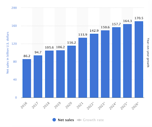
ALDI has experienced massive growth in multiple countries over the past few years, turning it into the grocery giant it is today. Here are some statistics that help summarize ALDI’s success story at a glance:
- ALDI’s net sales increased from $86.2 billion in 2016 to $133.9 by 2021
- ALDI expanded its UK grocery market share from 6.2% to 9% between January 2017 and January 2022
- There are over 2,100 ALDI stores across 38 states in the U.S.
- ALDI has opened over 1,000 new stores across America in the last decade, with 150 more planned for 2022, which will make it the third-largest U.S. grocery retailer by store count
- ALDI controls a 10.5% market share in Australia, rapid growth from just 4% in 2009
- ALDI was the first discount grocery store in the world
Discover more resources about FMCG retailers
- Sainsbury’s Marketing Strategy: Becoming the Second-Largest Supermarket Chain in the UK
- Tesco Case Study: How an Online Grocery Goliath Was Born
- The Marks and Spencer eCommerce Case Study: 3 Growth Lessons for Retailers
- The Ocado marketing strategy: How it reached the UK TOP50 retailers list
- ASDA’s marketing strategy: How the British supermarket chain reached the top
- Walmart Marketing Strategy: Decoding the Success of the US Multinational Retailer
- Analyzing Lidl’s Marketing Strategy: How the Discount Supermarket Leader Scaled
- FMCG Marketing Strategies to Increase YOY Revenue
Differentiate and grow like ALDI
ALDI didn’t become one of the most dominant grocery brands worldwide by luck. It identified its brand values early and built itself around them. Though this sounds simple, the difficulty comes from decades of consistency that was possible because of a consistent, brilliant, passionate, and exceptionally executed business plan that has now been successfully replicated in ALDI’s digital marketing strategy.
The pandemic has drastically changed the world, accelerating the integration of technology into all aspects of business. It has created an opportunity for rapid growth — for companies that can quickly incorporate technology to create an omnichannel experience that improves customer satisfaction while reinforcing brand values.
Before investing in a powerful customer engagement platform, however, it’s important to conduct deep market research and evaluate the benefits of the platform’s tools. Book a free 30-minute retail customer engagement consultation with ContactPigeon’s experts and incorporate an omnichannel strategy that will bring a high ROI to your business.

Let’s Help You Scale Up
Spending time on Linkedin? Follow us and get notified of our thought-leadership content:


