


Latest posts
Discover our most recent marketing insights.
Target Marketing Strategy: How the US Retailer Dominated Omnichannel Retail
Target offers one of the clearest examples of how a legacy retailer can evolve into a modern omnichannel operator without...
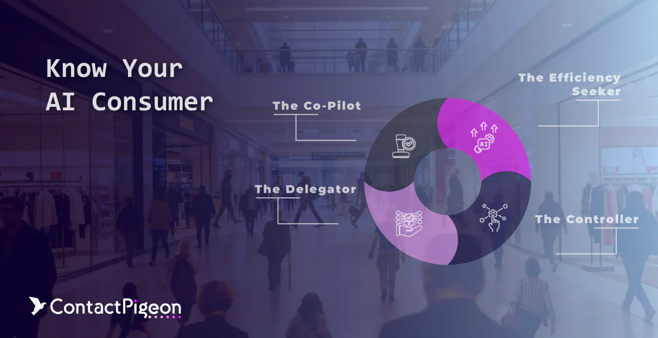
Know Your AI Consumer: The Demographics Driving Agentic Commerce Consumer Adoption
Agentic commerce is reshaping how purchase decisions are made in digital retail. Instead of guiding users through linear...

The Best eCommerce AI Agents for Grocery Retailers
AI agents are rapidly reshaping how grocery retailers optimize pricing, expand baskets, and forecast demand. As competition...
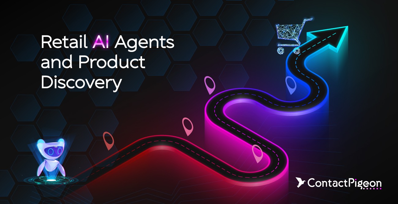
Retail AI Agents & Product Discovery: What CMOs Must Prepare for in AI-Driven Shopping Journeys
Artificial intelligence is beginning to reshape how customers discover products. Retail AI agents and product discovery are...
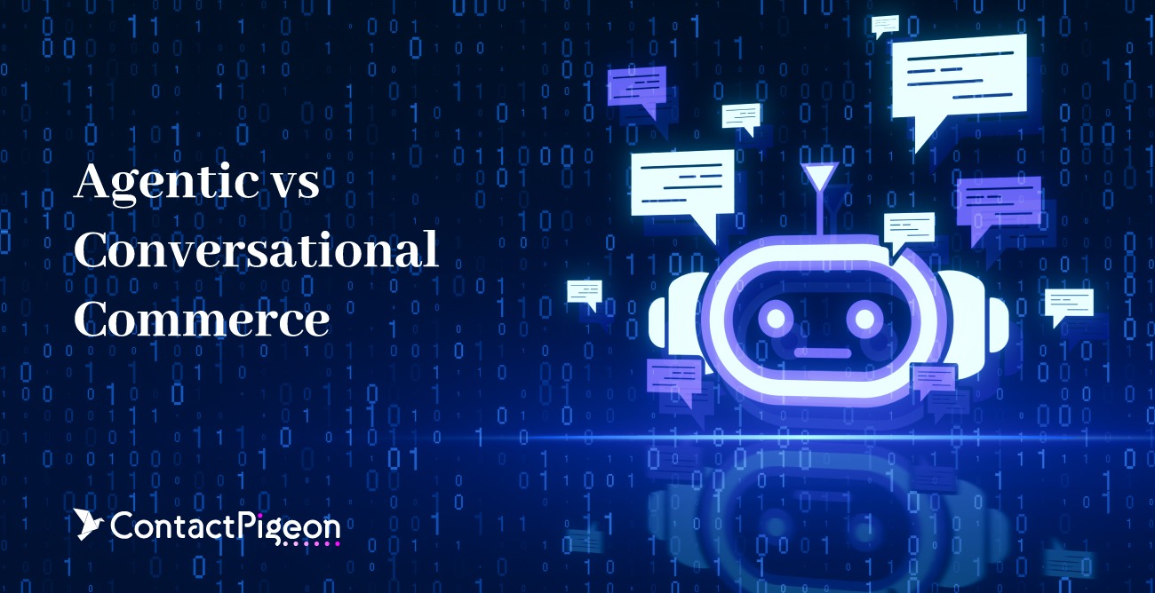
Agentic vs Conversational Commerce: What Actually Drives Retail Performance Today
The debate around agentic vs conversational commerce is quickly becoming one of the most important strategic discussions in...

Best eCommerce AI agents for Retailers in 2026: Capabilities, Pricing & Use Cases
Retail is entering a new era of agentic commerce, where AI agents do more than respond. They guide shoppers, automate decisions,...
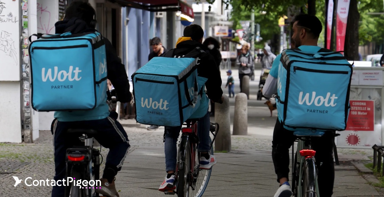
Wolt Marketing Strategy: How the Finnish Marketplace Scaled On-Demand Retail
Wolt has evolved from a single-city food delivery startup into a multi-country marketplace operating at the intersection of...

The Best eCommerce AI Agents for Electronics Retailers
In consumer electronics, customers do not just “browse.” They compare specs, ask compatibility questions, worry about...
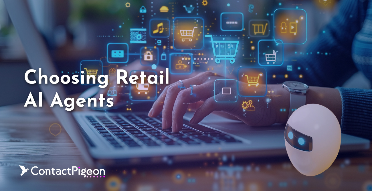
Choosing Retail AI Agents: A CMO’s Framework for Customer Lifetime Value
Retail AI agents are increasingly moving beyond early experimentation into real operational use, helping retailers improve...

Ulta Beauty Marketing Strategy: How the US Retailer Dominated the Cosmetics Industry
Ulta Beauty has become one of the most instructive case studies in modern retail, not because of any single campaign or channel,...

AI in Retail for Valentine’s Day: Driving Revenue with Guided Personalization
Valentine’s Day remains one of the most commercially significant retail opportunities each year, reinforcing its importance into...

Top Retail Predictions in 2026: How AI Is Reshaping Commerce, and Customer Experience
As we move into 2026, retail and ecommerce are entering a more mature phase of digital transformation. The past five years were...
Get retail insights and customer engagement tricks delivered to your inbox.
By entering your email address above and clicking Register, you consent to receive marketing communications from ContactPigeon. You can unsubscribe from our marketing emails at any time by clicking on the “Unsubscribe” link at the bottom of our emails. For more information on how we process your personal data and rights in this respect, please see our Privacy Policy.

